Sign up for the Packaging Digest News & Insights newsletter.
David Bellm
March 11, 2015
3 Min Read
.svg?width=850&auto=webp&quality=95&format=jpg&disable=upscale "Orange-Juice Firestorm: Tropicana Redesign")
 The recent debacle over Tropicana withdrawing its redesigned carton really seems to have touched a nerve in the design/branding/ marketing community. I wouldn’t have thought that orange juice could evoke such passionate discourse – among professionals as well as consumers.
But hey, one can never tell exactly what’s going to set ablaze opinions anymore. And unlike farces such as the New Coke incident, we now have the internet and its vast array of social networking outlets to propagate the firestorm.
Naturally, I have my own share of opinions about it too.
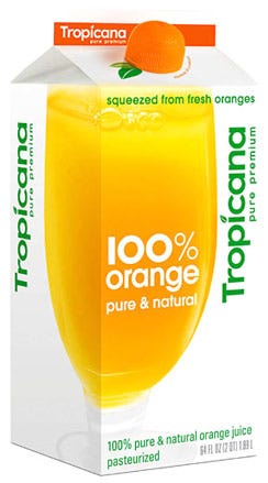
I like designs that are clean and sleek. But I still can’t help but feel that Tropicana reversing their decision is a victory. For almost the entire second half of the 20th Century, the trend in design and branding was in reducing information, paring down, simplifying. In many cases, this strengthened and intensified the essence of the communication. But often times it did more to make things just bland. The previous Tropicana design was rich and lively – it moved one’s imagination. In many respects it possessed a lot of what we love about vintage packaging … without seeming the least bit “vintage.” A tad dated perhaps, but not slavishly retro in any one particular element.
And maybe we shouldn’t bag too much on the design team that came up with the new carton design. In any creative work — be it a song, a painting, or a package design — it can be a very fine line between “spare” or “sleek” or “clean” on one hand, and “generic” or “bland” on the other hand. The Tropicana team just happened to have gotten on the wrong side of that line.
Or did they? That new design is indeed surprisingly weak overall. Too much so. Could this be a ploy by Tropicana? There are still many people who claim the New Coke debacle of the 1980s was all just a publicity stunt. And if it is, it’ll probably work tremendously – this week, the name “Tropicana” is emblazoned on any corner of the Internet that might possibly care about it. Whether or not it was on purpose, the attention is surely translating to pure gold for the brand.
I would really like to see an update of the previous design. Just not such a radical one. In this day and age, I think it takes some courage to resist the urge to make things really sleek. That is the prevailing aesthetic now, influenced by the tempo, attitudes, and values of our time. But orange juice – like certain venerable brands such as Coke, Harley Davidson, and Jack Daniels — don’t have to hue so much to contemporary whims.
Good old O.J. is largely about tradition – about drinking the right stuff for the right reason, because you’ve always known it’s the thing to do. Brand managers and designers don’t really have to put a slick, “now” spin on that to make it a hit.
.
About the Author(s)
You May Also Like


