January 29, 2014

What happens when packages in a product category form a level playing field? Usually, the design innovator comes to rule the roost.
The cock of the walk in egg marketing is undoubtedly Egg-land's Best (EB), which nearly a decade ago, introduced the first nationally distributed, branded egg. Egg-land's Best® eggs, anticipating and perhaps creating the trend to the best-quality “natural” egg, result from what the company says is a patented vegetarian diet of grains with no animal fats, animal byproducts or hormones fed to the free-roaming hens laying its eggs.
From his company's Cedar Knolls, NJ, headquarters, Charles T. Lanktree, president and CEO, tells PD that the triple foundations of quality, taste and identity buttress EB's growth. He holds these components responsible for the incredible record of 114 consecutive months of double-digit sales growth in a market sometimes as fragile as its product; and for the fact that EB now owns between a 75-percent and 80-percent share of market in national sales of branded fresh, whole eggs in supermarket distribution.
There's no letup, either. He notes that 2006 sales growth to mid-September is up 24.1 percent.
Lanktree acknowledges the roles of quality assurance and new product activity in keeping sales sizzling: “We know the FDA inspects very few eggs moving through the distribution system, so we retain an independent company to inspect our eggs in stores, as well as the checks run right after laying,” he notes.
Nor does he underestimate the role of advertising in developing and keeping interest in his company's eggs, even while noting that a burgeoning of media tends to splinter ad effectiveness. “We do spend more on ads,” he says, but in terms of encouraging trials, “word of mouth continues to be a strong influence.”
The strongest influence is his packaging. From the outset, when EB began using the same cartons as other egg packers, Lanktree has emphasized the power of branding through the design system developed and maintained by J. Roy Parcels Associates (www.jroyparcels.com) ; and of directing the packages as instruments for informing consumers about the quality, taste and, most recently, health implications of eating eggs as part of a nutritious diet.
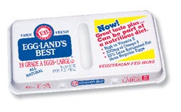
Most powerful is the logotype in red and blue on the white background of the foamed polystyrene cartons made by the Dolco Packaging (www.Tekni-Plex.com) subsidiary of Tekni-Plex used for white eggs. This logo incorporates a circular, quality-approved seal in red, with the tradename reversed out of a rectangular blue background and, also in blue, the words “farm fresh.” It is complemented by the EB mark in red, stamped reassuringly on each egg by a proprietary process.
Copy beneath the logo gives the grade, count and large or extra large size, plus the required net weight statement and the words “all natural.”
The other half of the carton cover, flexo-printed in four colors, praises the product as America's Best Tasting Egg, with callouts citing “high in Vitamin E,” “100 mg of Omega 3” and “25% less saturated fat than regular eggs” and the bottom-line copy, which reads, “vegetarian fed hens.”
Also given prominence are a seal and a medal proclaiming the 2006 Best Taste Award presented to Egg-land's Best eggs by the American Culinary Institute.
It doesn't stop there. Under the cover, copy in much greater detail thanks the consumer for selecting Egg-land's Best eggs and explains about the eggs and what makes them special, also giving the nutrition facts table.
There is a statement that tells the consumer, “If you are concerned about cholesterol, follow a diet lower in saturated fat and cholesterol and ask your doctor or dietitian about Egg-land's Best clinical studies.”
“From the beginning,” Lanktree says, “we have done trials to make certain that the quality of our eggs remains consistently high, and we have plenty of testimonials from consumers who continue to eat our eggs because they know we don't ease up on our standards.” Continuing to encourage trials, the company recently added an EPS 18-count carton with cover copy varied to suggest that eggs can be part of a nutritious diet, with the same callouts, distributed primarily in clubstores and in some supermarkets. For this package, the Parcels design approach varies the logo format to place the quality seal above the blue rectangle, gaining flexibility as well as impact.
The trademark is at the heart of the package designs, and of all EB's communications, comments Roy Parcels, president of the design firm. “With the full trademark, which can be used in horizontal and vertical packaging formats and the EB symbol we developed, the company has an identity that works with a variety of product and package surfaces, and that anticipates new product introductions,” he adds.
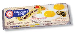
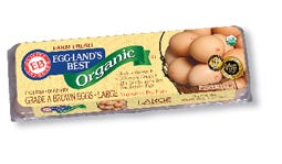
Proving out these statements are the most recently introduced 12-count cartons for Egg-land's Best Cage Free® and Egg-land's Best Organic® large brown eggs. The package structure is by now familiar. It is a carton that other egg packers, including those for supermarkets' own labels, have started to adopt for their protective and marketing advantages.
It's the transparent, trifold carton made of recycled polyethylene terephthalate (PET)/ethanol produced by Interplast (www.interplast.net). Originally debuting in 2005, the carton labels are revised for this year with the addition of the American Culinary Institute medal incorporated seamlessly into the graphic designs.
The labels open up the packages visually. They are supplied applied to the cartons by Interplast and printed via offset lithography in one spot and four process colors on an uncoated gloss stock by Imprimerie L'Empreinte (www.empreinte.qc.ca).
During die-cutting, the labels are perforated approximately 1 in from the edge on three sides to conform with the carton-lid configuration, explains Leyenda Lee, Interplast marketing and sales director. “We developed equipment that applies a spot thermal glue and inserts the labels into the carton lids at high speeds online at the thermoformer,” she informs PD. “That helps to keep our operation efficient and competitive.”
The graphic designs for both egg varieties take this factor into account. For the cage-free variety, all graphic and copy elements of the EPS carton carry over, plus a brown-on-gold banner proclaiming the egg type and an appetizing depiction of two eggs, sunny side up, with fruit and mint leaf garnish.
For the other variety, the word “organic” is reversed out of a green banner, and a basket of Egg-Land's Best eggs is shown with the EB marks prominent and an overprint of the U.S. Department of Agriculture (USDA) Organic mark. A mini version of the egg-basket graphic repeats on a folded side of the label.
Both labels also carry the information from the EPS carton labels in one color on their reverse sides, as informing consumers post-purchase is important to building and keeping brand loyalty.
Sums up Lanktree: “The designs have enabled us to brand ourselves, are clear and clean and set us apart from competitors while we get our messages across to consumers. You could hardly ask for more.”
More information is available: |
Dolco Packaging, 908/722-4800. www.Tekni-Plex.com. |
Imprimerie L'Empreinte, 514/331-0741. www.empreinte.qc.ca. |
Interplast, 888/925-0500. www.interplast.net. |
J. Roy Parcels Associates, 609/424-0387. www.jroyparcels.com. |
About the Author(s)
You May Also Like


