Packaging Design
thumbnail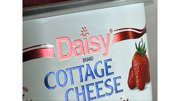
Packaging DesignDaisy’s Dairy Case DanceDaisy’s Dairy Case Dance
Unique, upscale packaging elevates cottage cheese to an indulgent splurge.


.svg?width=300&auto=webp&quality=80&disable=upscale "Mars Opens R&D Hub")


.png?width=300&auto=webp&quality=80&disable=upscale "Legal Case Made with Real Cheese Claim")


Editors' Choice


Sign up for the Packaging Digest News & Insights newsletter.
Unique, upscale packaging elevates cottage cheese to an indulgent splurge.