January 29, 2014
An esthetically satisfying engineering feat has captured the Package of the Year award in the New Jersey Packaging Executives Club's (www.njpec.com) annual competition.
A
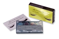
First flirting for the gold award in the color cosmetics category, the winning package is a compact that San Francisco-based Bare Escentuals is using to draw eyes to its i.d. bareMinerals(TM) Liner Shadow Compact Quad II series of loose radiant colors (A).
The kit, reportedly introduced in July, is sister to the original Compact Quad, differing only in the selection of four liner colors, with the compact exactly the same as the original. The palette of colors—aquamarine, coffee bean, firefly and retro—can be mixed wet or dry in two watertight wells molded into the compact, which is structured for consummate convenience.
Produced, filled and supplied as a turnkey package by HCT Packaging (www.hctpackaging.com), the compact, barely 4 1/2 x 2 1/2 x 9/16 in., is injection-molded to incredibly close tolerances, a practical necessity for keeping the loose shadow in place as well as providing smooth function when blending shades.
Components are a black lid screen-printed with the brand logotype, its underside fitted with a mirror, and a strip of four plugs mating with the product wells, molded of acrylonitrile butadiene styrene and styrene acrylonitrile; a polypropylene spigot plate, rings and insert for the four wells; a clarified ABS pushbutton to open the compact; and a transparent SAN base for viewing of the product colors.
There is a third well for an applicator brush. Covering the lower half of the base is a pressure-sensitive, die-cut 0.21-mm label, which is round-cornered and matte-coated, featuring product names, content statement and the copy, "no animal testing" and "please recycle." In several ways, the package, as well as other winners in the competition, anticipates the findings in the presentation by Ampacet's Linda Carroll (see sidebar on p. 47).
A double-face card with product use suggestions is included with the compact in a straight-tuck, C1S 300-g folding carton, printed in four process colors and given an ultraviolet finish. The eyes have it in the fetching graphics of the carton's face, with the rear including close approximations of the product colors.
B
For an uncompromisingly elegant presentation of a product that crosses over to anti-aging skin treatment, New York City-based Chanel captures the gold award in the personal care category, also taking the technical merit gold award.
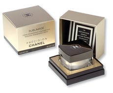
Marketed under the Chanel Précision aegis is Sublimage Essential Regenerating Cream (B), said to result from the discovery of an extract of the green fruit of the Vanilla Planifolia growing in Madagascar. It is reportedly more potent than traditional plant extracts in targeting wrinkles, loss of firmness, dehydration and other aging characteristics.
To hold a 50-g (1.7-oz) quantity of the Sublimage cream, a heavy, sculptured glass jar from Saint-Gobain Desjonqueres (www.saint-gobain-desjonqueres.com) is inside-sprayed with champagne color before a matching plastic cup of the product is inserted, notes Scott Widro, Chanel's vp of materials management.
Screened in champagne and black with the product identity and other information, the jar receives a plastic insert that rests over its neck and enables an Embatherm (www.embatherm.com) disc with pull-tab to be heat-sealed, preserving the product's freshness. The closure is a threaded, linered unit in Chanel's signature black with silver embossing of the logo and is produced by Rexam Closures & Containers (www.rexam.com/closures).
There's more. The jar is placed into the base of a two-piece setup box supplied from Chanel's operation in France that seats a foam platform with a cutout that receives a spatula. Inside the cover is black flocking to protect the gleaming closure and to add a feel of luxury. The setup box and a fully illustrated, 22-page color booklet then are inserted into a reverse-tuck folding carton that Cultech, Inc. (www.cultech.com) prints in champagne, black and white (a contrast for the UPC code). Widro notes that the booklet cover and folding carton are printed using the champagne color over a silver, Mylar-coated board to give them a custom metallic look.
C
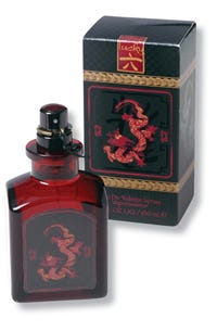
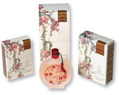
Still another double gold award winner gets lucky twice in the same category: fragrance. From New York City-based Liz Claiborne Cosmetics and Lucky Brand Cosmetics comes Lucky Number 6 fragrance lines for men and women (C), which debuted respectively in August and October.
The packages are submitted by Standwill Packaging (www.standwill.com), responsible for primary container labels, and Hirschhorn + Young Graphics (www.hirschhornandyoung.com).
For the 100-mL package of men's eau de toilette judged in the competition, arresting graphics and structural daring pair with a tongue-in-cheek approach to winning acceptance. Carton copy urges the consumer to "Become a man of magnetism and mystery" and wear the product so "...an air of prosperity will be yours."
Resembling an apothecary bottle but rendered in a deep crimson by Saint-Gobain Desjonqueres is the glass container fitted with a Rexam pump sprayer with a metal clip and a decorative black cord tie preventing accidental actuation. For the face label by Standwill, a graphic includes a fancifully wrought dragon. Printing is on 60# Kromekote(R), from SMART Papers (www.smartpapers.com), in red, gold and black with embossing, plus matte and gloss finishes for extra-dimensional visual impact. All product data appear on the rear label, also printed by Standwill, to the same specifications.
The outer reverse-tuck carton, produced by Shorewood Packaging (www.shorewoodpackaging.com), uses the same graphic approach against a repeat-pattern background, banding the dragon graphic in an embossed gold ribbon. Also printed and embossed at the edge of the dustflap and wrapping down the main display panel is a seal with the Lucky Number 6 logotype and the Chinese symbol for the number six.
C
For the women's collection, including eau de parfum, body milk and shower gel, the somber, dramatic graphics of the men's packaging are replaced by branches with flowering plum blossoms against a pearl-shaded sky. These effects are captured especially effectively on the embossed, reverse-tuck folding cartons by Shorewood.
On the shower-gel's 200-mL plastic bottles from M&H Plastics (www.mhplastics.com), two of the Standwill full-body labels use the branches hung with lanterns, printed on a white 2.5-mil polyolefin film in four-color process with spot colors, a matte finish and a rainbow hot-stamp foil.
Copy for all three packages reflects the same intriguing touch as for the men's line. It ranges from "Your elegant scent will attract many," to "Your soft skin reveals a strong mind" and "Good things come to those who shower." Liz Claiborne marketing director Lisa Hershkowitz tells PD that the colors and symbology are meant to convey life that is in balance and harmony—the essence of an opulent philosophy.
D
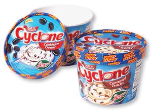
Yet another winner of two gold awards is a familiar, 2-pc cup for ice cream that follows a growing trend to mix-ins, adding ingredients to a creamy ice-cream base. The top package in the food/beverage and impact category is the Breyers(R) Cyclone line of four novelty bulk-pack ice creams (D), infused with cookies and candy pieces, from Unilever Foods North America for second-quarter 2006 debut.
The design system by Smith Design (www.smithdesign.com) is for the lids and sidewalls of containers for Caramel Tracks, Cookies & Cream and (not submitted in the competition) Choco Chip Cookie Dough and Chocolate Fudge Brownie.
The approach is the same: Against a creamy, swirling, ice-cream background, a maelstrom of appetizing solid ingredients is caught up. A spoon graphic suggests the consumer might want to try the indulgent treat, while the Breyers leaf logotype is a familiar assurance of quality.
Because of the way ice cream is displayed at point of sale, the lid is used as billboard, clearly communicating that the ice cream is loaded with "good stuff." Printing on the lid and cup is in six colors and is done by offset lithography. The packager declines to name the package supplier.
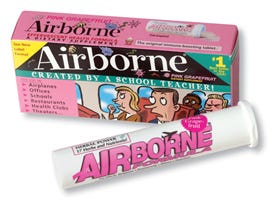
A package focused on a specific retail outlet captures the gold award in the pharmaceutical/medical device category. The package is for a dietary supplement in effervescent tablet form (E), offered in a new pink-grapefruit flavor in a larger size aimed specifically at clubstore sales.
E
Launched just more than a year ago is Airborne(R) Formula pink grapefruit in an innovative rigid PP vial just shy of 5 3/4 in. long. Marketed by Airborne, Inc. of Tarpon Springs, FL, the vial holds 18 tablets—eight more than the original package marketed nationwide in food, drug and mass-merchandise outlets, PD is informed by Airborne senior vp of operations Alex Terranova.
Sanner of America, Inc. (www.sanner-usa.com) injection-molds the vial, decorating it via offset printing in four colors plus a lacquer overcoat. Sanner also injection-molds the tamper-resistant low-density polyethylene stopper closure, which has a chamber containing a desiccant, a spiral spring that applies pressure to the tablets, protecting them from damage through the distribution cycle, and a breakaway ring that deters in-store testing.
Sanner notes that the package format is very popular in Europe, though less so here versus foil packets. The company claims the Airborne package offers a lower cost per tablet than foil unit-packs, since the vial is a stock size, and the package provides improved graphics space and better impact protection. The stopper is also a stock component. Not judged in the competition is the folding carton.
Terranova says the vial is doing very well at the retail level, with sales becoming "airborne."
More information is available:
Cultech, Inc., 732/225-2722. www.cultech.com.
Embatherm, +33 4 78 0624 96. www.embatherm.com.
HCT Packaging, Inc., 908/203-8610. www.hctpackaging.com.
Hirschhorn + Young Graphics, Inc., 212/246-4695. www.hirschhornandyoung.com.
M&H Plastics, 540/667-3865. www.mhplastics.com.
New Jersey Packaging Executives Club, 856/722-1122. www.NJPEC.com.
Rexam Closures & Containers, 812/867-6671. www.rexam.com/closures.
Saint-Gobain Desjonqueres, 212/753-4200. www.saint-gobain-desjonqueres.com.
Sanner of America, Inc., 856/988-6465. www.sanner-usa.com.
Shorewood Packaging, 212/508-5693. www.shorewoodpackaging.com.
SMART Papers LLC, 800/443-9773. www.smartpapers.com.
Smith Design, 973/429-2177. www.smithdesign.com.
Standwill Packaging, Inc., 631/752-1236. www.standwill.com.
About the Author(s)
You May Also Like


