May 21, 2014

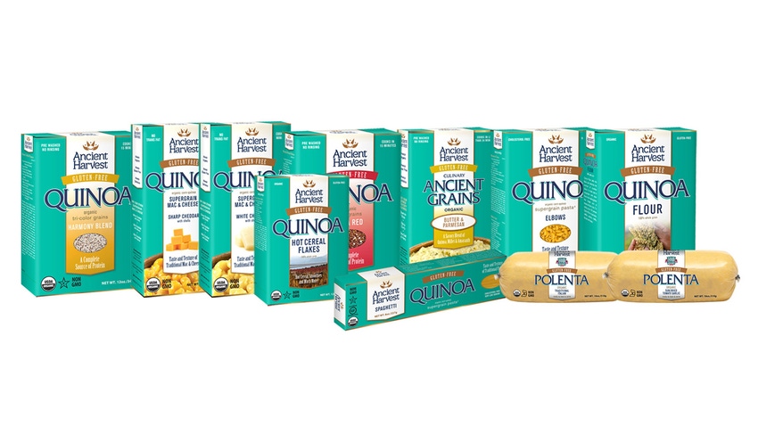
Ancient Harvest, known for its organic quinoa and ancient grain line, recently expanded its product portfolio by launching Mac & Cheese and Culinary Ancient Grains. These new introductions coincide with a packaging redesign and revamped website. Packaging Digest got the exclusive on the new packaging refresh from Constance Roark, director of marketing, Ancient Harvest.
What is the motivation behind Ancient Harvest’s recent activity in introducing new products/packaging?
Roark: One of the biggest challenges – for those eating gluten-free, vegetarians, flexitarians, or people who are simply living a healthy lifestyle – is finding nutritious options that can satisfy the entire family. Growing our portfolio of products adds to the variety of high-quality, tasty options available. While the brand’s roots are in quinoa, we feel it’s important to expand to include other nutrient-dense and naturally gluten-free ancient grains in our products.
Taking consumer feedback into account, the refreshed packaging is anchored in the core benefits of our products with a more contemporary and culinary look. The new logo designed as an abstract representation of a quinoa seed emerging from its pod, emphasizes the iconic image evocative of the quinoa “supergrain” that is the centerpiece of the Ancient Harvest brand.
What are the benefits for retailers and/or consumers of introducing new products and packaging in tandem like you have?
Roark: The refreshed packaging gives Ancient Harvest the ability to expand into the rich world of ancient grains while maintaining our connection with loyal customers. Ancient Harvest continues to thrive in the booming quinoa category while driving new product innovation. As we continue to evolve to meet consumer needs, the new packaging will allow us to better communicate our rich company history, values and vision, and showcase our robust product lines to existing and future fans of Ancient Harvest, which will help consumers more clearly identify products from the brand they have trusted for more than 30 years.
Does your new packaging set any new trends in the natural/organic industry?
Roark: Trying to stand out on the shelf while communicating product benefits, taste and texture profiles, flavors and product imagery on packaging can get cluttered and overwhelming. Our new packaging is minimalistic, but also shares Ancient Harvest’s values and promise. Prior to creating the new design, we heard from consumers that they like the bold teal color and associate it with Ancient Harvest. For this reason, the teal is still very bold and prominent on our new packaging.
What changes did you make to the packaging that makes it more eye catching?
Roark: We think our original packaging was eye catching with the bold teal color. We looked at the new packaging as an evolution instead of a revolution. We wanted to maintain our connection with loyal customers while creating a more contemporary look, so we kept the well-known teal color and made it a bit brighter. One of the biggest changes we made was revamping the Ancient Harvest logo. Our new logo still pays tribute to quinoa, our flagship grain, but makes the Ancient Harvest brand more recognizable to the consumer.
When and where (regionally or nationally) were the products introduced?
Roark: The new Mac & Cheese and Culinary Ancient Grains hit shelves in spring 2014. Both products are available nationally.
What were the key goals and requirements from a marketing view? From a packaging view?
Roark: While consumers recognized our packaging, they didn’t necessarily recognize the brand by name. Our goal was to debut our new products and packaging and make the Ancient Harvest brand name more recognizable while maintaining the recognition with loyal customers. From a marketing perspective, we aim to continue to drive relevancy for the brand, which new packaging helps us do.
About the Author(s)
You May Also Like


