March 11, 2015


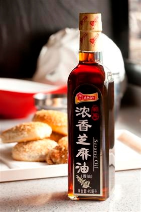
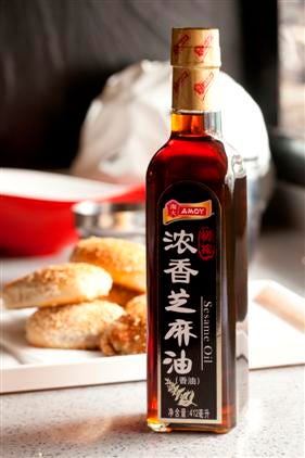
AMOY_Sesame_Product Shot
Research from the Assn of European Producers of Steel for Packaging shows that more than 70 percent of consumer purchasing decisions are made at the retail shelf. With the role of packaging as part of the marketing mix steadily growing, package design has become a critical tool in influencing consumers' decisions in-store.
A clear example of the role packaging plays in establishing and maintaining a brand's identity is the fact you only have a matter of seconds to visually stimulate most consumers as they make their purchasing decisions. Marketers can make their products stand out from the crowd and improve shelf-appeal by choosing the appropriate mixture of packaging concepts, including packaging substrates, labels, colors, shapes, visual effects and print quality.
In its recent report Shelf Differentiation, the Assn of European Producers of Steel for Packaging noted that consumers, in general, make more than a dozen purchases in a typical supermarket shopping trip, and rarely take the time to read labels and actively compare products and prices. Instead, shoppers use visual cues to sort through the vast array of options at the store shelf to make a quick purchasing decision. As referenced in the report, brand packaging specialists state that the message communicated on the front of a package, must be "captivating," as well as "easy and quick to assimilate."
When Amoy Food Ltd, based in Hong Kong, was looking for a way to allow its line of sesame oils (Pure Sesame Oil and Pure Black Sesame Oil SKUs only) to stand out on supermarket shelves, the company set out on a new packaging and label design that would protect its reputation as a premium cooking oil supplier, along with increasing its ranking within the market.
"Innovative packaging not only has the power to enhance a brand's position in the marketplace and in the minds of consumers, but also to drive sales and build brand loyalty," says Binli Lu, deputy supply chain director at Amoy. "With more than 100 cooking sauces and condiments producers in the market landscape, Amoy wanted a new design that would expand market share and differentiate the brand from key competitors at shelf, while positioning the new brand as a high-quality product."
The company chose to work with Avery Dennison, with which it had a previous working relationship, to determine a premium package decoration schema. Wanting to provide the best label solution for the new Amoy sesame oil application, Avery Dennison recommended three p-s labeling materials, including biaxially oriented polypropylene (BOPP), semi-gloss paper and silver paper. After a trial run, Amoy chose the Fasson p-s semi-gloss paper to get noticed at shelf.
"From past experience and successes, pressure-sensitive materials offer an array of advantages, including versatility, improved shelf-appeal, functionality, better end-use performance and simplified operations," says Lu.
Jenny Wang, assistant product manager at Amoy, adds: "In the case of our sesame oil line, the product is now packaged in a 412-mL, amber, cube-shaped glass bottle to showcase the rich color of the oil, which is either amber or black. We wanted to create a quality label that complemented the product and conformed nicely to the new bottle, while being vibrant and visually appealing to consumers. Fasson labeling materials enabled us to do just that."
The Amoy labels are run using a letterpress and are printed CMYK by a converter, located in Shanghai. The new prime label features a black background with gold hot foil stamping, the Amoy logo, a single branch of sesame seeds and minimal text. The label follows the contours of the bottle, with a curved top at the shoulder moving into a straight vertical line to the base of the bottle. The new back label features information on how the sesame oil is produced, how to store the oil and a short history on Amoy. A rich gold foil, branded with the Amoy logo, is used as a safety seal around the bottle cap. After printing, the labels are laminated to provide extra protection for the graphics.
"The labels visually communicate the rich and distinct taste of the product," says Wang. "We want consumers to quickly know how just a few drops can enhance the flavor of a dish and further stimulate the taste buds, creating an overall gourmet dish."
According to Avery Dennison, pressure-sensitive labeling is a fairly new technology for food applications in China. To help the converter and the label design house expand their knowledge of pressure-sensitive labeling technology and printing, Avery Dennison worked closely with the converter, located in Shanghai, to ensure a smooth and successful print run and application process of the new label. The label supplier even hosted a ‘Pressure-Sensitive 101' training session, along with several printing workshops.
By working closely together, Avery Dennison was able to help Amoy, the converter and the design house gain a complete understanding of pressure-sensitive material printability, while creating a 100 percent localized solution for Amoy.
.
You May Also Like


