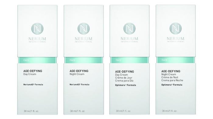
Nerium Intl.’s updated packaging design better reflects the science behind its age-defying skincare products and creates a consistent look for its U.S. and international product lines: NeriumAD and Optimera, respectively.
The sleek modern containers are white for the daytime formulas and slate grey for the nighttime formulas. A color band at the containers’ slightly pinched waist identifies the product's usage (“Face,” for example, in the photo above). This same color band also appears on the paperboard cartons (photo below), but it’s not printed on the clean, white cartons. Instead, Nerium Intl. opted for an inset Mylar sleeve within each box to show the product-usage color between the carton top and bottom.
To distinguish its NeriumAD Formula Firming Body Contour Cream, the company selected a white 200 ml/6.7 fl oz tube with an orange band.
Since their launch in 2011, the scientifically advanced, proprietary products have seen rapid growth around the world. In 2015, Nerium ranked No.1 in sales gains in the WWD list of the world’s top beauty companies, with more than more than $400 million in sales through 2014.
The Optimera product uses multilingual packaging in English, French and Spanish for its international sales in Canada and Mexico. According to the company, this packaging facelift strategically positions Nerium for ongoing international expansion, including into South Korea, which was recently announced.
Amber Olson Rourke, Nerium Intl.’s chief marketing officer, says, "We offer advanced, proprietary products that continue to make a difference in people's lives. The new packaging really reflects how unique our products are. We're excited to take this next step in the evolution of our brand as we expand into other avenues in the space of anti-aging."
[UPDATED 5-21-15] Patricia Finn, vp of marketing at Nerium Intl., shares a few more details about the packaging:
What elements of the packaging design communicate “scientific” to consumers?
Finn: The form-factor, material and copy layout of the primary packaging focus on clarity, biotechnology and nature in a system-driven design. Our breakthrough anti-aging product innovations are rooted in our research and development labs, where this packaging design would be right at home. Our goal was to allow our users the opportunity to bring that feeling into their homes and into their lives with this new design.

Why use an inset Mylar sleeve with the cartons to show the products’ usage color band? The carton top and bottom simply don’t meet, correct?
Finn: Correct, the base and lid do not meet. We elected to create an exposed cuff outer carton to visually connect the external packaging to the primary packaging. The structure allows one more opportunity to build brand equity. The Mylar draws focus to the center of the box by creating both a color and a finish contrast that allows users to clearly establish the regimen of products.
Why use a carton at all?
Finn: Because our products are sold through direct sales, it is important that our products be packed to protect the integrity of the primary packaging. The outer carton also allows the space and breathing room required to highlight our brand through conveying a cohesive look and feel, as well as creating the appropriate real estate for the marketing, ingredient and regulatory information.
The languages on the Optimera formula packages look like English, French and Spanish. Correct?
Finn: Yes, correct. Our Optimera Formula is our international formulation, as opposed to our NeriumAD Formula, which is only available in the U.S. As we continue to expand our global presence you can expect to see the number of languages increase as well.
What kind of dispensing closure are you using on the containers?
Finn: For the facial skincare products we use an airless pump that dispenses a measured amount of product. This packaging also protects the integrity of the formula from external elements.
Why use a tube for the body cream instead of the same rigid container as the NeriumAD and Optimera formulas?
Finn: Due to the size of the body cream (6.7 fl oz) and how often and where the product is used, we found that a tube was the best solution that allowed users the right amount of product in a container that’s super portable. It’s easy to take on the go—without worry of damage to the outer packaging. Additionally, the flip-top cap aids in usability. The tube also allows the user to dispense more product versus the more measured amount of the airless pumps. Our users spoke, and we listened.
About the Author(s)
You May Also Like


