March 11, 2015
|
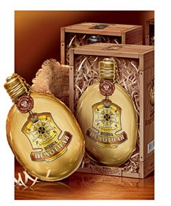
Pekhotnaya Vodka from Russia's SDS Co. challenged Soldis Communications Agency (www.soldis.ru) with a holiday presentation package. The brand name originates in the Russian word for “infantry,” and conveys strength and glory. The design concept was inspired by military attributes and decorations. The conventional glass bottle gave way to a rugged and reusable 200-mL iron canteen executed in three color variations to designate the three different vodka recipes: gold (the strongest and most high-quality vodka recipe); silver (a more economically priced, mid-quality recipe); and green metallic (the least expensive of the three but still in the primary market segment). To avoid chemical contact of the vodka and the iron of the canteen, the container's inner surface was covered with a lacquer/varnish. Soldis says the paper front panel label represents Russia's highest military decoration—the Georgievsky Cross. The label is process-printed and hot-stamped with foil by Ima-Press-Print Co. (www.imaprint.ru). Made by a proprietary source, the canteen is placed in a corrugated box printed with a woodgrain-like background and an image of the bottle.
You May Also Like


