December 7, 2018

Carlton & United Breweries (CUB), owner of the Strongbow international cider brand, sought to launch a product and packaging that injected excitement and allure into the category.
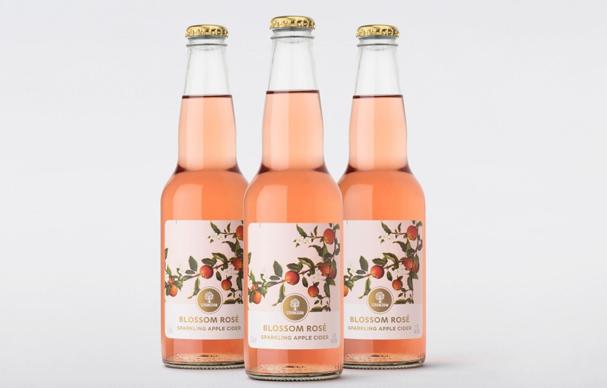
Partnering with design house Denomination, the team created bottles and cartons for its Strongbow Blossom Rosé Sparkling Apple Cider with curves, colors and a premium feel designed to stand out from the crowd.
According to the Denomination team, their design strategy homed in on apples (the primary ingredient) for packaging cues. A hand-drawn apple-blossom branch curving around the front label is intended to impart freshness, natural flavor and authenticity.
“The beautiful blossom illustration elevates the premium cues of the brand while creatively linking it to the cider category,” says Page Dawes, marketing manager for cider, CUB.
Pink hues allude to the light, not-too-sweet taste of the cider. The palette also is meant to bring the cider in line with contemporary alternatives favored by female consumers, such as Aperol.
Another challenge presented to the design team: tying closely to the Strongbrow brand while attracting new consumers with a bold design. The standard glass bottles (provided by O-I) incorporate the rounded shape associated with the cider line, produced in a flint finish for added elegance. The Chromalux wet-glue label features gold lettering to connect with to premium-minded consumers, and an overall matte varnish helps seal the inks and prevent scuffing.
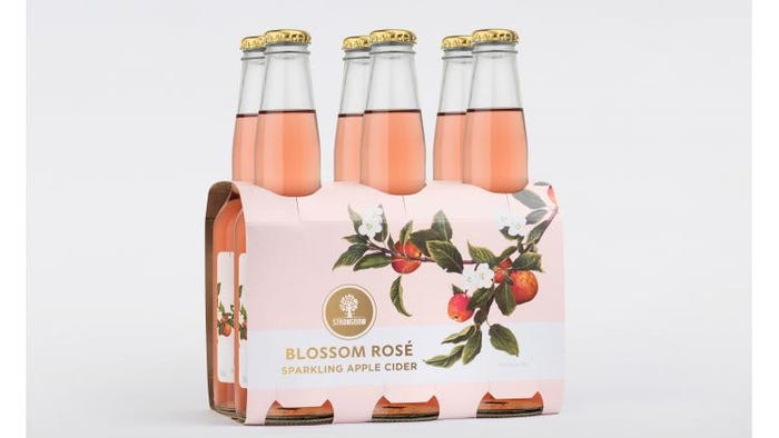
Finally, the carton uses a new-to-the-brand six-pack cluster format. The six-pack configuration, intended to encourage consumers to purchase for socializing and parties, mirrors the pink palette and apple-blossom-branch motif of the bottles.

The six-pack carton (a first for the brand) enables the Strongbow Blossom Rosé Sparkling Apple Cider’s curvy bottles to shine, and it incorporates natural, pink-hued design elements mirroring the bottles inside.
CUB split production of the packaging and product between Australia and New Zealand, so they turned to different vendors for each component. Labelmakers handled the labels in Australia, and Premier Business Print in NZ; WestRock produced the cluster in Australia, and Graphic Packaging Intl. in NZ; and Visy Print produced the cartons in Australia, and Charta Packaging in NZ.
Rowena Curlewis, CEO, Denomination, says response to the cider—currently rolling out in Australia—has been positive.
“The reaction to our design for Strongbow Blossom Rosé Sparkling Apple Cider has been so strong in both consumer research and with trade, that we believe it has the potential to positively impact the growth of the parent brand,” she says.

Freelance writer and former Packaging Digest senior editor Jenni Spinner is a trade journalist with two decades of experience in the field. While she has covered numerous industries (including construction, engineering, building security, food production and public works), packaging remains her favorite.
********************************************************************************
In addition to leading suppliers showing the latest solutions in labeling, automation, food packaging, package design and more—WestPack 2019 (Feb. 5-7; Anaheim, CA) gives you access to the industry's leading educational offerings with the 3D Printing and Smart Manufacturing Innovations Summits, the MD&M Medtech Conference and free industry education at the Expo. Register to attend today!
About the Author(s)
You May Also Like


