March 11, 2015
|
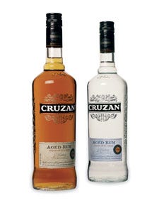
Cruzan rum—a product of V&S Group—had attained more than three dozen awards over the last decade for its quality, yet in consumers' eyes, the product remained a “value” brand, rather than a premium product. Looking to shift consumer perception, the firm turned to Dragon Rouge (www.dragonrouge-usa.com) to craft a new packaging design.
The primary goal of the redesign was to attract a more sophisticated, discerning consumer, and move away from the perception of being a value brand. To that end, Dragon Rouge created a new structure and new graphics for the Cruzan rum portfolio, consisting of 16 SKUs. The new brand identity—a distinct, hand-crafted, iconic crest, inspired by the family coat of arms engraved in the distillery's wall—gives the brand a sense of authority. The bottle's broad shoulders are contoured to complement the crest, and the structure tapers subtly to the foot. These design elements help the Cruzan crest instill a sense of pride on the package. The secondary goal was to create a cohesive family feel, while clearly delineating the role of each SKU within the portfolio.
Following the packaging redesign, Dragon Rouge created a global brand identity for the line and will continue to serve a key role in the brand's strategic innovation pipeline over the next three years. The new Cruzan Aged Light and Aged Dark rum brands were launched worldwide in mid-September; the single barrel product will launch in early 2009.
You May Also Like


