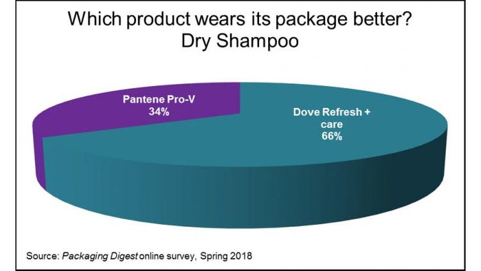
A contemporary container and matte graphics on the Dove Refresh + Care Dry Shampoo package appeal more than a sleek cylinder and threatening warnings on the Pantene Sheer Volume sprayer, according to our exclusive survey from the last two months.
In another Who Wore It Better trial, Packaging Digest asked its global audience of packaging professionals to vote for the Dry Shampoo brand they thought had a better package and to tell us why. It’s a competitive category: In the U.S., the dry shampoo market has been on the increase as Americans continue to seek convenient and time-saving personal care routines.
During April and May, 62 packaging design devotees picked their favorite, with Dove besting Pantene by two to one.

Before we tell you why respondents picked the package they did, here’s a detailed description of the containers, as it was included in the survey:
Both products cost the same, $4.49, and are sold in aluminum cylinders with sprayers and overcaps. The Dove Refresh + care is slightly wider and holds 5 ounces (141 grams) to Pantene’s 4.9 ounces (140 grams). With the overcaps on, Dove is just a hair taller. But when the overcaps are off, the Pantene container is about half an inch taller (7.75 inches versus 7.5 inches).
Both cylinders are white with direct color printing (not sure of how many colors, though).
The copy on the shiny Pantene aerosol is in English and French. And the black-only text on the back— while small (maybe 7 or 8 points?)—is easily readable because of the high black-on-white contrast. Both sides on the Pantene round are blank.
Dove prints most of its all-English text in a color I would call goldrod. Most of the copy, especially on the back, is a little smaller (maybe 6 point?) than the Pantene print. In addition to words on the back, Dove also has black-and-white drawings of a woman showing how to use the product in three steps. Dove continues the teal and goldrod color scheme around the container, with a teal ribbon wrapping around the side, from front to back.
Dove’s matte finish had some scuffs, but they all cleaned up quickly and easily with a little finger rubbing. While doing that rubbing, I noticed that the Dove container “whispers” during any handling. The sound is subtle but noticeable.
Both sprayers have finger groves to help prevent fingers from slipping off the button while spraying. The Pantene sprayer has a plastic skirt to cover up the aluminum crimp, which you can see on the Dove package.
Both overcaps are tinted yet translucent. Pantene’s overcap is a smoky black to match its jet black sprayer. Dove’s white overcap complements the mostly-white package, including the sprayer. There is a huge size difference in the overcaps: Pantene’s is at least one-third the size of the Dove one.
Dove fans
The majority of survey respondents selected the Dove package as the more appealing one on its own merits:
“The soft tones of teal color is more pleasing to my eyes.”
“Aesthetically more appealing. Cleaner, and dry shampoo is, after all, supposed to make you feel and look clean.”
“Clean cylinder with nice fog effect on the cap.”
“Matte finish is more premium. The packaging shows in a simple way how to use the product. Colors and artwork are more sophisticated.”
But a lot of Dove lovers took the opportunity to also dis the Pantene design:
“Dove is clean, fresh, simple. Pantene is a train wreck.”
“Looks more updated. The Pantene looks like a hair spray of 10 years ago.”
“Dove seems lighter, more dry, where Pantene seems heavy.”
“Dove exhibits a fresher customer appeal, colors used are elegant and lays out messaging in appropriate location—unlike Pantene.”
“Softer look gives feel of being more gentle on hair. Warnings on Pantene are in unusual location and will negatively affect customers.”
“The Dove can has a nice texture that makes it feel more premium than the Pantene.”
“Huge warnings on front of Pantene is a turn off. Liked ribbon and coconut on Dove, but looks like excess head space.”
“The design of the package says ‘gentle care,’ to me. Pantene is too ‘loud,’ if you will.”
However, some people who voted for Dove still had some nice things to say about the Pantene package:
“Although I liked the Pantene container better, the graphics on the Dove package are much more attractive.”
Another respondent echoed the comment about the better-looking graphics: “Dove’s graphics and art looks much better than Pantene. While I like the Pantene dispensing actuator and overcap better, Dove did a better job grabbing my attention with the artwork.”
“Dove has a clean and classy visual appeal. Though Pantene is sleeker, so better while traveling.”
Pantene enthusiasts
Of the minority of respondents choosing the Pantene package as the better one, many cited the high-impact graphics:
“Pantene had easier to read graphics, contrast was better and looks more higher end. Dove may have higher net weight, but graphics [are] hard to read, so I can’t confirm. Dove also reminds me of a matte finish spray can.”
“Smaller diameter container for easy hold during application, clear warnings, bright color that ‘pops’ when you look at it.”
“Glossier finish to the bottle is more attractive. The colors (especially the purple) stand out more. It looks more like a salon-standard product. The Dove product looks like an air freshener.”
Pantene’s closure garnered several positive comments:
“The finger button looks easier to use.”
“The visible curved shoulders of the package are attractive, as is the smaller plastic cap.”
“Pantene’s top taper and overall sheen made it more clear to me that it was a spray product. I liked the plastic skirt as it hides the exposed metal.”
And, despite their vote, a few Pantene admirers also questioned the prominent position of the warnings:
“Sleeker packaging. Although I don’t like the danger signs on the front of the bottle.”
“I think the applicator looks better. I think the Sheer Volume message and the vitamin speaks to me more than a coconut. I am a little put off by the giant DANGER and icons however :).”
*****************************************************************************************
Production efficiencies, ecommerce challenges, sustainability trends, new bioplastic technologies and more are among the topics on the agenda at the new Packaging Education Hub at EastPack 2018 (June 12-14; NYC). This free educational program will have more than 15 hours of can’t-miss presentations, demonstrations and hands-on activities. Register to attend for free today!
About the Author(s)
You May Also Like


