

Sign up for the Packaging Digest News & Insights newsletter.
6 Min Read
 full of vodka")
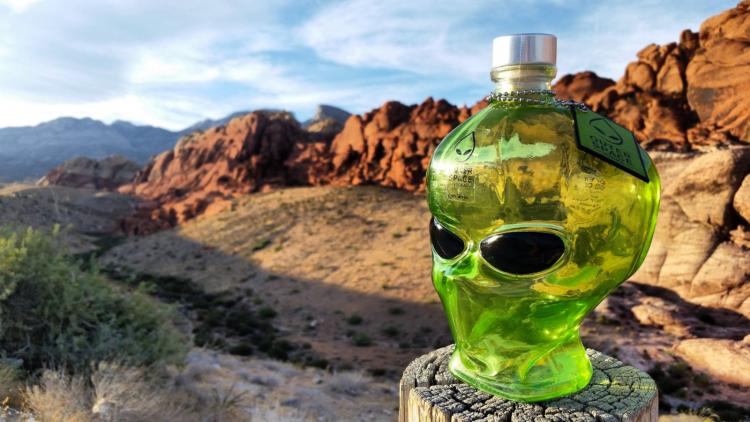
How freaked out would you be if these eyes were looking at you?
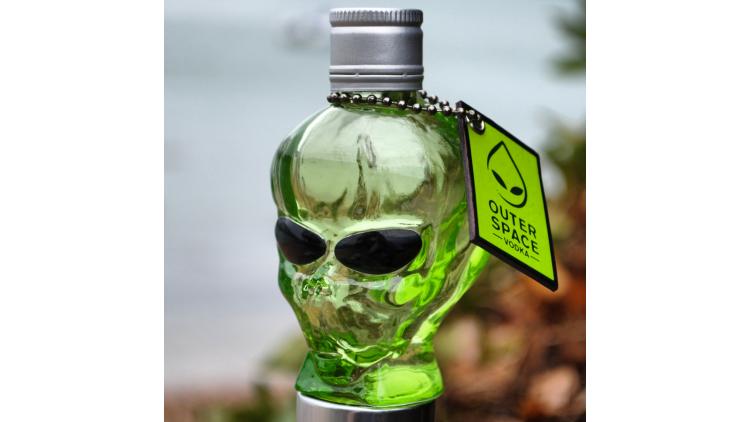
In a twist on the trend in the spirits market to create eye-catching bottles in the shape of heads or skulls, Outerspace Vodka gets its packaging inspiration from another, more extra-terrestrial source. Green coating and aluminum black eyes make this bottle of clear vodka look even more alien (think “little green men”).
This package really is freaky! Like Rick Lingle’s first Freaky Fridays installment, I, too, have a personal story to share. I came across Outerspace Vodka’s “alien head” bottle in 2016 and had it sitting on my desk in my home office. One weekend when my grandkids came over, my five-year-old grandson pointed to it and asked what it was. I told him it was something for work. JJ nodded, and we went back to playing. But a few minutes later, I saw him go back to my desk and turn the head around so the eyes weren’t looking at him because it freaked him out! Ha! Kids!
Since its U.S. introduction in 2015 in two sizes, 50 ml and 750 ml, Outerspace Vodka has expanded into several new markets. It is now also available in the U.K., Canada, Korea and Australia.
Company co-founder Jim Denoon gives us an autopsy of the package.
The industry standard 750 ml size, with two loops on the chain holding the tag.
How did you come up with the idea to use the shape of an alien head for a bottle of vodka? Why this particular shape?
Denoon: Over the past decade, there’s been a small but growing category of head-shaped liquor products coming to market. For example, Kah Tequila—another skull (albeit painted and based around the popular Mexican “Day of the Dead” theme)—has been reasonably successful.
Observing this progression made me think that there’s probably scope for more. The advantageous thing about these radical shapes is that they are self-marketing and very good at gaining that all-important first engagement with customers. That is to say: they stand out sufficiently to get consumers reaching for a bottle off the shelf. Vital, especially when you’re new.
Did you come up with the Outerspace name first and then create the package?
Denoon: No, it was very much pack led. Initially, it wasn’t immediately clear what “head shape” I should develop. Human skulls were a well-trailed concept, so I had to think further afield. I also knew it was important to create something that had broad consumer appeal—or, in the very least, recognition—the world over. It dawned on me that the notion of little green men from Outerspace was a familiar concept to most. And I wondered if I would be able to transpose those characteristics into a bottle.
It is of course a work of fiction, but I have attempted to translate (what I think) is peoples’ common conception of an alien’s appearance into the pack. And done a pretty reasonable job. At least, so far I have had 100% success rate when asking people to identify what it’s meant to be!
Why use a glass container?
Denoon: Most spirits packs are glass, and this is where my experience lies in terms of development and production. Moreover, glass is an infinitely aesthetically superior material to work with, so it was the obvious choice for the brand.
Why have two sizes?
Denoon: 750ml is the standard SKU [stock-keeping unit] in the world of spirits. Most brands have a 50ml SKU as a promotional item, too. I think it was particularly important in our case, as people do seem to find the baby aliens (baeliens), “cute.”
The "cute" 50 ml size.
Are both size containers identical in shape?
Denoon: Yes, pretty much. Glass is a difficult material to work with. It still boggles my mind to think that (literally) no two pieces are alike. Upon mold release, glass remains slightly molten and is prone to creep as it cools. The degree to what extent depends on a number of factors, but overall size is a factor. Some of their slight differences can be attributed to this phenomenon.
Any design issues with either of the sizes?
Denoon: No, not really. It’s quite a complicated shape so we had to work quite carefully concerning the mold’s relief. It’s often the challenge in modelling a new pack—being able to release it from the mold easily.
Who is your container supplier?
Denoon: We make the pack in Asia. Don’t really want to go into more detail than that if you don’t mind(!).
The closure on the smaller size is different, a screw on. Why a different closure?
Denoon: For a couple of reasons;
One, TPE/alu [thermoplastic elastomer/aluminum] stoppers like this are expensive and it’s harder for us to absorb the cost on the miniature version.
Two, TPE stoppers can be vulnerable on smaller packs. Much more secure to have a BVS cap. [Editor’s note: BVS indicates a specific glass finish.]
Are you adhering the aluminum eyes by hand or automatically?
Denoon: It’s done by hand.
Green coating is applied to the outside of the container. Is this done by the container supplier or is this a separate step?
Denoon: It’s an organic green spray applied and baked onto the container by our supplier.
Any concerns with recycling because the eyes are aluminum and the glass is coated?
Denoon: I don’t see a great deal of these bottles going to waste. Consumer behavior to date suggests that they are keeping them. Which is good and bad at the same time, obviously.
Tell us about the labeling. Are they the same for both sizes? There seem to be three pressure-sensitive labels: one on the cap that also goes down the back of the bottle; one (film, correct?) on the front in the center of the forehead; and one on the back with the product and regulatory info, as well as the bar code.
Denoon: All the labels are the out of necessity, rather than by choice. They exhibit the mandatory information and we have used these labels in the hopes that consumers will opt to remove them to leave a much cleaner finish.
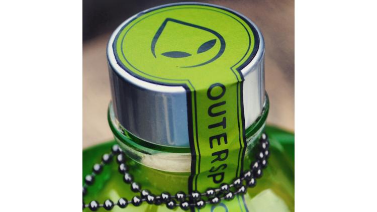
Why have the cap label continue down the bottle? Is this a paper-based label?
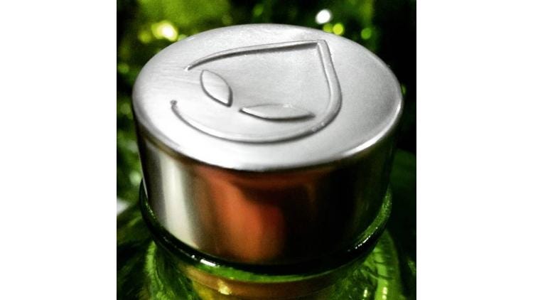
Denoon: Yes, it’s paper based, as a destructive seal. We have a double whammy though as we also have a plastic shrink sleeve. In later products, we’ve have an embossed alu-cap. See below.
How are each of these labels applied? The back label looks challenging to get a smooth look because of the shape of the head. Any insight into how you determined the size of this label?
Denoon: Yes, it started a bit big. It’s adjusted on further iterations of the product.
I run a philosophy of continuous improvement. Never going to be right first time. Always room for improvement. Do you remember the first iteration of Facebook?
There’s also a clear shrink neck wrap. Is this for tamper-evidence?
Denoon: Yes. With the new embossed cap, we only have this.
Do both sizes also have the hanging neck label?
Denoon: Yes, the only real difference is that the 750ml has two-wraps of chain. Although we may change this as some people don’t realize that and just put one around. Best laid plans…
____________________________________________________________________________________________
MinnPack 2019 (Oct. 23-24; Minneapolis) is where serious packaging professionals find technologies, education and connections needed to thrive in today’s advanced manufacturing community. See solutions in labeling, food packaging, package design and beyond. Attend free expert-led sessions at multiple theaters around the expo.
About the Author(s)
You May Also Like


