August 1, 2016

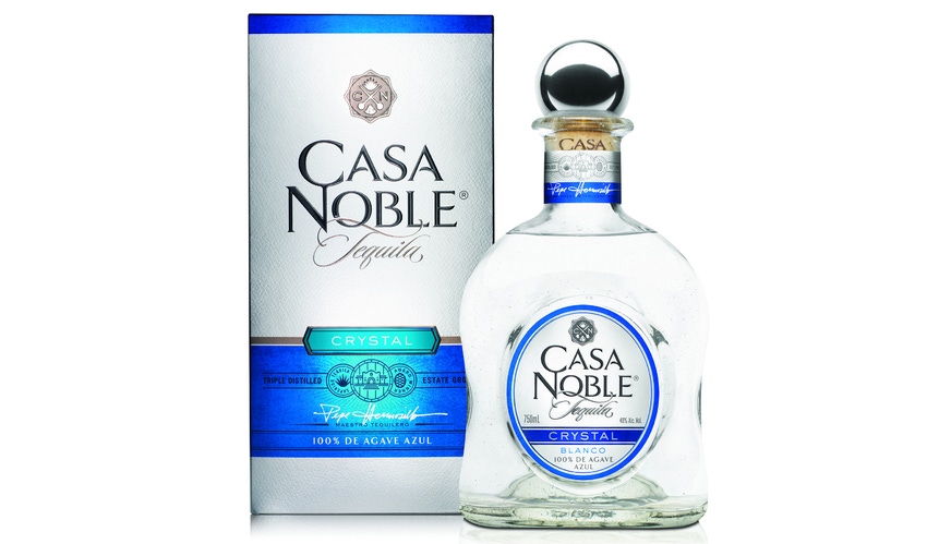
Super-premium tequila Casa Noble recently refreshed its beverage packaging (both the cartons and bottles) to better reflect its hand-crafted quality and rich heritage.
The tequila is housed in glass bottles with a hand-blown feel (bubbles and other imperfections included) designed to communicate craftsmanship and quality. The bottles are enveloped in tissue paper bearing the brand name and logo, then rested inside metallic-printed and embossed paperboard cartons adorned with high-quality product imagery and the brand’s story on the back.
Constellation Brands—the Chicago-based owner of popular Mexican beer names like Corona and Modelo—snapped up the high-end tequila in 2014 to broaden its import offerings, and the company immediately explored ways to take the niche brand to the next level.
“The Casa Noble brand was respected by industry experts but needed to evolve to become a major player,” says Ryan Anderson, Casa Noble brand manager for Constellation Brands.
One of the brand’s strengths, points out Anderson, is a deep history. Casa Noble’s “maestro tequillero” is Jose “Pepe” Hermasillo, the seventh-generation craftsman leading the spirit’s production. The company felt the outer paperboard carton and the glass bottles should be upgraded to more closely reflect that heritage and attention to detail, and to better connect with consumers. Constellation Brands engaged Berkeley, Calif.-based Trinity Brand Group to dig deeper. Rebranding research included conducting a brand strategy workshop with key stakeholders.
“The results of that workshop, together with a robust audit and consumer and category insights, suggested that it would have to brush away its quiet formality and become more personal, contemporary and vibrant,” says Erin Paul, director of design strategy for Trinity Brand Group. “Making a strong connection to its unique Mexican heritage and family history would provide a meaningful way to connect with consumers and live distinctively in the tequila space.
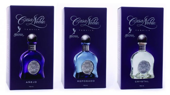
The two firms pinpointed attributes of the previous beverage packaging ripe for a revamp:
• The logo, though elegant, imparted a feminine feel that was out of line with consumer expectations of the category,
• The script used on the packaging that came across as “old world” European.
• The cool tints used in the hand-blown glass—corresponding to different tequila styles—made the spirit appear green in the bottle.
• The cartons’ reflective paper and monochromatic embossed design made the labels recessive on shelf and difficult to shop.
• The brand’s purple color—while a stand-out within the category—was perceived as feminine and not in line with Mexican heritage.

The "before" packaging design
The packaging upgrades include an enhanced Casa Noble logo, fonts that better communicate the product’s premium nature, stronger color palette, and other carton and label elements that fit with its premium positioning.
However, despite all the challenges, many successful attributes stayed. According to Paul, the short-statured, bell-shaped bottles and round pewter closer fit in with consumers’ connection with authentic, high-end tequila packaging (versus low-price, low-quality tequilas vended in tall, thin bottles). She says the team decided to keep the hand-blown-feel but removed the tint to improve show-through, and preserved the pewter topper for its authentic feel.
WS Packaging Group produces the enhanced Casa Noble labels, tissue and outer cartons. The nine-color cartons are printed on 18-pt C1S SBS with 48-gauge metallized polyester on one side—according to Paul, the team arrived at the combination of stock, coatings and textures after thorough testing and evaluation to ensure the packaging came through with the desired shine, brightness and readability. The cartons also are foil stamped, textured and embossed.
Fitting for a hand-crafted tequila, Casa Noble packaging involves a human touch. Labels are applied, the cork put in place, bottles wrapped in tissue and inserted into the cartons, the inside flap put down so the cap peeks out through the die-cut hole, and the carton closed—all by hand.
The various aspects of the refresh, says Anderson, fit the brand’s goals.
“The design solution speaks directly to consumers’ desires–a luxury experience from start to finish,” he says.

Former Packaging Digest senior editor Jenni Spinner is a trade journalist with two decades of experience in the field. While she has covered numerous industries (including construction, engineering, building security, food production and public works), packaging remains her favorite.
About the Author(s)
You May Also Like


