March 11, 2015

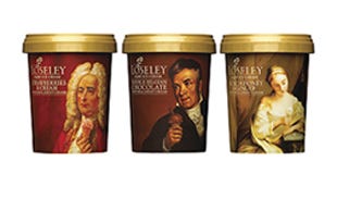
England's Hill Station revved up the branding and packaging appeal for the Loseley Ice Cream line with the help of British design agency Pemberton & Whitefoord (www.p-and-w.com). The design firm helped to create a fresh look for the ice cream canisters that also covers point-of-sale, van sides and a new website. In answer to Hill Station's call for updated visuals and brand values, the revision doesn't appear "too pompous or stuffy." Stuffy indeed, as the tongue-in-cheek design is quite the opposite, with humorous but artful, specially commissioned portraits, each by a different artist, that wrap around the canister sidewalls. At first glance, the painterly portraits seem to be old masters, but on closer inspection, they reveal a subtle and humorous twist. The quirky reproductions create a unique humor around the brand while back-panel copy expands the theme in the form of a "potted soliloquy," singing the praises of each subject's favorite flavor in a dotty and eccentric tone.
The Jotipac 520-mL silk-finish containers are supplied by Superfos (www.superfos.com), with film labels offset-printed in five colors plus varnish by Verstraete (www.verstraete.be) in Belgium.
"The packaging design is based on portraits of dapper, dour and demure, gentrified folk, tucking into their favorite Loseley flavor in their own idiosyncratic style," explains Adrian Whitefoord, founding partner of Pemberton and Whitefoord. "Overall, the [labels] have a National Portrait Gallery feel to them, and one could imagine them hanging in any grand English country house." The label graphics manage to look stately, but put a smile on your face, says Hill Station, while they still remain true to the brand's heritage.
You May Also Like


