

Sign up for the Packaging Digest News & Insights newsletter.
3 Min Read

New packaging design for Maty's organic and all-natural product lines looks more like it belongs in a kitchen cabinet rather than a medicine cabinet.
This cold-and-flu season, a new packaging design for Maty’s natural and organic remedies, featuring full-body labeling and food-centric graphics, is turning shoppers’ heads. Made with “whole-food ingredients”—the kind found in traditional home remedies—Maty’s over-the-counter pharmaceutical products are formulated to calm or prevent maladies ranging from coughs to diaper rash.
The redesigned packaging helps shoppers easily distinguish between two of Maty’s product lines: Organic Cough Syrup and All Natural Cough Syrup. Both product lines use a custom square bottle made from recycled plastic, a matte-finish shrink-sleeve label and a continuous-thread closure. There the similarity ends.
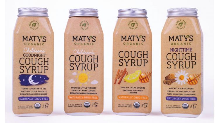
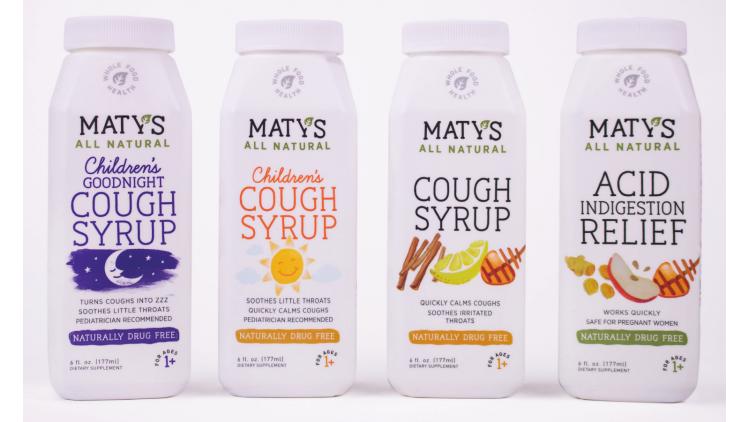
The All Natural Cough Syrup bottle’s label is white, and its closure is plastic. In contrast, the Organic Cough Syrup package has a tan label and a custom aluminum closure “inspired by Mason jar lids,” according to Jeff Berg, creative director at Haberman, the agency Maty’s worked with on the redesign.
“The previous packaging included brown, plastic stock bottles that lived inside rectangular boxes,” Berg adds. “For environmental reasons, we stepped away from the outer box they had originally. This dictated the shape of our bottle, because we had to make room for all of the information that originally lived on the box.”
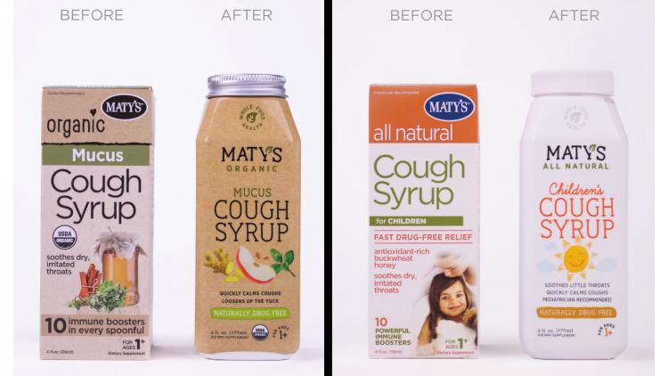
Maty’s ointments and rubs remain in their original tubes and tubs. But, as with the rest of the product line, these packages benefitted from redesigned graphics that include artful illustrations of ingredients like cinnamon and nutmeg.
Berg answers a few questions about the package redesign, which launched in September 2017.
Why did you use an aluminum closure for Maty’s Organic Cough Syrup?
Berg: We chose to use the metal cap on the Organic line to further distinguish it from the All Natural line.
How does the new packaging communicate “kitchen cabinet” rather than “medicine cabinet”?
Berg: The packaging is food first. The recipes for Maty’s are an evolution of recipes our great grandmothers might have made from scratch. By illustrating the ingredients, we convey an all-natural but also a folk-like aesthetic. It highlights the food ingredients in each bottle. This look and feel really pops next to the bold reds, blues and oranges of the traditional medicine-aisle shelves.
Why is that so important?
Berg: The design has everything to do with appealing to those consumers. Over-the-counter medicines, as products, have lived in this clean, clinical—even sterile—aesthetic for a long time. But Maty’s is made with ingredients you can find in your kitchen. And consumers who want real foods and natural products buy things that look natural. So it made sense to us to match Maty’s outside—its packaging—with what’s inside.
Who supplies the packaging components?
Berg: Berlin Packaging in New Jersey created the custom bottle and cap. Consolidated Label in Florida printed the bottle labels.
How have consumers reacted to the new packaging?
Berg: The feedback has been resoundingly positive. Good impact, easy to understand and very differentiated.
*************************************************************************
A magic kingdom of packaging solutions: For packaging engineers, executives and designers—WestPack 2018 (Feb. 6-8; Anaheim, CA) delivers leading technologies, free educational presentations, hands-on demonstrations, exceptional networking opportunities and expert-led Innovation Tours. Click here to register now!
About the Author(s)
You May Also Like


