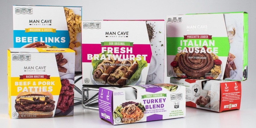
Man Cave Craft Eats, a Minneapolis-based artisanal meat purveyor, is letting shoppers know exactly what they’re buying, with a new packaging design that features luscious product photos and die-cut windows to display the products.
The first products in the new packaging launched in February 2018; the remainder will roll out in the spring, in anticipation of grilling season. All of Man Cave’s 20-plus beef, pork and poultry products will eventually be in the redesigned packaging, which will be used for both frozen and refrigerated merchandising.
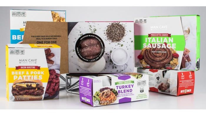
The secondary package structures are cartons, in two configurations. A window in each carton displays product sealed in a Cryovac pouch with a branded sticker. Upscale touches on the cartons, including soft-touch paperboard and silver-foil logo and embellishments, communicate the brand’s premium quality.
A front flap on cartons used for products like bratwurst and Italian sausage opens to reveal the product, through a round, die-cut window, in a transparent pouch. The cubic ground-meat carton has no flap over the die-cut, so to protect against light, the ground-meat pouches are made from opaque film.

Package graphics feature photos of the prepared meats, and the cartons also provide information about Man Cave’s charitable Bite Back program. Outlook Group Packaging & Printing Solutions supplies the packaging.
The redesign, like all the company’s design work, was performed in-house. Gabriel Welker, Man Cave’s creative director, provides insight into the new packaging.
What was the impetus for Man Cave’s package redesign?
Welker: Consumers told us they loved our previous packaging, which featured bright colors and soft-touch paperboard and communicated the brand’s start-up roots. However, we heard from consumers that they wanted to more clearly know what was inside the package.
With the new design, consumers can easily tell what’s inside the box, with the photography of the finished product and the bold typography of the product names. The new packaging features eye-catching colors to stop consumers in the aisle, disrupting the sea of sameness of meat in foam trays and plastic wrap. Not only is our box packaging visually disrupting on the shelf, it also helps with the shelf life of product, because there isn’t exposure to light.
How does the new packaging design communicate Man Cave’s craft message?
Welker: The front of the packaging clearly calls out: “Simple Honest Ingredients,” “Hand Crafted, Hand Selected & Ground” and “100% Independently Owned & Operated.”
Within the inside flap of the packaging, we message that, for every pack of product we sell, we donate a meal to a hungry child [through Bite Back]. Specifically, we message: “Our passion is crafting exceptional products. Our purpose is to provide for those in need. Together, we’ve provided more than 1 million meals!”
The back of the packaging messages the company’s small, independent roots, as well as our purpose of delivering a cleaner, better tasting product that helps feed others with the donation of each pack sold.
Why use the soft-touch finish and silver-foil touches?
Welker: At Man Cave Craft Eats, we never skimp or cut corners to offer the best products with premium ingredients. We want our packaging to be the same: high-quality and telling the story of why our product and brand separate us from the pack. Silver foil was used to bring elements of a high-end, commercial-style kitchen to the design.
How is the Bite Back campaign more prominent on the redesigned package?
Welker: In our previous package design, our Bite Back initiative was messaged on the back of the packaging. With the redesign, we’ve made it more prominent, featuring it on the inside flap. And we’re also letting consumers know how many meals we’ve donated since the program began in 2017.
Man Cave’s “Renegade Chef” previously appeared on the front of your packaging. Where did he go?
Welker: Our Renegade Chef no longer appears on the front of the packaging, as we’re aiming to focus on what’s in the box, inspiring consumers with the finished recipe photo, as well as dedicating more packaging space to communicate our Bite Back program. On the new design, an image of the Renegade Chef oversees the cooking instructions on the side of the carton.
*************************************************************************
Optimize your packaging operations. Advanced Design and Manufacturing (ADM) Expo in Cleveland returns Mar. 7-8, showcasing the latest in robotics, automation, plastics, packaging and design engineering. Find a solution for your project. Register today!
About the Author(s)
You May Also Like


