March 11, 2015
 Pretty pictures still have a role in package design, but adaptation and flexibility rise to the top like cream does in glass bottles of milk. So it's not surprising that package designers and their marketer clients are purring at the appreciation represented by the Mobius (www.mobius awards.com) awards earned for packages marketed in 2007.
With the winners picking up their statuettes Jan. 28 in Hollywood, the worldwide competition is opening a bit. The package design category now accepts redesign entries, acknowledging the added challenge of innovating for products that have been marketed for some time.
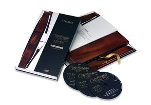
The category's best-in-show package combines the pretty-picture advantage with flexibility, though accompanied by a paucity of information from the designer. A three-CD set of music of Richard Wagner is accompanied by literature in an elaborate folder known as the Classical Music Exquisite set. Designed and apparently marketed by Chi Mei Fine Art (www.chimei.com.tw) of Taiwan, the package is described as having “originated from a single string. The basics of black and white have been utilized to create the image which tones in to reflect the infinite extension for simplicity.” And that's it.
Cartons lure computer cognoscenti
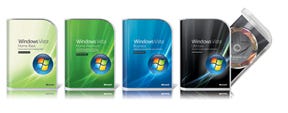 Basic change is responsible for a Mobius bestowed on a ubiquitous structure, the paperboard box used for computer software. For Microsoft Corp, Bellevue, WA, the series of new rigid polyethylene terphthalate containers submitted by Hornall Anderson Design Works (www.hadw.com) lures computer cognoscenti to the highly anticipated 2007 operating system, Microsoft Windows® Vista, and its four product lines: Home Basic; Home Premium; Business; and Ultimate. Hornall Anderson says it conducted a comprehensive package review. This includes target research, on-line testing, one-to-one interviews and ethnography studies to come up with external component graphics taking in packaging for the lines, plus best-in-class templating for additional snipes, internal components graphics consisting of CD and DVD hologram designs and silk-screen visuals and collateral. Credit for the physical container design goes primarily to Smart Design (www.smartdesignworldwide.com), improving on the lines' durability, while saving considerable space in the consumer's home and office.
At Microsoft, motivating the program and merging its components are senior packaging projects manager Patti Sullivan and packaging manager Linda L. Jacobson, respectively handling the structural and graphic developments. Sullivan informs PD that the new structure produced for the North American market by Jarden Plastic Solutions (www.jardenplasticsolutions.com) achieves its iconic goal while fulfilling other criteria. These include reflecting the product quality, beauty and simplicity of the new software within a unified system that is easy to identify and relates exclusively to Microsoft.
For her part, Jacobson tells PD that “the application of…design principles aligned with consumer research resulted in visually stunning packaging that communicates the products' value both visually and verbally.” She cites the comprehensive cooperation of internal and external design teams and the “unprecedented cross-region, cross-vendor collaboration” that, among other things, “pushed the technical envelope to be a leader in producing an injection-molded PET package.”
Along with eliminating the paperboard box, the new package allows reduction in overall size to 7½-in L to 5.38-in.-W to 1½-in.-D, lopping 2 in. off the width and the length. Paperboard isn't eliminated. But there's much less of it and the gauge of what's there is considerably reduced. For the back cover of the package, from Rock-Tenn Co. (www.rocktenn.com), there's a folded and glued sheet of coated-one-side, .010 SBS printed in up to five colors. The same specs apply to a wraparound single-sheet die-cut label that's inserted in the transparent cover of the package.
The board is used to strong visual purpose. An appealing light green, almost chartreuse, identifies the Home Basic software; darker green the Home Premium; blue the Business, and for the Ultimate, there's black illuminated by light bending in space, almost like the tail of a meteor. For this last label, Rock-Tenn uses a .010 foil board. Presenting the silvertone-decorated DVD as it opens on a hinge supported with a polypropylene pivot pin, the inner, frosted-finish injection-molded PET component also houses a 42-pg. quick-start booklet and other literature in a convenient storage space.
Gold for tequila labeling
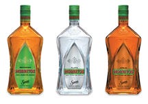 Another package that couldn't have competed for the Mobius gold before the category opened to redesign is breathing excitement into the marketing of tequila. The goal here is improved sales through new brand perception. In Deerfield, IL, Beam Global Spirits & Wine, a Fortune Brands unit, and the Hornitos™ tequila brand of the Sauza® family in Mexico, take the wraps off new packaging as part of a repositioning campaign that includes memorable advertising. It is beamed at a younger consumer profile, but may reach far beyond that target market.
With the package redesign program by Akimbo (www.akimbogroup.com), the brand's signature green is picked up on the enlarged agave leaf of the die-cut pressure-sensitive labels by York Label (www.yorklabel.com) using a 60# metallized paper, flexo-printed in seven colors with UV inks and matte and gloss varnishes. The horizontal green line also relates to new print advertising for the brand.
The agave label's configuration defines the face of the new 750-mL glass bottle from Vitro Packaging (www.vitro.com), molded to a graceful arch that nestles the label, protecting it from scuffing. Shaped for comfortable gripping, the bottle is pentagonal, creating a feeling of balance and harmony, in the words of Akimbo creative director Paul van den Berg. It also continues the family look as the tequila is expanded from the original Hornitos reposado to now include plata and añejo variants—all interrelated by a green line on the labels' faces.
Topping the bottle—its last designed dating back reportedly to 1950—is a 30X50-mm roll-on tamper-evident aluminum closure/capsule from Alcan Packaging (www.alcanpackaging.com) lithographed, in the distinctive bright green.
F-style can for wine?
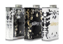 One factor probably is responsible for more packaged goods sales than any other: The unexpected. Curiosity closes the sale. With the motto “veniger ist mehr” (less is more), American entrepreneur and distiller Anthony Robert Hammond establishes the Garage Winery and its related Anthony's Wine Shop in Oestrich-Winkel in Germany's Rheingau wine district not far from Frankfurt am Main. Taking its inspiration from its office/plant, a former garage, he introduces and tests three liqueurs in an F-style metal can, rather than the expected bottle.
From a perspective of packaging history, the package is a valid combination of past and present. Harking back to the metal hip flasks of the 1920s, it anticipates the hip German consumers of 2007 who relate to the garage/factory class-driven image of the F-style can.
Each stainless steel, 500-mL container, designed by Kolle Rebbe Werbeagentur (www.kolle-rebbe.de), presents a trellis-like Art Nouveau graphic framework formed of fruit-laden boughs, shade-varied for the three varieties of Anthony's Super Schnapps. These are Anthony's Super Z for plum liqueur, Super W for Williams Christ peach liqueur and Super K for kirsche or cherry schnapps.
The can is screened in Pantone colors with a gloss overcoat and topped by a threaded closure with inner seal. Kolle Rebbe representative Thomas Stritz tells PD the test run with the cans “is all sold out.” He adds, “Anthony now wants to start mass production,” but “that is a question of distribution.”
Burlap quality for chips
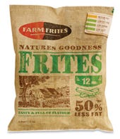 Similarly a rustic, down-on-the-farm quality for a fairly sophisticated institutional bag for quick-frozen potato chips captures a gold Mobius for Design Bridge Ltd. (www.designbridge.com). Described by the design firm as “the number two player in the international foodservice market,” Farm Frites Intl., B.V. of Oudenhoorn, the Netherlands reportedly is moved by legislation and consumer awareness regarding health issues to use the high density polyethylene bag, supplied and printed flexographically in eight colors by Flexicon AG (www.flexicon.de).
The design mimics a burlap sack with its worn, stenciled look, with the farmhouse line art leading the eye to the selling copy “tasty & full of flavor.” The bold, “50-percent-less-fat” statement relates to the tag-like table of nutritional values in the upper right quadrant as a quick guide to fat, saturated fat, sugar and salt levels per serving. The product can be glimpsed through a window in the rear of the end-sealed, back-gusseted bag, where preparation instructions plus additional nutritional information are also provided with the graphics format.
A Design Bridge representative explains that the impact of the red logo is heightened by a double hit of PMS 173 ensuring a bright, punchy color even though printed as a gradient, with a less coarse anilox, rather than line art. The printing is protected by an overall matte varnish.
Luxury for Tesco meals
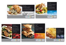 Private label soars to new design heights with the introduction of Mobius gold award-winning packaging for the Tesco Finest Ready Meals line by Tesco Supermarkets, Cheshunt, Herts., U.K.
The cartons are designed, PD learns from partner Simon Pemberton of P&W Design Consultants (www.p-and-w.com), for more than 160 stockkeeping units with graphics broken down by cuisine type: Italian; bistro; Indian; and seasonal, each identified by a specific photographic image vignette.
Each cuisine, he notes, has a specific color the consumer identifies before seeking out the specific meal in that group. The format, origin identification in the lower right quadrant and above it a black block with product-specific copy reversed out, then guides the eye to the chosen carton. The meal cartons for one or two people are printed primarily via lithography with both matte and gloss varnishes in six colors, including a special silver, by Benson Group's Benson Box (www.bensonbox.co.uk), with inner microwavable trays and pouches suitable for home freezing, he notes.
Quality look for tea
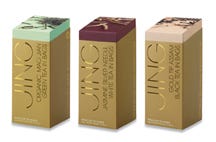 Trying to set a gold standard in tea packaging design captures a Mobius second-place certificate for creative excellence for Williams Murray Hamm (www.creatingdifference.com). The design system was created for London's Jing Tea, which calls itself, “U.K.'s whole-leaf tea company” and the “U.K.'s premium online tea shop.”
The carton, formed to resemble a gold ingot, consists of a board sleeve decorated in gloss and matte gold sliding over a tray with one angled end holding 20 biodegradable tea bags containing premium whole leaf teas. Submitted in the competition are organic Mao Jian green, gold tip Assam black and jasmine silver needle white varieties.
Sharing the drama of the sleeves, which feature the Soil Association Organic Standard seal, the inner trays are printed with images depicting loose tea (no specifications are provided).
About the Author(s)
You May Also Like


