Packaging Design
Good Measure 2024 redesign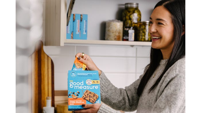
Packaging DesignGeneral Mills Transforms Healthy SnacksGeneral Mills Transforms Healthy Snacks
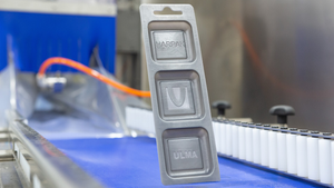
A packaging redesign for Good Measure bars and crisps highlights their “blood sugar-friendly” formulation, macronutrients, and flavor.


.svg?width=300&auto=webp&quality=80&disable=upscale "Mars Opens R&D Hub")


.png?width=300&auto=webp&quality=80&disable=upscale "Legal Case Made with Real Cheese Claim")


Editors' Choice


Sign up for the Packaging Digest News & Insights newsletter.