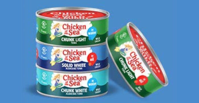
The redesign, part of a larger rebranding effort, included evaluating and refreshing all visual and verbal aspects of the iconic brand’s food packaging.

Chicken of the Sea has completed its first brand and packaging design refresh in more than 20 years, updating the brand’s look while staying true to its roots.
Conducted in partnership with Little Big Brands, the rebrand underscores Chicken of the Sea’s commitment to helping consumers eat healthily and live happily. The packaging design and all other aspects of the brand received scrutiny in the rebrand.
In particular, Chicken of the Sea’s mermaid character, Catalina, was refreshed to look stronger and convey greater confidence. She is now rendered in a more contemporary illustration style and holds a large trident rather than a small scepter.
Previously, the packaging’s wordmark was shown against a color-gradient burst, which can be challenging to reproduce and potentially date the design. Now, the wordmark is displayed against a white clam shell that evokes the sea and creates a bull’s-eye at retail.
Additionally, the on-pack information was edited to include only the brand, product variant, and key claims such as “wild caught.”
Two executives from Little Big Brands — founder and chief creative officer John Nunziato and senior account director Bill Frohlich — answer our questions about the packaging redesign in this exclusive Q&A.
See Before and After pictures in the slideshow.
When did the rebranded packaging start rolling out on store shelves? Is it a worldwide rebrand?
Frohlich: The rebrand started rolling out in January 2023 and will continue through the year, until the entire portfolio features the new branding. That includes [products] beyond tuna. Salmon products, sardines, and [the brand’s] line of specialty seafood will soon feature the new look. Chicken of the Sea is a North American brand.
Are the colors the same on the rebranded packaging as they were on the old packaging? If there was a palette change, why?
Nunziato: Every aspect of the brand was considered and respectfully evolved. This is a heritage brand and wasn’t broken, so we took great care with the details. We were very mindful of bringing consumers along and making sure they could continue to find their favorite products.
A huge part of that is the brand’s color palette. So, while we freshened up the colors, making them more vibrant and saturated, we continued to follow brand and category norms to aid in the shopping experience. In fact, by bringing more vibrancy across the line, we made it even easier for consumers to shop by the colors they are used to looking for.
What changes did you make to Catalina, the mermaid character?
Nunziato: Today’s Catalina, like the brand, is a leader and a change agent for good, which prompted the more modern illustration style. She was drawn to be more realistic, and she has more dimension and a more confident stature while wielding the power of her trident.
To help with brand visibility, Catalina was also removed from the center of the logo, which serves multiple purposes. It gives Catalina the opportunity to evolve as a standalone character while allowing for a clean wordmark that can be stacked and scaled in size.
The front of the can has a “wild caught” claim. Is there anything on the can to explain that claim?
Frohlich: “Wild caught” is an important distinction for consumers and speaks to sustainable fishing practices and a high-quality product. But that is just part of Chicken of the Sea’s commitment to consumers.
Through its SeaChange program, [the brand is] working to address overfishing, leading the charge on safe and legal labor practices and overall responsible operations throughout the supply chain. Its parent company, Thai Union, is currently No. 1 on the Dow Jones Sustainability Index and has been listed on the index for nine years running.
Of course, all that won’t fit on a little can, but consumers can learn more at chickenofthesea.com. They can even trace where the fish in their can was caught!
How have consumers and retailers reacted to the rebranded packaging?
Frohlich: The entire experience has been extremely positive. Retailers appreciate the shelf impact, and the care and attention to detail aids in the consumer’s shopping experience. And this is only the beginning. There is some exciting innovation rolling out later this year that both consumers and retailers will appreciate.
See Before and After pictures in the slideshow.
About the Author(s)
You May Also Like


