March 11, 2017

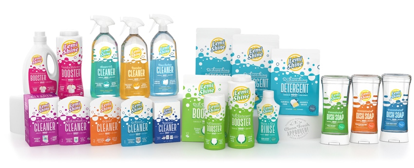
Lemi Shine, a line of what might be called "clean" cleaning supplies, just freshened up its packaging graphics to better reflect the brand’s personality and strength. Its products—including household cleaners, dish soap, dishwasher detergent, laundry soap, appliance cleaners and more—are based on 100% natural citric extracts, with no bleach, artificial chemicals or toxic ingredients of any kind.
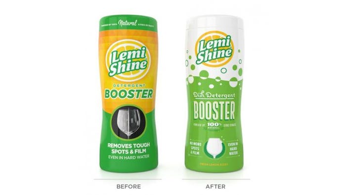
In the recent packaging redesign project, the family-owned firm, based in Austin, Texas, kept the logo pretty much the same, but the rest of the graphics underwent a revamp by packaging design firm Helms Workshop.
"Lemi Shine is genuinely different than the competitors it sits beside on the shelf, so communicating that was key," says Christian Helms, owner of Helms Workshop. "In addition to clearly communicating overarching product attributes, we wanted to highlight performance aspects of specific cleaners—and the bright wit that makes the brand's personality sparkle."
The new graphics feature an enlarged logo isolated against white space at the top. The text and remaining graphics sit against a pastel-colored background that covers a little more than half the front panel. Bubbles "float" up from the colored portion to unify it with the logo area. The typeface was changed from a utilitarian sans-serif to a more retro style, and the realistic photos of targeted uses, like glasses and washing machines, were turned into more stylized images.

"We didn’t want to overly clutter the package, even in situations where there was a broad amount of information to convey," Helms says. "We wanted the pack to stand apart on the shelf, and to be distinct while clearly tying to the brand family. And, of course, we wanted the package to have some warmth and personality. The choices of illustration and typography do a lot to build that welcoming tone."
The redesign did not, for the most part, involve changing the packages' existing structure or materials. "The team at Lemi Shine wanted to make a few small shifts, but overall the package structure was performing well," Helms says. "We wanted to bring along existing Lemi Shine Clean Freaks as we attracted new fans, and maintaining the current pack architecture and only minimally refining the logo helped us to do that."
Lemi Shine CEO Curtis Eggemeyer was initially hesitant about making the switch, but was eventually won over--with the help of some consumer testing.
“When you have a brand that is experiencing tremendous success—our sales were up 20% year over year, and our retailers continually impressed—you tend to think, 'Why change?’" Eggemeyer says. "At the same time, though, we really wanted to capitalize on our leadership position in powerful and safe cleaning products. We wanted packaging that was consistent with our positioning, resonated with our target consumer and provided a platform for product expansion into new categories. As uncomfortable as the change presented itself, the internal research and consumer testing performed gave us the final confidence that met our objectives."
***********************************************************************
See a host of new ideas in packaging machinery, materials and more at the new Advanced Design & Manufacturing Cleveland event (Mar. 29-30; Cleveland, OH). Register today!
About the Author(s)
You May Also Like


