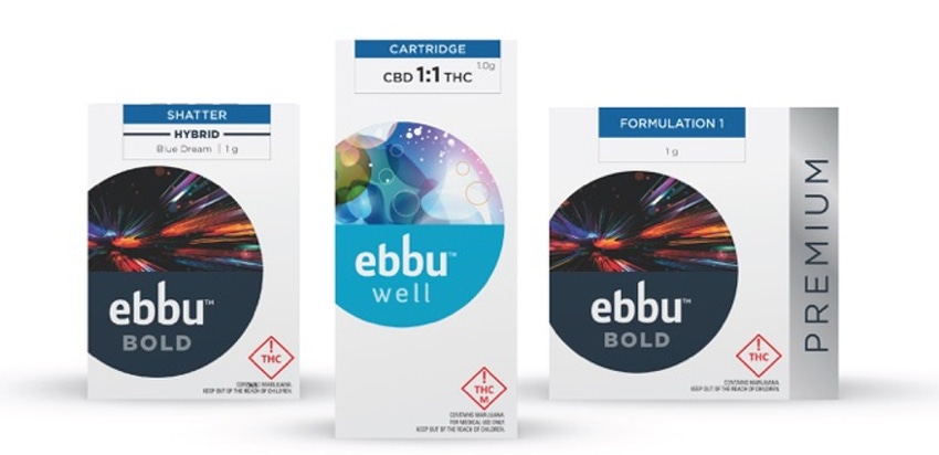
With marijuana becoming a legal recreational product in a growing number of states, cannabis-product providers are taking a hard look at their packaging design. For Denver-based ebbu, which makes and sells cannabis products within Colorado, that led to a major package and brand redesign.
Working with Trinity Brand Group, ebbu created a new visual identity, which positions the company as a lifestyle brand for contemporary cannabis consumers. The redesign debuted when the brand owner launched its ebbu Bold and ebbu Well product lines in August 2016. The ebbu Bold line features the brand’s first formulated product.
The new package graphics on ebbu’s folding cartons feature colorful artwork displayed in a circle, suggesting a lens. “The inside of the package reveals the full illustration that is only hinted at on the outside,” says Matthew Youngblood, CEO and executive director of strategy and client services at Trinity Brand Group. All Packaging Co. supplies ebbu’s folding cartons.
Kedric George, vp of marketing at ebbu, adds that the redesign’s goals included:
Building a strong, consistent master brand that could extend across all touch points and create a foundation for future expansion.
Developing a premium look and feel for the core product line that would hold together as a system while creating clear differentiation among ebbu’s other product lines.
Developing a visual identity system that would not only deliver functional information about the product but also represent the appropriate emotional response, based on the product’s attributes.
The resulting package design stands out in cluttered, dark dispensaries. And the use of soft-touch finishes and gloss varnishes provides a premium, fingertip-friendly experience.
George and Youngblood provide further details about ebbu’s new packaging and brand redesign:
Why did ebbu believe it needed to make a change?
George: Cannabis is quickly becoming a legitimate consumer packaged goods product. The packaging and consumer experience should convey this idea. At ebbu, we know our products are unlike anything else on the market. We wanted our packaging to reflect that, as well as resonate with the current consumer and the upcoming, more mainstream user. We wanted to make the cannabis journey easy to navigate, “shoppable” and inviting. And, our packaging must reflect that.
In addition, ebbu has recognized the positive impact “normalizing” the purchase and use of cannabis products will have on our business and the industry as a whole. We wanted our packaging to convey a familiar, comfortable and sophisticated consumer shopping experience: clean design aesthetic, clean color selections, intentional structural design and material selection.
Did you evaluate competitive packaging? If so, how did that inform ebbu’s redesign?
Youngblood: As part of our work with ebbu, Trinity not only evaluated the key competitors’ packaging but also their brand strategy, promise and communication strategy. We looked not only at local brands but other brands outside of Colorado. We summarized our findings in a positioning matrix and a visual language map showing the duality of cannabis design.
There were two main categories: One, brands that were about traditional “pot culture,” relying heavily on the use of marijuana leaves, and two, ones that looked more scientific and cutting-edge, nodding to the science and “function” of the product.
We did store audits to see how the packaging was performing from a brand visibility standpoint and to gain a stronger understanding of how the products were shelved and stored, and what the shopping experience was like.
Overall, we identified the need to have a product that would cut through the busy clutter and move beyond the stereotypical green color and marijuana-leaf iconography and not look cold and engineered like some of the other players.
We instead took our inspiration from outside the category, relying on our experience developing highly emotive and premium lifestyle brands to differentiate from the competition and reflect the high-quality product. It was important to be relevant to current cannabis consumers while communicating an approachable, trustworthy message to new and potential consumers.
What did ebbu’s previous packaging look like?
Youngblood: Unfortunately, ebbu’s packaging wasn’t delivering on the brand’s promise or capturing the attention of consumers at retail. It was dark, recessive and challenging to store and display because of its awkward structure. So this is not only a redesign but much more. We’ve established a foundation for a new master brand and a packaging system that has the ability to quickly scale as cannabis becomes legal in more markets.
Please describe the child-resistant features on the packaging.
George: First and foremost, all initial structural/design considerations were born from industry compliance regulations, including:
Opacity—you cannot see the product;
Child resistance—containers with product inside must be child-resistant containers, such as push and turn, much like a medicine bottle or pop-top, where you squeeze the bottle so the top “pops” open; and
“Warnings of use”—the exterior package must include Colorado Marijuana Enforcement Div. warnings of use, as well as universal THC symbols and warning copy for “Rec & Med” products.
[Editor’s note: THC, or tetrahydrocannabinol, is the psychoactive chemical in marijuana.]
Where does this regulatory language appear?
George: The regulatory information is printed on a sticker and adhered to the back of the box when the product is packaged. On the front of the package is a mandatory THC warning symbol that has specific regulatory guidelines for minimum size, color and placement. It is printed on all secondary packaging; ebbu takes regulatory compliance very seriously, and we worked hard to ensure we were compliant with all regulatory requirements.
How have consumers reacted to the package redesign?
George: So far the response has been great! Store managers and budtenders have loved it. They are excited to see a brand attempt to stand out with clean, inviting, easy-to-use packaging.
*********************************************************************************
See a host of new ideas in packaging machinery, materials and more at PackEx Montreal 2016, Nov. 30-Dec. 1, in Montreal, Quebec, Canada.
About the Author(s)
You May Also Like


