March 11, 2015
New organic wheat vodka
New organic wheat vodka

New organic wheat vodka
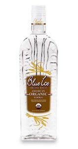
Blue Ice Vodka announces the inception of Blue Ice Organic Wheat Vodka, the American brand's first line extension since its introduction to the market in 2001. Blue Ice Organic Wheat Vodka continues the tradition of founder Jim Myerson's commitment to producing premium spirits reflective of the quality and purity of Idaho's natural resources. “In a crowded market inundated with fly-by-night brands, here today, gone tomorrow, Blue Ice has successfully circumvented this fate by focusing on the fundamental priorities of today's modern-day consumer,” says Kevin Egan, vp of sales and marketing for 21st Century Spirits.
The clear bottle was designed to compliment the flagship Blue Ice potato-vodka package, which is packaged in a blue bottle. The bottle is a sculpted work of art created by package design firm, Flowdesign Inc. (www.flow-design.com). It is tall, slender and ergonomically designed to make pouring easy. The elegant bottle looks great on the back shelf at a bar or restaurant and in the home as well. “The challenge was to differentiate the Organic Wheat from its flagship brand, “Blue Ice potato vodka,” says Dan Matauch, owner of Flowdesign. “We looked at several alternatives, but eventually came to the consensus that the clear bottle with the brown-toned label best suited the organic wheat line extension. We kept the core brand elements of the Blue Ice font, bottle and label shape of the flagship brand, but added wheat stalks, the USDA organic logo and color changes to help consumers recognize the brand's unique organic properties.”
The Organic Wheat Vodka, which sells for about $30, is distributed nationwide. The glass bottle and the pressure-sensitive label are supplied by Devon Intl. (www.devonintl.com).
Value driven drinks in hot-fill PET
Value-driven drinks in hot-fill PET

Value driven drinks in hot-fill PET
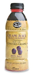
Cliffstar Corp., Dunkirk, NY, a private-label beverage supplier, now offers the Chadwick Bay line, its own brand of beverages, produced by Harborside Inc., a Cliffstar subsidiary. The line includes single-serve enhanced juice, enhanced water, organic juice and smoothies bottled in attractive, lightweight PowerFlex™ PET bottles from Amcor PET Packaging (www.amcor.com).
The shelf-stable drinks are Cliffstar's first foray into the private-branded beverage market. The company studied the U.S. market and identified a price gap between national brand and private-label products, according to Matt Walker, Cliffstar's marketing director. “This is the appropriate time to introduce a premium, mid-tier alternative that gives retailers a less costly, more value-driven product option,” explains Walker. The new bottle also creates an innovative look, he says, that will allow Cliffstar to surge ahead of consumer trends and quickly introduce more appealing and innovative products. The dome-shouldered, long-neck bottles are portable and breakage-resistant, lightweight, recyclable and can help reduce transportation costs. Consumers are drawn to the attractive features of the PET bottle. Cliffstar already uses Powerflex PET bottles for many of its private-label beverages.
The PowerFlex bottle has a patented, panel-less design that takes hot filling at temperatures around 185 deg F to a new level. Available in12- to 46-oz sizes, the bottles feature a recylable PETG shrink sleeve label from Hammer Packaging (www.hammerpackaging.com) that provides striking graphic esthetics.
Spiral Closure tops fragrance with drama
Spiral closure tops fragrance with drama

Spiral Closure tops fragrance with drama
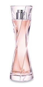
Inspired by the delicate and dramatic silhouette of a Kimono-draped woman, Lancome's Hypnose Senses' package design emulates the spiraling flow of fabric. The ultra-contemporary yet timelessly elegant package is capped by a Surlyn closure developed at Rexam's (www.rexam.com) Simandre-based Center of Excellence.
“This challenging project resulted in a closure with crisp, clean lines and a look that only the use of Surlyn—because of that material's superior transparency, ability to withstand demanding production processes and fragrance compatibility—can deliver,” says Elisabeth Benoît, cosmetic closures sales director, personal care, Rexam.
“We have a long history with Lancome,” she says. “For a prestige fragrance such as Hypnose Senses, the only acceptable closure is a work of art that communicates the magic of the Lancome brand.”
Fruit smoothie in a beeker
Fruit smoothie in a beeker

Fruit smoothie in a beeker
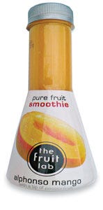
Consumers are looking for more natural nutrition and balanced meals rather than simply cutting out certain ingredients such as sugar, fat or sodium. This trend is also evident in their choices of snacks and drinks. In the Netherlands, The Fruit Lab is launching fruit smoothies that claim to be “freshly squeezed for gourmets.” Fruit Lab claims its brand is for fruit lovers, with fresh fruit from varieties such as Alphonso mango, Willamette raspberry and Senga Sengana strawberries. But the packaging is really the standout. The bottles are shaped to resemble laboratory flasks and bear a “flavor dimension” logo. The Fruit Lab defines its smoothies with flavor characteristics of bitter, sweet and sour; a circle represents each flavor's intensity.
Redesigned ice cream packaging serves up nostalgia
Redesigned ice cream packaging serves up nostalgia

Redesigned ice cream packaging serves up nostalgia
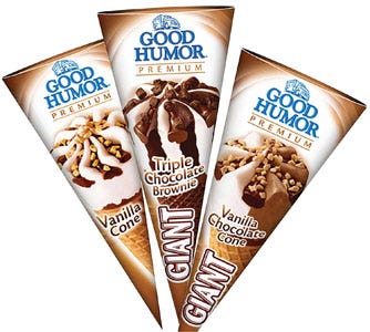
Previous packaging for Good Humor ice cream treats strongly emphasized the connection to Unilever's global ice cream brand, Heart; the newly designed Good Humor in-home and out-of-home packaging emphasizes the heritage and history of the American brand instead.
To reinvigorate the packaging with a nostalgic feel, Unilever commissioned Anthem! (www.anthemww.com) for an extensive identity exploratory. After which, the companies decided to move away from the red double-heart shape, which was the trademark of the global brand, and instead use imagery and coloration that harkens to the Good Humor heritage.
The new logo incorporates a visual representation of a Good Humor ice cream truck in blue. To emphasize the new branding, packaging for Good Humor's filled cones feature a swirl pattern that ensconces the new logo. Type treatment for each confections' flavor/variety designation also was standardized.
Canadian pasta shakes things up in sustainable packaging film
Canadian pasta shakes things up in sustainable packaging film

Canadian pasta shakes things up in sustainable packaging film
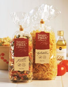
Nature's Farm, a Manitoba-based Canadian pasta company, selects NatureFlex™ sustainable, compostable film from Innovia Films (www.innoviafilms.com) to wrap its line of gourmet pastas. The family-owned business also has a poultry operation producing eggs. In 1993, after several years of careful research and some time as a “designer-egg” wholesaler, the company introduced Nature's Pasta™ to its lineup, and the tasty product now appears on the menus of some of North America's best eating establishments.
New products launched in the U.S.
Packed in-house on a Bosch (www.boschus.com) Terra 25 vf/f/s machine that runs up to 15 packs/min, the pasta in clear film bags was a wise choice, according to company founder, Hermann Grauer. “We are committed to ecological sustainability and stewardship. NatureFlex is sustainable, lessens environmental impact and has fitted into our production line process with only minimal adjustment required,” he says. “The reaction to the packaging has been very positive and enthusiastic.”The film begins life as wood and begins to decompose in a compost bin (or an industrial compost environment) within a matter of weeks, Innovia says.
You May Also Like


