March 11, 2015
LAUNCH PAD New Product of the Month:
Caide lanolin, whitening hand cream
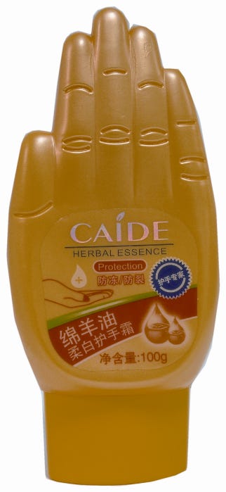
Caide lanolin, whitening hand cream
This delightful tottle hails from China, where it is used to house 100 g of Shantou Bornei Cosmetics Caide lanolin, whitening hand cream.
The bright yellow, plastic package is aptly shaped as a hand with a flexo-printed PP label over the palm. This clear p-s label also features the hand cream's brand name in gold foil. Further product information is silkscreen-printed on the back of the hand-shaped package.
The tottle measures 5.31 x 2.52 x 1.38-in. (h/w/d), and it sits on a simple injection-molded polypropylene closure. The package's tottle design eases product dispensing as product is naturally moved to the package opening by gravity.
The product is a mild, non-oily skin whitening cream that is formulated to penetrate quickly into skin, improving dark and/or dull skin tone. The lanolin cream also is formulated to protect hands against chapping that may be caused by winter weather conditions, leaving hands soft, smooth and radiant.
Shantou Bornei Cosmetics says its Lanolin Whitening Hand Cream is suitable for all skin types, as it contains both the whitening ingredient and an enriching sheep oil extract.
Del Monte launches ready-to-blend smoothies
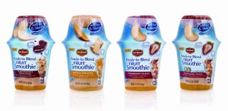
Del Monte launches ready-to-blend smoothies
Consumers are embracing the smoothie trend in a big way with thousands of retail locations opening across the country. Recognizing that many produce shoppers would like to consume smoothies more often, but find them too difficult to make at home, Del Monte brand has introduced a line of ready-to-blend Fruit Smoothie kits. The all-in-one kits contain fruit chunks and puree. Consumers simply add ice, blend and enjoy.
Strategic branding agency CBX (www.cbx.com) created the brand identity and design for this first product of its kind to be positioned for retail in the refrigerated produce section. Since it's sold alongside ready-to-drink brands, the design had to visually capture the advantages of the make-it-yourself product, as well as the added value: one Ready-to-Blend Fruit Smoothie makes two servings when ice is added.
"Research revealed that consumers expressed an interest in drinking more smoothies, but felt they were too expensive and complicated to make," says Rick Barrack, chief creative officer, CBX. "So we defined the brand's personality-simple, vibrant and friendly-and developed a design that communicates the value and easy preparation of this refreshing, good-for-you treat."
Both a blender graphic and the prominent Ready-to-Blend Fruit Smoothie logo clearly communicate the need for preparation. Positioned under the Del Monte brand name, the logo's clean, modern typeface and vivid color palette adds shelf impact.
The phrase "just add ice" on the overcap further emphasizes that this is a starter kit. Luscious fruit slices and iced cubes tumbling playfully into the blender suggest easy preparation, great taste and good-for-you positioning.
A vibrant blue background evokes the ultimate in refreshment. A consistent, color-coded banding device across the bottom of the cups and multipacks helps with flavor identification.
"The result is a great solution for this unique product; instantly communicating refreshing, premium and fun, while providing us with great shelf presence and visual appeal in a high-traffic area of the store where consumers look for healthy new items," says Bonnie McFarland, Del Monte Foods.
Ready-to-Blend Fruit Smoothie Kits, which are available on retail shelves now, feature four flavors: strawberry peach, strawberry peach lite, mango pineapple and pomegranate peach pear, as well as three club store multipacks.
PP bottles protect nutritional drinks
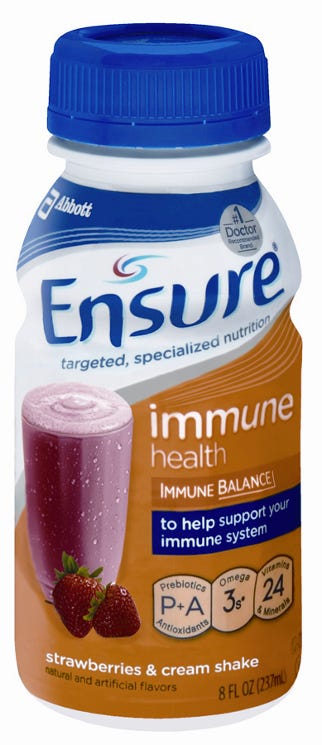
PP bottles protect nutritional drinks
Abbott has chosen multilayer PP bottles to protect the patented ingredients for the company's new benefit-based Ensure line. Ensure shakes contain multiple vitamins, minerals and nutrients that are formulated to targeted nutrition levels to help people better meet their health needs. The nutraceutical and pharmaceutical manufacturer says the PP bottles, used in conjunction with bottle caps made from steel and PP, are the optimal choice for its hot-fill process because the two materials work together to create a high-quality, repeatable seal and sterilize the product during production.
Each bottle is decorated with a polyethylene terephthalate glycol (PETG) shrink-sleeve label, which is gravure-printed using up to eight colors, with the combination of spot and process colors depending on the specific shake.
Abbott has revamped the product line's labeling to help consumers can easily identify the product that's relevant to their health needs on the shelf. The new bottles are designed to clearly introduce new ingredients in addition to creating a streamlined look for the entire portfolio that also points out the health benefit of each shake.
This labeling addresses a need uncovered by Abbott in its consumer research. The company found that consumers aged 45 to 74 are looking for products to help manage specific aspects of their health, such as muscle, immune or bone health. The study involved 6,000 consumers.
The package redesign also may help the Abbott capture a growing market. The company remarks that Baby Boomers, the first of which will turn 65 in January 2011, are proactive about healthy aging, including adopting proper nutrition and solutions that support health goals. Abbott says this is fueling the growth of the lifestyle nutrition category. Sales, estimated at nearly $2 billion annually today, are expected to double in the next five years.
Count On Tools' KeyDisc Holder wins a 2010 design award
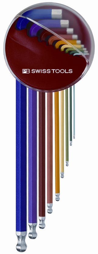
Count On Tools’ KeyDisc Holder wins a 2010 design award
Count On Tools Inc., a distributor of precision components and surface-mount technology (SMT) spare parts, announces that the KeyDisc Holder for key L-wrenches from PB Swiss Tools has been awarded a 2010 red dot design award. The KeyDisc Holder impressed the jury of experts with its innovative functional design. It was developed through a successful cooperation between PB Swiss Tools and the industrial designer Paulo Fancelli (www.fancelli.ch).
The PB Swiss Tools KeyDisc keeps key L-wrenches readily available for every situation. The tool holder is available for all chromed L-wrenches, as well as for the powder-coated RainBow versions in sizes from 1.5 to 10 mm.
With its new shape and design, the KeyDisc Holder provides easy storing and access to tool sets. The clear disc can be rotated around the holder to lock the tools in place for transporting the tool set. To use the tools, users simply rotate the disc clockwise as far as it will go and remove the keys by twisting the L-wrench forward. It then can be effortlessly removed from the holder.
The arrangement system includes three options for storing tool sets: magnet, pin hole and table stand.
• The magnet, which is molded into the KeyDisc Holder, allows users to fasten the tools to almost any metal surface, such as a tool box or a piece of equipment being serviced.
• The pin hole, located on the back of the holder, allows users to hang tools on most non-metal surfaces, where a fastener can be securely attached.
• The unique table stand features storage for tools on the workbench.
KeyDisc Holders are made by PB Swiss Tools in the Emmental region of Switzerland and are distributed in more than 30 countries. As the North American distributor, Count On Tools handles sales in the U.S. and surrounding areas.
So far, the market response has been positive. Customers like the ability to have their tools ready at hand at all times, especially for service techs in industrial environments like the packaging industry. It is also important that they are able to pack the tools up and take them with them if they are traveling techs or maintenance workers who have to move around a plant during daily operations.
About the Author(s)
You May Also Like


