March 11, 2015


Chandon Brut
Domaine Chandon is introducing a new package for its sparkling wines. Chandon Brut Classic and Blanc de Noirs will be the first wines to feature the updated look, available on store shelves nationwide in October 2010. Chandon Sparkling Rosé and Extra Dry Riche will follow with a full transition scheduled before Valentine’s Day 2011. SRP remains $22 per 750mL bottle.
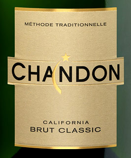
The new package includes a revised Chandon logo that incorporates the iconic and dynamic shooting star symbol in a more modern style. To increase brand recognition, the redesigned front label prominently features the new Chandon logo on a clean layout, drawing the consumer’s attention toward this hot-stamped logo and the variety of wine. Likewise, the foil capsule displays larger Chandon branding and the neck label now features a legible variety name.
In order to demystify sparkling wine for consumers, Chandon’s back label includes an innovative graphic image explaining taste descriptors and food pairing suggestions, presenting the wine’s taste profile along a continuum ranging from sweet to dry. Each wine within the portfolio will continue to be packaged with a distinct hue to differentiate flavors; the case shippers mimic the same vibrant colors as the wine labels on the enclosed bottles, designed to differentiate the SKUs and to grab attention.
“Qualitative research indicates that this new package positions Chandon as a more premium choice than our previous package. The quality of the wine inside the bottle remains high, evidenced by third party endorsements and high scores. With this clean look on high quality, textured materials, we hope the visual cues on the outside of the bottle will translate into purchase,” says Chandon Director of Marketing Michael Stedman.
SOURCE: Domaine Chandon
Chandon Brut label
.
.
About the Author(s)
You May Also Like


