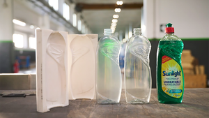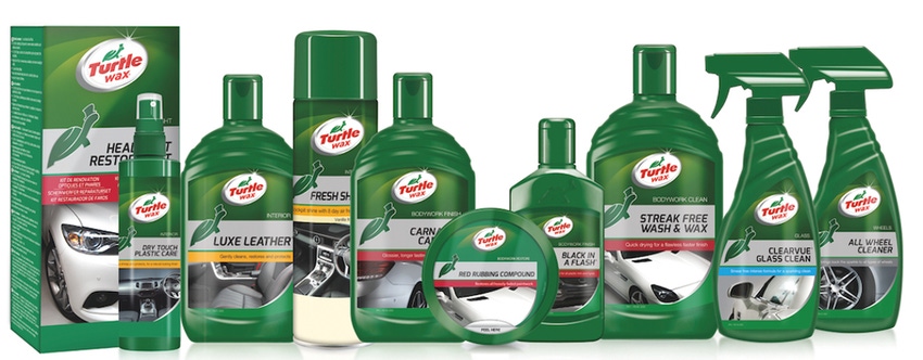
Turtle Wax is driving briskly into the new year with redesigned packaging for its expansive European product portfolio. The new packaging design, unveiled in December 2015, was created to broaden the brand’s appeal for female consumers, reinforce its premium image, modernize the packs’ appearance and, ultimately, boost sales.
Recognizing that women make 40% of Turtle Wax purchases, the brand owner made it a priority to design packaging that would be equally attractive to both genders. To implement the redesign, Turtle Wax worked with U.K.-based Redshoe Brand Design, which specializes in marketing to women.
The resulting packaging design evokes the brand’s heritage, leveraging Turtle Wax’s signature green hue and prominently displaying its iconic logo: a turtle in a top hat.
Adding a contemporary, gender-neutral look and feel, the new graphics incorporate close-up images of shiny auto exteriors and spotless interiors. The elegant automotive images on the front of each package are keyed to that product’s function and benefits.
To make shopping easier, the design team restructured the portfolio of more than 600 products into three tiers: Perfect Finish, The Main Line and Essential Range. The design of the packaging in each tier unifies it as a discrete group within the larger Turtle Wax family of products.
All containers in The Main Line—the brand’s best-selling range—are predominantly Turtle Wax green, providing quick visual confirmation of the tier. Packaging for the other two ranges uses the green more sparingly but identifies the products, on the front of each package, as a Perfect Finish or Essential product. Color coding is used throughout the tiers to differentiate product categories.
The relaunch is reportedly the largest for Turtle Wax in the past15 years. In addition to the packaging redesign, the project includes the new “Life Gets Mucky” ad campaign, also created by Redshoe.
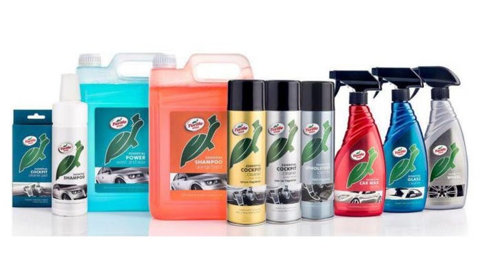
The brand's Essential product line departs from using green containers but keeps the turtle character prominent on the main panel.
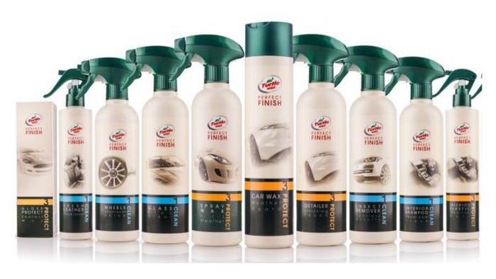
Packaging for the Perfect Finish products shows the Turtle Wax logo, but smaller than the other product lines, and ties in the brand's green color through the closures at the top of all containers.
_________________________________________________________________________
Attend “Packaging Design for Beer & Spirits” on Feb. 9, 2016, at the Anaheim Convention Center in conjunction with WestPack 2016. This intense one-day conference will reveal new ideas and techniques for bold and savvy packaging designs to capture and engage consumers.
_________________________________________________________________________
About the Author(s)
You May Also Like


