October 19, 2018

After years of touting its animal-care improvement efforts and all-natural products, Perdue sought refreshed packaging designs that reflected its refreshing approach to poultry production.
The brand owner connected with Enlisted Design, an Oakland, CA-based design firm, in July 2016 to reenergize its poultry packaging at retail. Beau Oyler, principal and creative director, Enlisted Design, says their goal at the outset was to create a look for the containers that better told the story of Perdue’s work in stepping up animal-care standards, highlighted their all-natural products, and connected with both current consumers and younger shoppers.
“Perdue is a brand leader in animal care, and just like their forward-thinking initiatives, they wanted the new design to go beyond what’s easy, comfortable or expected of typical mass CPG [consumer packaged goods] brands,” says Oyler. “They sought a modern look, remarkably unique from competitors that clearly communicates their progressive efforts.”
After Perdue engaged the team, Enlisted Design spent more than two years conducting brand, consumer and competitive research. The process started with collaboration between Enlisted and Perdue to pinpoint key messaging goals. Then, they conducted qualitative and quantitative consumer testing to inform the redesign. They created numerous packaging iterations, harnessing consumer feedback to help refine the design.
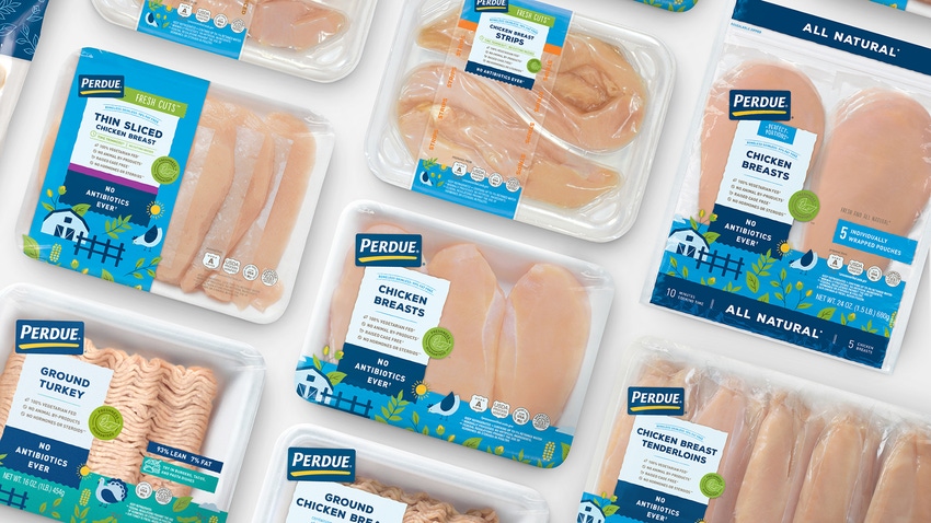
The updated designs, which hit retail September 2018 (starting with markets on the east coast and in the Midwest), feature whimsical illustrations, bright colors, and typography that combines bold letters and minimalist treatment.
“We created an entirely new visual language that celebrates the brand’s best practices: chickens raised in America on family farms; all-natural, no animal by-products; and no antibiotics ever,” says Oyler. “The new design radiates a sunshiny-fresh vibe—repositioning Perdue as more modern, approachable and natural.”

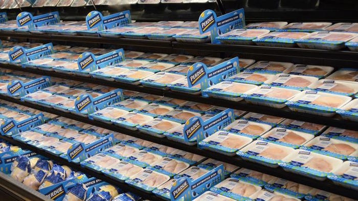
The bright colors and bold visuals of Perdue’s updated poultry packaging are intended to better engage and communicate product benefits to shoppers.
Details on Perdue’s new poultry trays and film wraps include images with a hand-drawn feel, storybook-like farm scenes and wood-grain textures created to impart a rustic, natural feel. Oyler says the simple, straight-forward approach helps consumers more easily identify products on the shelf, and it more clearly communicates the products’ benefits to shoppers.
While the updated packaging has only been in front of shoppers for several weeks, the brand owner is optimistic about its potential success.
“Our new package design for fresh chicken contemporizes our brand for a new generation while telling the Perdue story and values through bright and unique visuals and illustrations,” says Eric Christianson, chief marketing officer, Perdue. “We’re very proud of this evolution for the brand and continuing to effectively reach a new audience.”

Freelance writer and former Packaging Digest senior editor Jenni Spinner is a trade journalist with two decades of experience in the field. While she has covered numerous industries (including construction, engineering, building security, food production and public works), packaging remains her favorite.
********************************************************************************
PackEx Montréal 2018 offers everything from design to manufacturing—concept to market—with valuable free presentations available throughout the event at Center Stage. See more suppliers, products, and networking opportunities to help you take your projects, company, and career to all-new heights. REGISTER NOW!
About the Author(s)
You May Also Like


