August 2, 2017

Price Chopper/Market 32’s PICS soda line packaging redesign for cans and more exemplifies how a private-label grocery brand can prosper amidst the online ecommerce juggernaut.
It was during UBM’s Advanced Design & Manufacturing Toronto show in November that I connected with Packaging Digest senior technical editor Rick Lingle and showed him examples of a recent redesign done by Watt International (Toronto): the “PICS” project for a line of private-label soda done for U.S. grocery chain Price Chopper/Market 32.
The design was featured in the PAC Packaging Awards display at the show. Lingle was impressed as much by the look of the redesign done by Watt by the fact that it reportedly created a dramatic increase in sales and it appeared that the look of the canned and bottled soda packaging was the only thing that had changed.
“Sales are really the bottom line for any redesign, and that’s quite an impressive lift,” observed Lingle. What was even more impressive is knowing that it appeared that Market 32 customers were choosing PICS over the most well-known national brands in soft drinks.
The timing is especially interesting considering the recent news of Amazon’s aggressive move to enter the grocery market with the acquisition of Whole Foods Market. The move left in its wake a degree of uncertainty (see What Amazon buying Whole Foods might do for ecommerce packaging published in June).
There will remain a need for effective packaging design at least as long as people have a desire to use and consume physical products. Grocers who have effectively implemented a trusted series of private-label products, those that are typically unavailable on Amazon, are starting to find success in the face of a “retail apocalypse.”
Competitors in both the online and brick and mortar spaces are clamouring for ways to engage their target market. Some retailers double down in real estate, while others can’t seem to implement technology solutions or online ordering fast enough.
Savvy grocery retailers, however, are going to great lengths to build as much brand equity as possible to create a sense of loyalty that even e-retailers struggle with, but the question remains as to where to spend dollars and effort to achieve this.
Regardless of how customers choose to buy and receive their purchase, the product itself, and with that the packaging, will remain fundamental in consumers’ decision-making process. In the private-label product world, packaging becomes an extremely important marketing tool as such programs rarely have the benefit of support of large advertising budgets as with national brands.
The packaging, therefore, has to work that much harder in engaging, inspiring and educating shoppers. Another factor is how and when a consumer is exposed to a product—i.e., merchandised—and what it is about the product or the on-pack messaging that compels a customer to choose a particular product that is available at one outlet or the other.

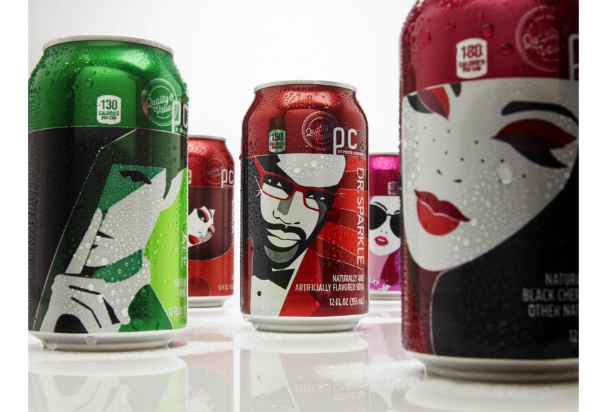
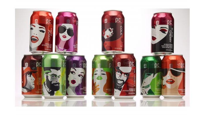
Each sku had its own character drawn from iconic cues associated with the flavor.
The PICS brand was developed by Watt to support and complement the rebrand of Price Chopper to Market 32. With declining market share and brand affinity, the rebrand sought to reposition the company with a heightened focus on core strengths in fresh food, and appeal to a younger audience with a more relevant, quality focused value proposition. The private label rebrand also sought to turn a line of product into a strategic asset for the company and elevate sales performance to best-in-class industry standards.
The PICS brand is positioned as a national brand equivalent, and reflects the brand positioning and attributes defined in the Price Chopper/Market 32 rebrand. In particular, the PICS brand delivers against the aspiration to make it affordable for community members to make everyday living healthier and more enjoyable, by offering a range of products that are carefully selected to offer exceptional quality and smart savings. The high-order benefit mantra is “make everyday living more enjoyable.”
The most innovative aspect of the PICS carbonated beverage category is the personification of flavors through the development of characters used to identify flavor variants. The approach helps add an emotional dimension to the consumer’s relationship with the product, and acts as a marketing asset, both stimulating word of mouth and allowing the development of campaigns around the flavour characters. The unique stylishness of the illustrations is disruptive on shelf and also addresses an insight uncovered regarding private brand products: purchasers’ willingness to serve (and pride in serving) them to guests.

Consumer subgroups and iconic personas
The target audiences were segmented to address diverse needs across generations of shoppers:
Boomers were targeted for Retention & Entrenchment;
Gen Xers were targeted for Growth;
Millennial attitudes and behaviours were used to inform approaches to targeting Gen X, who continue to be the volume purchasers of grocery, but whose own behaviour is increasingly influenced by Millennials;
Millennials were targeted through flavour variants and line extensions. The need to overcome private label barriers among the Gen X and Boomer cohorts does not exist with a generation who has grown up with private label.
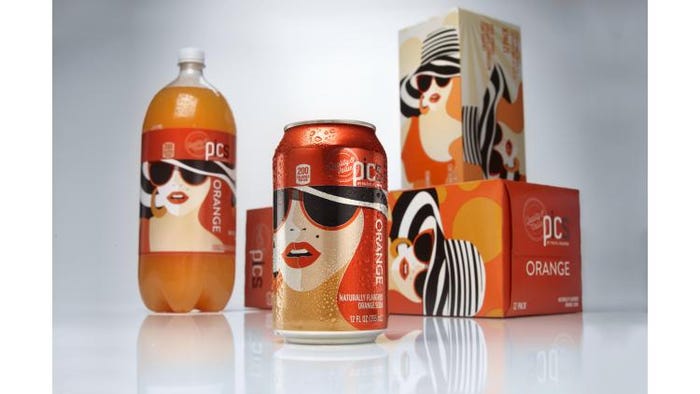
In order to be strategic in a saturated category, Watt decided to make the PICS cans, bottles and secondary multipack cartons really stand out against competition. The soda aisle is typically comprised of various colors and graphics aligning each flavor to its national brand leader. Our approach was to develop characters to represent each soda flavour, and really maximize printing capability on aluminum cans by going for a super graphic and contemporary illustration style. We took classic hints of each flavour and represented those in a character. Root beer, for example, reminded us of the classic drive in burger joint so we took that nostalgic feel and melded it into a 70's-inspired car racer printed onto the can and the box.
Fruit punch takes inspiration from the iconic Carmen Miranda and her classic fruit hat, but presented in a modern flavor-specific flair.
Our James Bond-esque ginger ale character draws inspiration from classic spy movies; one of the original sodas, ginger ale, continues to be considered a premium and classier drink to this day.
To create something more iconic and intriguing than what the other private label brands were doing, we utilized flavor color application in the designs to help the consumer navigate, but translated them into an extremely vibrant color palette that highlights each soda character perfectly. Color blocks were reinforced visually by the strong horizontal or vertical datums established by consistent color fields housing the brand identity.

Redesign unifies the look across cans, bottles and multipack cartons.
The PICS brand architecture is so strong we were able to break the rules within this category for maximum shelf presence. The result on-shelf is a beautiful line-up of intriguing characters, and proof that great design can shake up even the most predictable category.
In concert with the above, shelving strategies were fine-tuned by category, but generally included strong vertical or horizontal blocking of vibrant color families, centred in categories and flanked by category leaders. The result is energetic and iconic blocks of color throughout the store that build brand awareness and assist in identification while continuing to reinforce a sense of variety and selection. Equally important is packaging’s ability to catch the eye and make a shopper stop—online or in-store—to have a look. PICS achieved this with flying (pardon the pun) colors.
The numbers don’t lie. Market 32 has seen a significant increase not only in sales as well as in foot traffic to the stores. Capturing that kind of brand loyalty is certainly not an easy feat, but through packaging, strategy, and positioning, retailers have a path to regain the mind share of an increasingly fickle customer.
Michael Nussbacher is the VP, business development, for Watt International. From brick to clicks, he helps deliver successful leading-edge strategies to retailers. A well-known thinker and proven entrepreneur in the digital space, Nussbacher brings nimble and creative thinking from the retail tech start-up world to introduce fresh thinking to brands from craft to household names.
___________________________________________________________________________________
Is packaging and design top-of-mind? Join the packaging experience during MinnPack in Minneapolis November 8-9 that’s part of a comprehensive all-in-one 6-event plastics and advanced manufacturing exhibition. For more information, visit http://minnpack.packagingdigest.com.
___________________________________________________________________________________
About the Author(s)
You May Also Like


