March 11, 2015


Frische Vlag coffee creamer
FrieslandCampina's Friesche Vlag is not only the Netherlands' oldest dairy brand but also the country's market leader in coffee enrichers, regularly developing quality product innovations. However, the brand's logo and packaging needed a refresh to better reflect its relevance and to unify its range of offerings, from traditional creamers to more innovative coffee milk products.
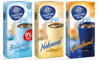
Anthem created a new logo treatment with a more organic and dimensional shape that is relevant to the liquid dairy category. The creative team applied a simple, clean brand architecture and design style across the entire portfolio that highlights the Friesche Vlag logo as the primary messaging. The redesign uses key existing brand colors across core products such as Goudband, Halvamel, and Balance, while an extended color palette was devised for less traditional extended offerings.
Anthem's design solution preserves Friesche Vlag's key equities while solidifying its positioning as a provider of enhanced, multi-sensory coffee moments. The architecture and design system are streamlined and consistent, allowing strong communication of the brand and allowing for future product introductions.
Source: Anthem
.
You May Also Like


