March 11, 2015

A&P 1
Historically, many private-label packaging designers have updated packaging with some sort of well-established equity element to help consumers identify which major brand a product is comparable to. This practice has become so much the norm that suppliers of private-label packaging often have grown to expect this when starting a new project with a retailer. “The expectations suppliers have of retailers is very little,” says Doug Palmer, vp of Own Brands, The Great Atlantic & Pacific Tea Company Inc. (A&P). “They [suppliers] expect us to be followers of national brands and, more or less, take a wait-and-see attitude and follow the national brand leader.”When A&P, Montvale, NJ, created its new Green Way private-label product line, it demanded high-quality packaging with high-end design that helps the private-label line stand apart from the national brands instead of mimic them.
Palmer explains, “In the case of Green Way and Via Roma and some of our other brands, we're actually stepping out on a limb and saying, 'No, we're going to lead here.'”
To help achieve this goal, A&P enlisted the help of united*dsn, a design agency that has worked on more than 30 global and domestic branding assignments for Pepsi and has helped Colgate on developing its personal-care brands.
Five pillars of the brand
The Green Way packaging design project began with A&P creating initial guidelines for the overall branding. “When we design a brand like this, we create some initial guidelines for where we want the architecture to go,” says Palmer. These guidelines, says Perry Seelert, partner at united*dsn, included five pillars onto which the Green Way brand was built: A new brand umbrella; simplification; visual language; transparency; and a voice beyond the package.
• New brand umbrella
The new brand would encompass organic, natural and eco-friendly products. “Doug saw that there was more power in creating an umbrella that expressed all of these three segment concepts within the brand,” says Seelert. “His thinking was that these segments represented close affinities that would be better understood and branded together for the A&P consumer.”
• Simplification
“The second idea that we felt was important to incorporate was an overriding simplification,” says Seelert. “Especially the simplification of language, where most people didn't understand the verbal nuances between fluorocarbons, biodiversity and geobiofuels. This is the Whole Foods consumer who gets this. A&P didn't want to intimidate consumers and even employees, so there is a conscious and continuing effort to explain the Green Way brand initiative in straightforward terms.”
• Visual language
Palmer also saw the simplication of the packaging design to be an important way to enhance shelf appeal. “We created very simple, white backgrounds because they really stood out. Everything else around them highlights the simplicity,” says Palmer. “To the consumer, walking down a cereal aisle is like walking down a row of color. It's rainbow after rainbow, and it's very confusing to pick out Fruit Loops versus Wheaties. But if you think about simplistic packaging like this, it really stands out in a sea of confusion.”
The white package backgrounds are enhanced by the Green Way logo, which Perry calls the “Funky G.” With its green color, the logo emphasizes the brand's connection with the earth in a modern way.
According to Seelert, this visual language “strives to do the exact opposite of most organic brands, where there is the stereotypical farm, dirty fingernails and exaggerated oneness with the earth.”
• Transparency
The brand aims for transparency about A&P's efforts to bring more organic, natural and eco-friendly products to its customers. But it also is designed to avoid preaching to consumers.
“There is also an apologetic language that exists today, asking you to buy on principle rather than buy organic because of its natural beauty,” Seelert explains. “We strove to change that, matching the verbal simplicity with a clean, minimal approach showing the innate beauty of the ingredient.”
• Voice beyond the package
The fifth characteristic of the brand is what he describes as a voice beyond the package, which carries the branding elements used in the Green Way product line's packaging to other marketing venues, including the web and billboards. On the packaging, the organic and natural messaging is done with a lighthearted approach that continues throughout the brand marketing. “There has been enough guilt-loaded moralizing with other brands,” Seelert remarks.
Simplicity and sophistication
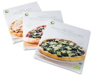
Many of these branding elements are evident in the Green Way frozen pizza line. The pizzas are natural, organic foods that are packaged in recycled paperboard that has 80-percent post-consumer fiber. Simple language is used to describe the pizza; ample white space is employed to offset the text; beautiful photography is used to emphasize the natural beauty of the simple ingredients; and three nutritional facts are highlighted on the front of the package.
While the product and its packaging aim for simplicity in design, both are targeted at consumers with sophisticated tastes. In addition to the high-end photography featured on the pizza's packaging, there's elegant type treatment with copy in both realist san serif fonts and a font with light serifs with varying stroke widths. The pizzas are imported from Eat Better s.r.l., a contract food manufacturer and packager in Modena, Italy that makes the pizza according to the Neapolitan tradition.
“There are rules in Italy for what makes a real Neopolitan pizza, a pizza from Naples,” Ivan Manfredi, sales manager for Eat Better, explains. “There's even an association in Italy that dictates what three things makes a real Neapolitan—real Italian pizza: The dough must be made without preservatives and must be raised for at least 24 hours; the dough also must be stretched by hand; and the pizza must be baked in a wood-fire oven.”
Using simple ingredients, Eat Better mixes and kneads pizza dough daily. The prepared dough is cut into balls and dusted with a fresh layer of flour before being placed in a humidity-controlled room to proof for 48 hours.
After the dough is leavened, it is kneaded again into balls with additional flour and left to proof for two more hours. To prepare the balls of dough for hand stretching, they are first mechanically pressed. But the final stretching of the dough is done by hand. “When you make raised pizza dough, you are creating bubbles of gases inside the crust,” Manfredi explains. “If you press only by machine all the bubbles disappear, of course, because you push them out. If you press by hand, you don't ruin what the leavening—all the results from raising the dough for two days. You can see the difference when you look at our pizzas and other organic pizzas—our crust is totally different.
The dough is covered with a tomato-based pizza sauce before it is conveyed onto the stone tiles in a wood-burning oven made of firebricks. “The wood gives the pizza a certain flavor,” says Manfredi. “A little smoke and the way they're cooked makes them taste much better.”
The pizzas are treated with UV rays as a food-safety and quality measure. Cheese and other toppings are added to the pizzas before they are cooled in a refrigerated cell and then are flash-frozen at -30 to -35 deg C for 25 to 30 minutes to achieve a biologically critical control point equal or less than a core temperature of 18 deg C. The pizzas then undergo metal detection as well as an additional UV treatment before being shrink-wrapped.
Standards and packaging
Eat Better sources the package printing for its customers, including A&P, which sends the artwork via CD to the copacker. Because the copacker adheres to the USDA National Organic Program's guidelines, A&P is able to both identify the product as organic with type and use the USDA Organic seal on the front of the paperboard carton
The copacker has the cartons printed locally in Italy and delivered as flats. Eat Better mechanically forms the cartons, into which the shrink-wrapped pizzas are placed. Filled cartons are sealed with hot glue. In accordance with the A&P aim of transparency with product and packaging information, filled and sealed cartons are coded using open date codes. This type of coding uses calendar dating versus proprietary codes that consumers may not understand.
The cartons are mechanically case-packed, and the packed cases are labeled with pertinent information such as the batch number, the pizza variety and date codes. A robot is used to palletize the cartons and wrap the pallets.
Good first impressions
A&P reports that in-store demos of the private-label pizzas have been received well. “Customer feedback is overwhelming,” remarks Palmer.
Source of pride
It also has become a source of pride for A&P's co-manufacturer and packer. “When people realize that we are the producer of A&P organic pizza, they give us compliments because they really like the product,” Manfredi remarks. “The product now is doing very well. I think we're selling around 20,000 pizzas every five weeks, which is very good.”
Manfredi credits the successful launch to the product, the packaging and the relationship Eat Better has with A&P. “Working with A&P is very nice, because they are open to new product ideas,” says Manfredi. “Whenever we want to present a product idea, A&P is always available to listen to us and give us the opportunity to arrange a big meeting with 10 people testing our product. Not all of the time are the product presentations successful. But the opportunity to present something is special, because not all of the supermarket chains in the U.S. are so available to listen—especially when you are from another country and maybe don't speak the language that well.”
Eat Better says that it hopes the success of the Green Way frozen pizza line will help it pave the way for its other organic, Italian foods onto A&P store shelves.
More information is available: |
united* dsn, 917/267-2857 . www.uniteddsn.com |
Eat Better s.r.l, 39 059 439 6459. www.eatbetter.eu |
About the Author(s)
You May Also Like


