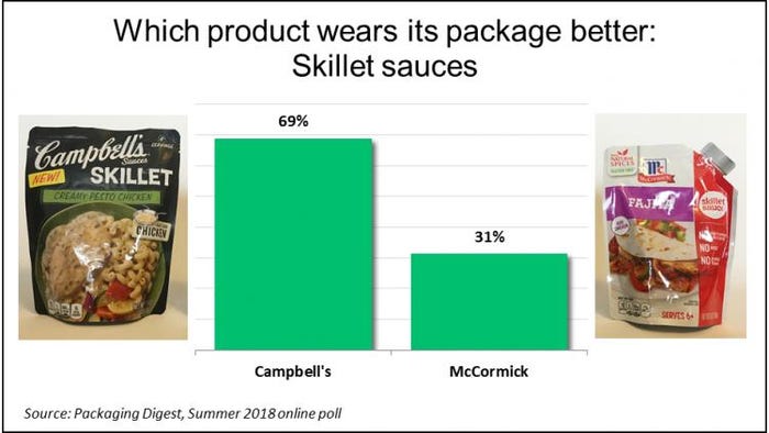
To cook a tasty hot dinner during the summer without using the oven and heating up the house, many people use their stovetop instead. And sauces in a pouch make it super convenient for cooks to prepare their favorite skillet meals. But we were curious…between two major brands, Campbell’s and McCormick, which flexible package has the more appealing design?
During six weeks in June and July 2018, 64 packaging professionals told us which of these two skillet sauce brands wears its packaging better, and why, in the most recent installment of the popular Packaging Digest Who Wore It Better series.
The vast majority (69%) chose the taller, wider, darker Campbell’s pouch; with the minority (31%) opting for the smaller and brighter McCormick package.

Descriptions of the packages
Before we share respondents’ comments on why they selected the package they did, here’s a short description of the packaging for each product, which survey takers read before voting.
Both products are packaged in a stand-up pouch but with some significant differences.
The Campbell’s pouch holds 11 ounces, which is 4+ servings. It stands about 6-3/4 inches high and sold for $2.50 (2 for $5 special at my local Jewel grocery store). The surface is a combination of gloss and matte; graphics on both sides are in full color. The bottom gusset is clear. Notches on either side at the top indicate where to tear open the pouch, which was fairly easy to do.
The McCormick pouch holds 6 ounces, which is enough for 6+ servings. It stands a bit higher than 6-1/4 inches and sold for $1.50 (2 for $3 special at the same Jewel). The surface is the same everywhere: glossy. It too uses full color on both front and back; but the bottom gusset uses white film, so the consumer cannot see the sauce. The McCormick pouch has an easy-tear corner in the upper right, which also acts as a pour spout to direct the sauce into the skillet.
Neither package is reclosable because the product is designed to be used all at once. Despite telling survey participants this in the packaging descriptions, several respondent comments showed they were clearly influenced by reclosability (more on this below).
Both brands include directions on the back. Campbell’s also has images with its instructions.
“Best By” dates are both on the back at the bottom. Campbell’s code looks like it is inkjet and the McCormick code looks like it is laser etched.
Both pouches are merchandised in shelf-ready corrugated trays (see above). McCormick’s continues the red color scheme; Campbell’s goes with white-on-black printing on the tray. We showed survey respondents pictures of the products in their trays on the store shelf for the first time in the Packaging Digest Who Wore It Better series (most stores do not allow pictures to be taken but I did it quickly and got away with it). Based on some of the comments, showing the secondary packaging did make a difference in how some people voted.
McCormick��’s pros and cons
Most of the people who chose the McCormick pouch as their favorite cited ease of use of the corner spout. But other benefits were mentioned too.
“Smaller size.”
“Unique flexible packaging design.”
“McCormick is 100% foil with no window and nearly zero oxygen transmission. Also has a tear-able pour-spout design.”
“McCormick pouch is more visually stimulating. Although it’s a tear corner, it gives the appearance of a directional cap/spout, both differentiating in appearance as well as function by providing more directional pouring from the top corner of the spout. Overall, more unique and premium. Nice execution by McCormick.”
“I like the side pour: It is easy to open and less mess.”
But a couple people who picked the McCormick design still had compliments about the Campbell’s package:
“I like the look of the Campbell’s but the price-to-serving ratio made McCormick the one I would likely purchase. Also, the spout on the side of the McCormick seems like it would be better at directing the sauce into the pan.”
“Easy pour spout, emphasizes that it contains no high fructose syrup or MSG or artificial colors—all things I think would be in a pre-made sauce. I do like that you can see the product at the bottom of the Campbell’s Sauce.”
Winning features of Campbell’s
Packaging professionals taking this survey especially appreciated being able to see the product through Campbell’s clear bottom. But their praises were also quite varied when asked why they opted for the package.
“Campbell’s stands stable with radiused bottom edges. Clear bottom. Illustrated directions.”
“More premium look, transparent base.”
“The matte finish of the Campbell’s pouch makes the text and graphics more visible and readable from a distance when on the shelf. The Campbell’s pouch seems to stand up better and not appear as wrinkled as the other, thus again enhancing the product presentation.”
“The artwork is simple yet attractive, the food shot catches my attention first. It is easy to find the variant that you’re looking for because of the clarity of the food shot. The transparent bottom gusset adds value, as customers nowadays wanted to see the real contents of the product before buying.”
“The clear bottom on the Campbell’s allows the consumer to see the product. Also, the picture images on the cooking directions makes it seem simplistic to use.”
Some respondents who were smitten with the Campbell’s pouch also criticized the McCormick package for what they saw as failings.
“Campbell’s package and design are minimal and straight to the point. McCormick package is an extra useless layer of manufacturing. The design and graphic elements are hideous. That red gives the feeling like if it is ready to be drank like a juice.”
“Superior graphic design. I immediately know that skillet sauce is in the Campbell’s pouch whereas the the McCormick pouch has competing messages. Fajita is the first thing I see. On the shelf I still look at the pouch first, even though it says ‘SKILLET SAUCE’ on the cardboard, that’s not what I see first. The Campbell’s pouch and box is more visually pleasing and balanced in general.”
“Campbell’s leads with a more elegant appearance, based on the color and simplicity of the graphic approach. The McCormick front panel is too busy focusing on various free-from claims to leap off of the shelf. Aside from the pouch, the Campbell’s case pack adds value (emphasis on ‘easy’) while the McCormick case repeats the effort to ID the product, without anything to draw the consumer in.”
“Bigger, no-border pictures are more appealing. ‘Easy Dinner’ carton text is a better draw for me. McCormick package shows crumples too clearly.” (In McCormick’s defense, flexible packages are hard to photograph and I am not a professional photographer. My apologies for not doing a better job showing the McCormick pouch at its best.)
Reclosability confusion
As mentioned above, some respondent comments showed confusion around the issue of reclosability, even though both products are supposed to be entirely used all at once.
People who preferred the Campbell’s package said:
“Easier to empty the pouch. Reclosability would not be the necessity for this application so that I do not see any benefit to chose that which also make it more difficult to completely empty the pouch and reduce the volume of waste.”
“Packaging is single use so you do not need a pour spout with cap! Just make it with less packaging. The pictures and graphics may be more useful for people [who] don’t read or have a language barrier.”
“Campbell’s has a better shelf impression with the color, graphics and package. Don’t know what direction McCormick was going—showing a reseal closure on a tear-off?”
“I like the see through bottom and it just looks classier. I do like the pour spout on the McCormick, but as you pointed out, it is a single-use product anyway.”
Respondents who favored the McCormick pouch said:
“Campbell’s has more eye appeal, but McCormick offers more front panel information, and pour spout, that is easier to reseal without contamination—ease of use. Thus, McCormick.”
“More servings, Gluten free, no MSG/corn syrup/artificial flavors, looks easier to pour & clip side (for storage).”
And so we conclude another installment of Who Wore It Better. What products or categories of products do you think we should look at next? Please comment below. Thank you!
********************************************************************************
Packaging solutions come to Minneapolis: As part of the region’s largest advanced design and manufacturing event, MinnPack 2018—and the five related shows taking place alongside it—brings 500+ suppliers, 5,000+ peers and 60+ hours of education together under one roof. Register for free today.
About the Author(s)
You May Also Like


