Designing packaging for elderly consumers can be a balancing act, with two of the most important design elements—text legibility and package size—at odds. The tension is especially noticeable in food, beverage, prescription-drug and over-the-counter (OTC) pharmaceutical packaging.
Causing the conflict is the need for both small package sizes and on-pack text that older consumers can read, despite their diminished eyesight. Happily, this issue can be solved with a little creative thinking.
There are reasonable arguments for offering elderly consumers smaller food and beverage packages, including single-serving packs. Many of these consumers live alone or in smaller households than when they were younger. They also may be watching their portion sizes for health reasons.
Smaller food and beverage packs offer elderly consumers the advantages of portion control, convenience, freshness and reduced waste. However, the smaller the package, the smaller the canvas for product information and branding.
Prescription medications and OTC products, by their nature, usually require small packages. They also require federally regulated on-pack information, and often there is so much requisite information that a small font size must be used. However, if the type is too small for consumers to read, they may be putting their health at risk.
At the grocery store
One way around the small-font problem is to make photos, illustrations and other graphic elements do the talking.
For food and beverages, especially those positioned as better-for-you, “you’re seeing pictures of the fruit and vegetables that are contained in the product. Those images are very reassuring to people, and especially the elderly, knowing that there’s something in the product that’s good for them. And it’s not small type, which can be incredibly frustrating,” says Tony Bash, vp of sales-beverage at LiDestri Food and Beverage.
Bash adds that “badges” are another high-visibility way to communicate that a product is, for example, all-natural, kosher, low-fat or low-salt. Badges include trusted seals, such as the American Heart Association (AHA) Heart-Check mark and the USDA Organic seal. Badges can be used on a food or beverage package of any size.
A badge is “something apart from the nutrition panel, which is often difficult to read,” Bash says. “A badge can run along the bottom or top of a package or down a spine, and you can see at a glance that the product has two grams of sugar, it’s a 12-oz bottle, there’s no fat in it and it has the organic badge.”
Another tactic is to make the ingredients panel larger, he adds. “We are all doing that, in the food industry, but I think the use of badges and call-outs is a better way to do it for the elderly.”
LiDestri’s Francesco Rinaldi pasta sauce labels are printed with badges and call-outs that vary by stock-keeping unit (SKU). One of the labels sports a gluten-free badge, AHA Heart-Check mark and life’sDHA logo, plus call-outs flagging “Reduced Sodium,” “No Sugar Added” and “FORTIFIED with 32 mg DHA OMEGA 3 per serving.” Note the capitalized words, which draw shoppers’ attention and also make the call-out easy to read.
Bash will share his thoughts in a presentation, “Millennial and Aging Populations: Innovating for Essential Markets,” at PhillyPack this fall. His presentation will be on Oct. 7, 2015, from 10:30 to 11:00 a.m.
Prescriptions and OTC
A different approach is needed for prescription and OTC packaging that’s used by older consumers. In some cases, it may be enough to revamp font styling and sizes on these packages, or to add an expanded-content (peel-and-reseal or booklet) label to the bottle or vial. Other times, digital technology linked to the package may be necessary to convey important information.
Of the various tactics to render text on small packages more legible for the elderly, “making the font larger is an obvious one,” says Jennifer Long, an optometrist, Certified Professional Ergonomist and founder of Jennifer Long Visual Ergonomics in Australia. Using all-capitalized letters may also be helpful in some cases, as the Francesco Rinaldi label illustrates.
“Maximizing the contrast is definitely good,” Long adds. “For example, black on white, dark blue on white. Also making the font bold. Color combinations to avoid are red/green and red/blue, as it is difficult to focus on these two colors simultaneously, even for young people. Also avoid color combinations that have similar contrast, like brown on yellow.”
Another approach is to use digital technology to make product information more accessible. This could take the form of an on-pack quick-response (QR) code that takes the consumer to a website with product information.
“When viewed on a digital device, it could be viewed as a larger size,” Long says. Or “the information could be made into an audio file, which is read to the person.”
For prescription drugs, pharmacists can counsel patients face to face, explaining medication dosing and side effects. “When you pick up your package, there’s an opportunity for them to communicate to you in simple language—what are the concerns, and what are some of the best practices when you’re taking this medication,” says Blake McGowan, managing consultant and ergonomics engineer at Humantech Inc.
Pharmacists can also make sure the instructions on a prescription’s primary package are printed legibly and without unnecessary verbiage. A simple directive to take one tablet by mouth once daily, printed in black ink on a white label in a large, easy-to-read font, is both comprehensible and readable.
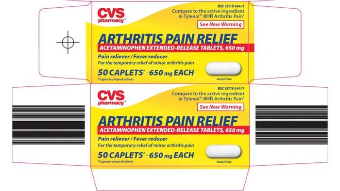
On some OTC packages, the best bet is to highlight the ailment the medicine treats rather than the brand or type of product. Elderly consumers may not know the difference between aspirin, acetaminophen and ibuprofen, “but they know ‘pain relief,’” McGowan explains.
“A lot of companies are starting to transition their packaging to the very simple—white background, black words, big letters that say ‘pain relief,’” he says. This gives “that older person the ability to identify the outcome they’re looking for from the packaging. It’s not the brand name or the product name, but the outcome.”

Highlighting what an OTC pharmaceutical does rather than what it is—“Arthritis Pain Relief” rather than acetaminophen, for example—helps older consumers choose a product that will provide the benefit they are looking for.
Kate Bertrand Connolly is a seasoned freelance writer based in the San Francisco area covering the packaging, food and technology markets. You can contact her at [email protected].
About the Author(s)
You May Also Like


