

Sign up for the Packaging Digest News & Insights newsletter.
2 Min Read

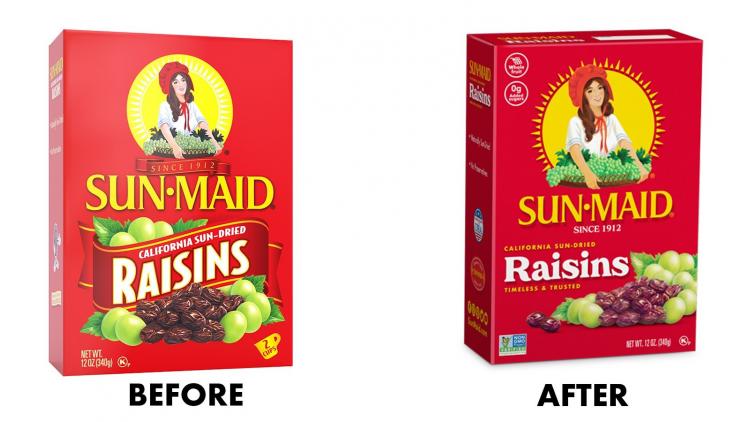
Sun-Maid's new graphics are rolling out across products, packaging formats, and the country.
Sun-Maid hopes to attract Millennial consumers with a packaging and logo redesign that modernizes the brand’s look and feel while preserving the brand iconography familiar to generations of shoppers. It’s the brand’s first pack redesign since the 1970s.
The new packaging design, which is being executed across the company’s full line of products, emphasizes simplicity and transparency. The new logo includes modifications to the sunrays behind the “Sun-Maid girl” and subtle changes to the figure herself.
Refreshed graphics on the food packaging include callouts that highlight better-for-you features such as “Whole fruit,” “0g Added sugars,” and “Good source of fiber.” The Non-GMO Project Verified seal also appears on the front of the packaging, plus the USDA Organic seal, on eligible products. Package structures include paperboard cartons and canisters and reclosable pouches.
The design updates the 108-year-old brand while preserving both the Sun-Maid brand identity and consumers’ nostalgia for it. Harry Overly, president and CEO of Sun-Maid, discusses the redesign in an exclusive Packaging Digest Q&A.
When did the redesign start to roll out?
Overly: We started the redesigned packaging with our Vanilla and Chocolate yogurt six-packs, which were on shelf in December [2019]. The rest of the portfolio packaging followed and started hitting shelves in January 2020.
The first Sun-Maid products to launch in the new packaging were the brand’s top stock-keeping units (SKUs). Which products are these?
Overly: Our California sun-dried raisins in various pack types, Golden Raisins, Zante Currants, yogurt-covered and Sour raisin snacks are among our top SKUs that just hit shelves mid-April. Products with the refreshed design will continue to roll out nationally throughout 2020.
How many products will be packed in the refreshed package design?
Overly: Consumers will see the Sun-Maid refreshed design on our 25-plus products.
Was this solely a graphic redesign?
Overly: Yes, this was solely a graphic redesign, with additional logo and packaging callouts.
The pouch is a newer package format. Will we see this for more Sun-Maid products?
Overly: We are not doing away with the iconic little red box; however, we are putting more products in the pouches because consumers tell us it’s convenient for their snacking needs.
Did Sun-Maid redesign the packaging graphics, or did you work with a design firm?
Overly: We worked with our creative-agency partner, Quench, based in Harrisburg, PA, on this redesign. They’ve played a major role in our ongoing efforts to better appeal to Millennials.
How have consumers, especially Millennials, responded to the redesign?
Overly: Shoppers have started to notice the change, and it’s been positive so far. We know, from research, that Millennials appreciate the clear labeling and understand the benefits of eating raisins and whole-fruit-based snacks. We redesigned based on consumer feedback and chose to keep the design simple and modern.
About the Author(s)
You May Also Like


