March 11, 2015
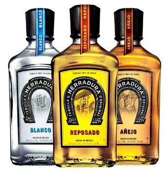
 Tequila Herradura will be introducing new primary and secondary packaging developed to highlight the brand’s ultra-premium, hand-crafted authenticity. The revamped Blanco, Reposado and Añejo packaging will be seen on U.S. store shelves and in restaurants and bars this summer.
“For the past 140 years, Casa Herradura has been at the forefront of the tequila industry and has been recognized for its innovations with 16 gold medals in taste and quality. In our commitment to Herradura’s place in the market as seriously great tequila, the new packaging reflects the confident and refined personality of the brand and our consumers, whose appreciation of quality spirits separate them from the casual tequila drinker,” said John Hayes, brand director for Casa Herradura tequilas. “By embedding images from our heritage into the new design, we are extending an invitation for our consumers to join us in celebrating Herradura’s rich history and tradition.”
Designed by the Brown-Forman Design Group in conjunction with Duffy & Partners, a brand design company, the new Tequila Herradura packaging incorporates key elements from the brand’s story. Prominently placed on the brighter-hued front label is a larger, more realistic horseshoe, herradura in Spanish, encasing the Casa Herradura crest. Imagery from the Hacienda located in the heart of Mexico’s tequila region is also displayed in the front and back of the square bottles, a reference to the all-natural, hand-crafted and estate-bottled production process followed to create the brand’s various expressions. In addition to the updated labels, the new all-black closures of the bottles and colored ribbons that differentiate the Blanco, Reposado and Añejo expressions help unify the line extension.
The new secondary packaging and shipper cases perfectly align with the bottle designs, utilizing the same bold colors, images from the Hacienda and super-sized horseshoe. On the single-bottle boxes, the black herradura is wrapped around its corner; when positioned correctly next to another box, a complete horseshoe is displayed, reinforcing the brand presence in off-premise accounts.
A national advertising campaign developed by Draftfcb-Chicago, which includes print, out-of-home, point-of-sale and online elements, will support the introduction of the new packaging. Playing off of the lucky charm connotation of the horseshoe, the ads feature the tag line “Good Fortune Awaits,” aiming to establish a conversation with those who rely more on tradition and perseverance than on luck to reach their potential.
Though the look of the iconic square bottles has evolved, the ultra-premium taste and aroma of Herradura will continue to be produced according to the standards set by the distillery’s founders, Ambrosio Rosales and Aurelio López, in the 1800s, including the use of clay ovens and naturally-occurring yeast.
Source: Casa Herradura
You May Also Like


