Sign up for the Packaging Digest News & Insights newsletter.
David Bellm
March 11, 2015
1 Min Read
.svg?width=850&auto=webp&quality=95&format=jpg&disable=upscale "Tide redesigns packaging for cause")
 I’ve talked before about Tide detergent as one of the all-time iconic packaging designs. And like most iconic designs, one of the ways it got that way was just by not changing much – or, more accurately, being a strong enough design that they don’t have to change it hardly ever.
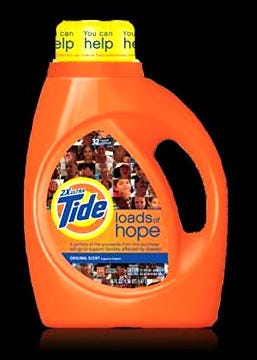
Well, Tide in this one relatively rare instance has redone its packaging significantly. But it’s not just a response to branding pressure or to try to ditch their old look. Rather, the familiar orange package was altered for a charitable cause – Loads of Hope, a campaign created by the brand and parent company Procter & Gamble to support disaster relief efforts.
Appropriately, the new Tide design is said to feature photos of people who have suffered through disasters – Hurricane Katrina, for instance – and have been helped by Tide’s aid programs.
Nice. A good-looking package for a good cause.
Read more at CreativeMatch.com
.
About the Author(s)
You May Also Like


