Informa Markets – Engineering, owner of the popular PACK events, unveils a comprehensive rebrand for the 2021 WestPack event in Anaheim, CA.

Packaging redesigns happen fairly frequently to keep brands current with consumers. Well, the same strategy applies to packaging-related events, too.
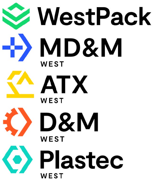
The nation’s leading advanced manufacturing event — comprised of WestPack, ATX West, D&M West, MD&M West, and PLASTEC West, plus the recent addition of the Cannabis Packaging Summit — has unveiled a new logo as a part of an extensive rebranding initiative that closely unifies and aligns the co-located events.
Produced by Informa Markets - Engineering (the Informa division that oversees Packaging Digest), the flagship event that has served as the annual meeting place for the packaging, automation, design and manufacturing, medical, plastics, sustainability, and product development communities for the past 35 years will display its new logos at the 2021 in-person event taking place August 10-12 in Anaheim, CA.
The rebranding, which includes the first logo redesign since the inception of the co-located event in 1985, simplifies the look and feel of the show brands and signifies continuity across each of the carefully cultivated brands.
Here is more about what the rebrand represents for the show and community.
Why change the branding?
The event logos that we know and love have been around for decades, so we were definitely due for a re-branding. We needed to simplify the branding and align the five co-located events to have cohesive designs that fit together and visibly illustrate that this is one mega-event.
This change is more than just about look and feel, color of icons. It’s a new era for Informa Marketing – Engineering (formerly UBM/Canon Communications). We want to make sure that we continue to support and build momentum across the industry for the largest advanced design and manufacturing event in North America. As reflected with the arrows in our branding, we are here as an event and platform to continue to move the industry forward.

What does the new look signify?
The new look closely reflects where we’ve come from in terms of icons, but there is more alignment and symmetry to them as one identifiable brand. We’ve used the same font across all show brands, with the variation on the color and icons for each brand. The blue medtech cross for MD&M West; the orange cog in D&M West; the yellow robotic arm for ATX West; the aqua polymer in PLASTEC West, and the green box outline for WestPack.
The biggest change we’ve made is with WestPack — going from red to green. We knew this was an important decision. Green represents sustainability, which is becoming more pertinent across all industries including packaging, not to mention that we are pleased to take the inaugural Cannabis Packaging Summit into its second year in 2021.

What else is in store for the 2021 event?
We are focusing on quality across the board — from content, to exhibitor support, to increasing the number of decision-making attendees coming to the 2021 show. The IME West team is diligently working on making sure we align the attendee needs with our exhibitor categories. You will see more focus on 3D printing in 2021, as this is our number one attendee area of interest. We look forward to sharing more information at the start of next year!
About the Author(s)
You May Also Like


