March 11, 2015

CooperVision rebrands, launches ‘vivid’ visual identity
CooperVision, a leading global contact lens manufacturer, has unveiled a vivid new brand identity. Global strategic branding firm Siegel+Gale collaborated with the company's leadership to develop a brand platform and new visual identity that position the company for continued growth, and improve recognition of CooperVision around the world.
The new brand platform challenges industry conventions and captures CooperVision's true spirit. After extensive research, Siegel+Gale developed a new brand promise for CooperVision. The promise, "We bring a refreshing perspective that creates real advantages for customers and wearers," helps employees and customers understand the real point of difference the company is making. The statement references the unique approach and perspective CooperVision brings to the business of contact lenses and celebrates the optimism and enhanced lifestyle that contact lenses provide.
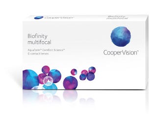
This refreshing perspective spawned a visual expression that clearly defines what makes the company unique and valuable. The new brand identity is based on a vibrant spectrum of colors that balances fluidity and technology. Visually represented through a beautiful array of watercolors, the new design offers an original and unexpected take on the concept of moisture. It provides contact lens wearers with a celebration of the beautiful, vivid world they can enjoy in CooperVision lenses and crafts a narrative to tell the CooperVision story.
"We understand that no two eyes are alike, and that every contact lens wearer and customer is unique. Our brand promise and visual identity needed to represent that to the market," says Lisa Fawcett, vp of global marketing for CooperVision.
"Our new brand promise, our purpose, our values and our visual expression capture this sentiment, and signal our momentum that has been building over the past few years. It also communicates our unique approach to contact lens development and production," says Jeff McLean, evp of brand development and strategy for CooperVision.
"This surprisingly refreshing perspective breaks away from the conventional and creates a genuine connection between the eye care practitioner, the contact lens wearer and the CooperVision brand," says David Srere, co-president and CEO, chief strategy officer at Siegel+Gale. "CooperVision thinks differently. It provides creative solutions to customers. Through our collaboration with CooperVision the brand now reflects that truth."
Source: Siegel+Gale
PACKAGING DIGEST EXCLUSIVE FOLLOW UP:
Mary Reed, senior director, global web strategy & marketing communications, explains more about a key element of the package design: the "watermark" logo.
"Our new look perfectly expresses how we see the world: as a vibrant, ever-changing place where no two things are alike, but all things are part of a vivid, fluid whole. The watermark represents the art and beauty of the eye and the precision of the CooperVision logotype signifies the science involved in creating contact lenses.
"Our new visual identity distinguishes CooperVision in the marketplace. The vivid colors and fluid nature of the design perfectly express our perspective that the world is a vibrant, ever-changing place and that no two people see things in the same way. The new identity is a balance of precision and fluidity. It's sophisticated and infused with energy. Each watermark is slightly different and reinforces CooperVision's unique, flexible and refreshing approach. When we use this extraordinary new palette of colors and shapes, it supports our distinctive offering to the market and demonstrates to our customers and wearers that we understand their unique needs."

CooperVision watermark logo
.
About the Author(s)
You May Also Like


