December 19, 2018

Bryce Rutter
It’s hard to imagine why any of us would not comply with the prescription from our doctor. After all, we initially went to the doctor to help treat our health issues. But then we veer off the path of taking medications as prescribed, only to return for a follow-up visit to lie about our behavior and complain that nothing helps.
Compliance is a complicated concept from the user’s standpoint. There are three fundamental requirements to consider in device and packaging design that leads to not only compliance but to preserving the user’s experience and dignity rather than dwelling on the emotional effects of dealing with their ailment or disease.
Let’s unpack why compliance is so tough from the patient’s point of view.
1. It must consider how humans are built.
Everyone has been the victim of impenetrable blister packs that are impossible to get into without some type of tool. Through extensive ethnographic research, the most commonly used devices to pry open or penetrate the package are pens, a knife from the kitchen drawer, and screwdriver or corkscrew. Thousands of users have reported injuries through the Centers for Disease Control and Prevention from trying to get into these failed package designs. Poking themselves with the tool or nicking their fingers on an exposed sharp plastic flange from the packaging is far too common and unacceptable.
In the pharmaceutical and medical fields, too many autoinjectors require six fingers and the strength of an Olympic athlete to use the product effectively. Buttons that are too hard to press, a product shape that is awkward to handle and does not allow the user to easily target their injection site, and underdosage due to use errors and poor technique are all frequent mishaps due to the device’s bad design.
Good design considers user capabilities. First and foremost is the concept of physical fit. For example, people with diabetes experience neuropathies that dramatically dampen tactile feedback, and as a result, any clicks that should be felt need to be amplified for their sensibility. People experiencing rheumatoid arthritis commonly possess only 5% to 25% of the hand strength compared to a normal, healthy hand. Users with neuromuscular disorders, such as multiple sclerosis, have issues with tremors that impact targeting and control over the injection site, meaning two-handed use must be considered in the design to stabilize the dominant hand in targeting and injecting.
To make matters more challenging, designers need to overlay that most people using autoinjectors (and the like) skew older. Through the natural course of aging, this introduces further complications of reduced vision, coordination, control, skill, and, in many cases, a slowing of cognitive processing.
Usability is all about designing devices, products and packaging that fit the way users think, feel, see and behave. Good design means that the impact a disease or ailment can have on user hand function, vision and state of mind are taken into account. This also includes variations in hand size, strength, range of joint motion and haptic abilities from 5th percentile female to 95th percentile male, hand-eye coordination and the acoustical signatures that packaging may provide as cues to reinforce proper usability.

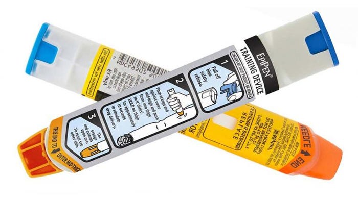
For example, the industry standard EpiPen does not set a high bar for ergonomic design. While its 3-Step Instructions for Use are effective, the handling is not quite right. It needs a good “handshake.” The oval body needs texture on its lower one-third so it engages with the fingertips for traction. The fussy tamper-evidence plastic covering the injector site is tedious and time consuming. And, it should provide a 10-millimeter wide by 15mm long perforated fingertip pull-tab to optimize fingertip pull strength.
2. Read the instructions, please.
Instructions-for-use (IFU) represent a significant opportunity for improving compliance. Users are routinely confronted with IFUs that use a typeface that is too small to read, are printed on a high-gloss substrate that introduces contrast and glare issues, and/or list too many steps to follow. So, it is no surprise that people struggle with reading instructions, get lost in an extended list of steps, and are often confronted with ambiguity. One thing is for sure with human behavior, only when everything else fails do people go and read the instructions.
IFUs must be designed in a way that segments information so the user can digest the content bite by bite. For decades, research has shown that once a user surpasses seven chunks of information–think telephone number or license plate–their ability to process and retain information dramatically diminishes. The design of IFUs can easily take advantage of this known fact by creating steps and sub-steps that allow people to easily navigate this cognitive labyrinth.
A best practice is to have five steps or less before subdividing within each one. And within each step, there should be a maximum of five sub-steps. Minimizing glare and contrast is easy to solve by adjusting the color and brightness of the substrate background or selecting a more matte paper stock. It is important for designers to know that many users over the age of 45 struggle with high contrast and, in many cases, use eyewear.
There exists a classic debate with IFU designers about the use of embedded photographs versus illustrations versus words alone. Make no mistake, words alone are not effective enough.
While photographs may intuitively seem most effective because they show the user the real situation, they include extraneous visual information that distracts from the fundamental point trying to be made in that step. The most effective strategy is to use clear and succinct copy with illustrations that specifically focus on and emphasize the behavioral outcome needed for success, removing all other visual noise.


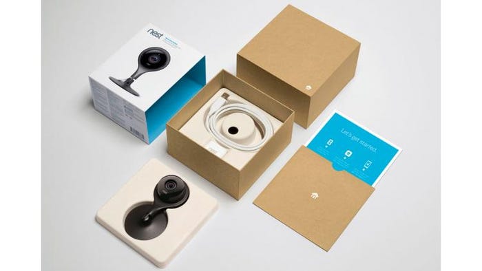
For example, pharmaceutical companies need to take a page out of consumer electronics packaging where each and every touch point, from product and packaging design through to its digital fingerprint, consider how things sound, feel and look. Top: Nest does it best with exemplary packaging design. Bottom: A typical in-home setup for self-injection that looks more like a messy chemistry experiment.
3. Preserve dignity with emotional design.
Although tangible and physical design elements directly impact compliance, one of the most difficult factors of compliance is to design for dignity. Bad design, whether it be lacking in physical or aesthetic qualities, directly impacts user perception of their own health status, which in turn, influences their behavior. For example, test kits that appear more like chemistry sets or backbench lab experiments project complexity and fear in the user.
When things look unapproachable, users shun them, and in this paradigm, compliance drops because users want nothing to do with anything that looks scary, complicated or uninviting. The last thing users want to be reminded of is that they are sick and in need of care.
It is the responsibility of anyone involved in the design of healthcare packaging, products and devices to create solutions that do not erode the user’s sense of self-worth and remind them of their ailment or disease state. Dignity is a right of every human being, not an optional feature.

For example, 95% of the things people do every day is done with their hands. Good design is simple, intuitive and accommodates for variability in hand sizes, strength and reach. Because older hands lose dexterity and strength, they are the bar for usability and design. Based on knowing that, whatever they can do, healthy hands shouldn’t experience any problems with.
4 ergonomic packaging design tips
Designing for compliance is not complicated, but it does require traditional pharmaceutical manufacturers to rethink their manufacturing- and clinical-driven approach to device and packaging design—and adopt a user-centered design strategy. Designers need to consider how the user will interact with the product to fully grasp its functionality.
As you develop your pharmaceutical and medical device packaging, keep these four design tips in mind:
1. Integrate physical design qualities that impact fit and performance.
2. Understand the effects that illness or disease states have on a user’s ability to use their hands and obtain relevant feedback.
3. Embed ergonomic features that facilitate intuitiveness and ease-of-use.
4. Use functional aesthetics to guide user behavior by manipulating product form, texture, color and sound.
These fundamental tenets of good design directly impact a person’s conscious and unconscious willingness to comply with their doctor’s prescription and, when doing so, are not reminded of their compromised health. The most potent antidote to compliance is a user-centered design that projects an uplifting state of mind and reinforces a strong quality of life.

Bryce Rutter, Ph.D., founder and CEO of Metaphase Design Group Inc., is an expert in ergonomic design and a leading specialist in hand-intensive product and packaging design. His work includes collaborations with numerous global prestigious brands and high-profile start-ups on products ranging from robotic surgical systems, powered and manual instrument design, and drug delivery systems to disposables, mobile and wearable devices to personal care products, instructions for use (IFUs), and usability and contextual inquiry research programs. Under Rutter’s leadership, Metaphase has received more than 120 international design excellence awards and 117 patents. Email him at [email protected].
You May Also Like


