January 29, 2014
It is said that change is the only constant. At Clearly Canadian Beverage Corp., Vancouver, BC, this attitude has become a linchpin of the company's marketing strategy over the last several years, after a change in the packaging for its flavored sparkling water line in 2000 resulted in a wellspring of consumer interest. "We were so terrified of changing our packaging and refreshing it, that we didn't do it strongly enough," says Jonathan Cronin, vp of marketing for Clearly Canadian's U.S. subsidiary, CC Beverage (U.S.) Corp., Burlington, WA. "When we did finally make the move to new packaging, it was such a radical transformation, that people really responded to it."
From a blue-tinted, raindrop-shaped bottle with subtle graphics on clear, pressure-sensitive labels, Clearly Canadian® sparkling water packaging evolved to a slim, tapered bottle with bold, colorful full-body shrink-sleeves (see PD, April, '00, p. 4). After eight months on the market, the redesign was deemed "a tremendous marketing success," by the company (see PD, Oct., '02, p. 58). Said Mike Duffy, operations manager for the Burlington production facility, at the time: "We've been running a double shift all summer and still can't keep up with demand."
Now, having learned the lesson that growth in the highly competitive alternative beverage category depends upon change, Clearly Canadian has once again re-energized its packaging. Working from the basic template used for the '00 label, the company drew from the talents of Karacters Design Group and the expertise of label converter Seal-It, Inc. to launch bottles bearing vibrant, multipatterned labels that have once again caught consumers pleasantly by surprise.
Change begets change
As introduced in '00, the packaging for Clearly Canadian sparkling water is sleek and simple. Supplied by Owens-Illinois, a proprietary 14-oz cylindrical, clear-glass bottle that tapers at the top conveys the product's natural origins and simplicity. Topping the bottle is a bright-silver, 28-mm roll-on aluminum cap from Silgan Container Corp. The pi?ce de r?sistance, however, is a full-body polyethylene terephthalate glycol (PETG) shrink-sleeve label, converted by Seal-It. Originally, the gravure-printed labels offered subtly patterned backgrounds of red, blue, green, etc., depending on the flavor variety, with a large opaque swath across the front that bore the product name and a stylized bubble graphic.
The idea for a complete revision of the nearly new Clearly Canadian label graphics, recalls Cronin, came as the company was planning to establish a new flavor, Orange Pineapple. For years, the company had relied on the introduction of new varieties to generate consumer interest. However, the impact of the recent packaging launch could not be ignored. "So we thought, while we're at it, why don't we refresh the graphics for the whole line," recalls Cronin.
This involved label changes for all existing flavors–Blackberry, Cherry, Grape, Peach, Raspberry Cream and Strawberry Melon–as well as a design for the new Orange Pineapple flavor. In addition, the packaging would be extended to a completely new product from the company, Lemonade, which is the first non-clear Clearly Canadian beverage.
Karacters Design Group of Vancouver, which created the original label design, "was quite excited to do something so quickly to update the design they'd done so recently," says Cronin. The challenge was to retain the structure of the original design, while making it considerably different from its predecessor. The result is a line of eight different labels offering abstract designs reminiscent of the '60s in colors that complement the flavor varieties. Spires, scribbles and circles in purple, red and orange, respectively, are just some of the striking, yet still sublime, designs used for the new labels.
"We wanted something more than just a different color scheme on the Strawberry Melon, or a different color red on the Cherry," says Cronin. "We wanted to make each of them look different so that they each would have their own strengths and preferences.
"The way Karacters used translucent and solid colors makes the designs even that much more interesting," he adds. "For example, the way the spires on the Blackberry label look when light is behind the bottle is very different from the way they look when the bottle is up against a wall. They have an almost 3D effect."
|
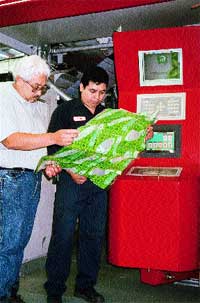
Press operators inspect labels reverse-printed three-across, in six colors, on a new 40-in., wide-web gravure press. |
Cooperation is key
Critical to the success of the project–which went from concept to finished design in roughly just three months, Cronin relates–was the input and direction provided by Clearly Canadian's label supplier, Seal-It. Located in Farmingdale, NY, Seal-It drew upon its years of experience in the shrink-film converting market to guide Karacters through the process of creating designs that would shrink without distortion onto the bottle.
Says Seal-It president Sharon Lobel, "When a customer, whether it be Clearly Canadian or anyone else, starts working with us at the very beginning of a project, even before the artist is involved, they have a smoother-running job, and everything comes out better."
The main thing to watch for in shrink-sleeve label design, she explains, are any areas that change drastically from one diameter to another, because distortion becomes a concern. "We try to keep logos or other information away from that area of transition," she says. "Karacters is very good; they understand shrink. If you notice, the Clearly Canadian logo is placed more toward the bottom of the bottle, where you're not going to get any real distortion.
"Most of the distortion that we had to deal with on the label was with the Nutritional Facts box, which runs narrowly up the whole side of the bottle," she adds. "The challenge was to ensure that the panel retained a rectangular shape."
According to Cronin, designing for the neck of the bottle was also a challenge, because it is so much narrower than the body. "That was where Seal-It technically gave us the support we needed," he says. "They showed us how to design the graphics so they didn't just look like a big blob at the top."
Also a cooperative effort was the selection of the appropriate film for the application. Used for the original re-packaging, the label stock is Bonset's 2-mil BONPET 5A™, a heat-shrinkable PETG film made from Eastman's Embrace® copolyester. With a shrink rate of more than 75 percent, the film offered "all of the required characteristics from a technical standpoint, including printability, consistency and quality," explains Cronin.
Enhanced converting capabilities
In addition to lending its expertise in shrink-sleeve label design, Seal-It also contributed to the project its prepress, printing and finishing skills, recently enhanced with the addition of a new 50,000-sq-ft production facility housing a new state-of-the-art gravure press.
Established by Lobel in '86, Seal-It has grown from incredibly humble beginnings to a 250-person enterprise that converts heat-shrink PVC, PETG and OPS film for applications that include multipack wrappers, tamper-evident neckbands, full-body sleeve labels, and more. The company operates two side-by-side facilities, one of which just recently began operation, that together provide approximately 150,00 sq ft of manufacturing space. Services include in-house design, prepress and flexo film separation, as well as combination flexo printing, gravure printing, and label seaming.
According to Lobel, having on-site prepress capabilities provides advantages to both Seal-It and its customers. "The less you have to depend on outside sources for anything, the more control you have, and the better the job will be," she told PD during a recent tour of the facilities. "Having prepress in-house also helps quite a bit with turnaround time. If you find an error, it's so much easier and faster to fix the mistake."
Grooving with gravure
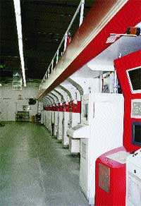
Seal-It's newest equipment, used to print the Clearly Canadian label, is a 40-in., 10-color, wide-web gravure press from an unnamed supplier that "has every bell and whistle you can imagine," says Lobel. Customized to include a range of components suited for Seal-It's particular applications, the press's special features include automatic registration, a custom-built doctor blade system and computerized job setup that saves parameters for each job entered into the system. "We have features on this press that I don't think anybody else has," notes Lobel, without elaborating any further.
Label stock for Clearly Canadian is reverse-printed on the press in up to six colors at speeds from 700 to 800 ft/min. Because it prints the labels three-across, the press is ideal for Clearly Canadian's high-volume requirements, Lobel says.
After being printed, the film is seamed, forming tubes of finished rollstock, using equipment custom-built by Seal-It. The finishing department in the company's newest building presently operates four seaming machines, with two more on order.
Lastly, film is inspected for any inconsistencies or errors on machines built in-house. Seal-It's current equipment scans first one side of the label, and then the other, at a speed of about 200 ft/min. New equipment gradually replacing the old machines will scan both the top and bottom of the rollstock at one time, upping the inspection speed to a rate of 400 ft/min, PD is told.
But, even before labels reach the automated inspection machines, they undergo intense scrutiny by Seal-It's quality assurance manager and staff in accordance to ISO-9000 requirements, Lobel relates. "All throughout production, they make sure there is nothing inherent in the film that shouldn't be there, making sure the labels are cut correctly, signing off, and checking and rechecking," she says.
|
A new gravure press "has every bell and whistle you can imagine," relates Seal-It president Sharon Lobel. |
Bottles make waves
In April, '02, Clearly Canadian released its Orange Pineapple line extension, clothed in a phantasm of orange swirls, to a receptive audience. In July, much to the delight of both distributors and consumers alike, the company began rolling out its newly designed sparkling water beverage bottles, one flavor at a time, to retail stores nationwide. Says Cronin, "We introduced the bottles one at a time, so that the store shelves would be constantly changing. If you think about the beverage category, it's all about change and about trying to get people's attention."
With some flavors still making their way to store shelves, Cronin says it's too early to gauge the impact of the new packaging from a sales perspective. "But we are encouraged," he says. "We're hearing from consumers that they really like the labels; they find it a nice surprise that we're trying to keep ahead of the market."
As for future packaging and product developments, undoubtedly Clearly Canadian has more tricks up its (shrink) sleeves.
More information is available:
Label converting: Seal-It, Inc., 800/325-3965. Circle No. 269.
Label design: Karacters Design Group, 604/640-4327. Circle No. 270.
Bottle: Owens-Illinois, Inc., 419/247-5000. Circle No.271.
Caps: Silgan Container Corp.,203/975-7110. Circle No. 272.
PETG label stock: Bonset America Corp., 336/375-0234. Circle No. 314.
PETG resin: Eastman Specialty Plastics, 423/229-2000. Circle No. 315.
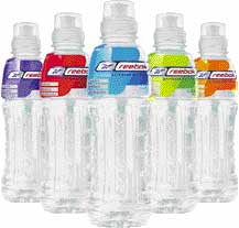
Exercising new technology for Reebok 'fitness water' |
Another project teaming Clearly Canadian with Seal-It to recently cross the finish line is an enhanced line of fitness water bearing the Reebok name. Using new hot-fill polyethylene terephthalate bottle technology from Schmalbach-Lubeca and a trim, streamlined shrink label from Seal-It, the packaging is "the absolute best out there" in the enhanced water category, according to Jonathan Cronin, vp of marketing for CC Beverage (U.S.) Corp. |
About the Author(s)
You May Also Like


