January 29, 2014
Vibrant labels sheetfed-offset-printed with specialized inks help bottles and jars of salad dressings from T. Marzetti Co. and spice bottles from Tone Brothers show their true colors while enhancing sales. Converted by Hammer Lithograph, the cut-and-stack labels are printed using Pantone's Hexachromew six-color processing system that yields quality results, uncommon brightness and lively graphics. The new front/back and wraparound labels appear on glass jars and bottles and polyethylene terephthalate bottles of salad dressings from Columbus, OH-based T. Marzetti Co.
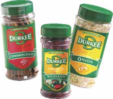
For Tone Brothers, Ankeny, IA, Hexachrome-printed wraparound labels featuring recently revised graphics adorn polyethylene spice jars for Durkee-brand products. Developed nearly a decade ago, the Pantone Hexachrome process-printing system features a specially enhanced color ink set, designed to allow converters to reproduce rich, vibrant, solid colors, realistic skin tones and elegant pastels. The process adds two new colors–orange and green–to the conventional four-color process of cyan, magenta, yellow and black (CMYK), permitting graphic designers access to, and printers to replicate, more than 90 percent of the colors in the Pantone Matching System (PMS), which encompasses more than 2,000 colors.
That's twice the amount of conventional CMYK that can be achieved using conventional four-color process printing, Pantone says, yet Hexachrome retains the same bright, vibrant colors on-press as can be designed on a computer. Printers can also repurpose designs for applications such as the web. Expanded palette
Both T. Marzetti's and Tones' tastes are discriminating when it comes to how they want their primary package labels to look. "We specialize in color and have to remain on the cutting edge," notes Geralyn Curtis, founder of 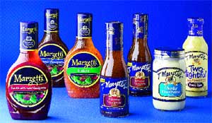 Chesapeake Group, a graphic design firm in Cincinnati, specializing in packaging design for consumer products and major retailers, and Hammer Lithograph's first Hexachrome customer. Chesapeake was designing with the Pantone Tint Selector, which made the workflow easier. "Once we saw what Hexachrome could do, our expectations were set high, and we haven't been disappointed," says Curtis.
The converter chose Hexachrome five years ago, as an option to expand its color gamut without significantly raising costs to customers, says Hart Swisher, director of innovation and technology. He recalls that his firm was looking at new processes and found Hexachrome. "There were a number of different systems, but only one with real logic behind it. We use Hexachrome often, perhaps on ten percent of our jobs. One benefit of utilizing Hexachrome is that it's a Pantone [color] system, and Pantone is a leader in color specification. They have defined within their system what tint combinations must be used to achieve a Pantone color. Marketers and designers know Pantone, and they're comfortable with it. Hexachrome made sense."
Curtis says Chesapeake chose to incorporate Hexachrome into its workflow when it was creating new labels for T. Marzetti's salad dressings, which include 30 stockkeeping units.
"With so many brands of salad dressing, differentiation is critical," says Curtis. "We integrated the process almost immediately–a little bit of learning, and we were up and running. T. Marzetti was after a more distinctive image and flavor variety for labels on its shelf-stable salad and produce dressings, as well as color differentiation. The results were better than we thought. Hex gave us a bright blast of color across the packaging that was even more brilliant than we had expected. The colors printed true to the fan guide and were cleaner, especially the oranges and greens. It expanded our palette fourfold. We get a variety of oranges. Any of the combinations using orange are beautiful. We also get a cleaner magenta than is typically used in four-color process printing."
She says Hexachrome inks have helped the T. Marzetti dressing line differentiate dressing flavors on-shelf. "The former labels had somewhat of a store brand look. We achieved a nice photo image as well as good variety callouts with the new labels."
In fact, says T. Marzetti Co.'s Dick Anderson, the new labels contributed to reversing a three-year business decline on the shelf-stable dressing line. "We wanted to improve the shelf recognition of the shelf-stable products and to stem the bit of decline it was having," he notes. "We repositioned those products and redesigned the labels to convey a superior image. The new labels were a key component in boosting business."
He adds that the spectacular success of the T. Marzetti project also helped win Chesapeake Group additional label design business for T. Marzetti's produce and house dressings, and condiment labels.
Widening the rainbow
"This option makes colors really pop," says Hammer Lithograph's marketing planner, Tina Beauchemin. "With the addition of two colors, the process allows us to create a wider array of colors that can be difficult for CMYK, and can eliminate special colors." Does this make a difference with all graphics? Beauchemin says it depends on what the basic color of the label is. "But," she says, "we find it does make a difference. It seems to make almost any color brighter, especially those in the orange and green families."
Swisher says along with the brightness of the orange and green, Hexachrome's cyan, magenta and yellow are also brighter and cleaner. "That allows us to come closer to the colors in the original reproductions. Hexachrome's ability to expand the color gamut with six colors is a huge benefit. We can match a good portion of the Pantone book, without bringing in spot colors."
|
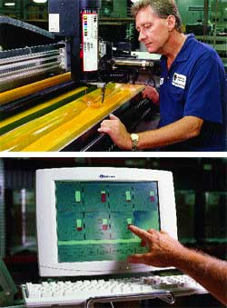
Ink application, right, is inspected by pressman John Thesing. Monitor, below, is used in the converter's new ink canister ink-delivery system to show ink levels on each unit of its 7-color press. |
Orange and green are critical colors in the new T. Marzetti and Tones label graphics. Assisted by Hexachrome's strengths on the yellow and orange part of the spectrum, the color schemes in both the T. Marzetti and the Tone's case capture the strength in oranges, greens, and yellows and elements with bright colors. "Greens and oranges printed by four-color process are difficult to achieve because they come out looking dirty or muddy," says Swisher. "With Hexachrome inks, we can reproduce the Pantone colors fairly accurately. "
There are additional benefits, he continues. "For customers, the conversion results in dollar savings from decreased printing costs, and color and brand consistency across virtually all product categories and with all print suppliers. Customers can also save money because items can be combined on the same press sheet to reduce the number of press units. If we had to do all of those special colors with one particular ink, we'd never be able to put all the different product varieties, if you will, on the same sheet. Our customers are quite happy," he says.
Hammer uses ICISS software to separate a transparency or digital photo into six-color Hexachrome. "The software is as critical as the Hexachrome inks," Swisher adds. Spicing up Durkee's look
Swisher's economic assessment is also reflective of the labeling project for Tone Brothers. Offering an array of products under the Durkee, Spice Islands, Tone's Dec-A-Cake, Trader's Choice and French's labels, Tone Brothers is the world's largest spice manufacturing company, with $300 million in annual revenues. Recently, Tones' in-house design department updated Durkee's brand imagery and jar labels with bold Kelly green backgrounds with orange/red and orange/yellow front-panel shields together with a green Durkee logo, color-matched to a distinctive green cap topping each jar. Graphics, packaging and design were handled by Tones in-house.
During the update project, Hammer Lithograph encouraged Tone Brothers to try Hexachrome for the Durkee line, notes Tones' marketing coordinator, Leslie Temme. "We were able to achieve the colors we had been hoping for with four-color process, but never got. The Hex colors are a lot brighter and less muddy, and we get a consistent look every time."
Tone then created new designs for private-label customers, also relying on Hexachrome, Temme continues. "We have accepted Hexachrome as our default production method and tailor our designs to take advantage of its benefits. The all-new labels for Durkee are spectacular."
Temme says Hexachrome increases flexibility and frees up inventory. The Durkee labels are color-coded by product category with product descriptor bands–garlic and onions have a green band, peppers have a red band. "We could never have just one label printed, without having to run companion labels at the same time," Temme says.
Now, more than 200 different product labels of Tone Brothers use the new six-color process. Though some of the spice labels are utilized in lower volumes than others, rather than order an unnecessarily large minimum quantity and create excess inventory, or pay a penalty for a short print run, Tones has low-volume labels gang-printed with the higher-volume labels, without having as much of any given label.
|
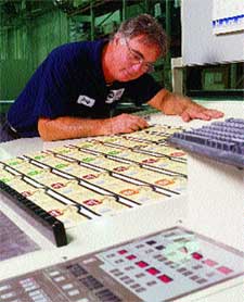
Pressman Shaw checks print registration and color consistency on Hexachrome-printed cut-and-stack labels for the T. Marzetti dressings line. |
Temme explains, "This gives us the ability to group labels together, so we get a significantly lower costs while maintaining the look and [print] consistency we need." Sheetfed printing
After electronic files for the label designs are accessed for use within Hammer Lithograph's computer-to-plate process, plates are made via digital imaging. The press sheets are proofed and inspected as they are running, so inspection of label copy is made during printing.
Hammer Lithograph prints the labels at its 92,000-sq-ft facility in Rochester, NY, on one of six sheetfed presses, which include two Mitsubishi seven-color, 56-in. presses, equipped with a new Accel ink-canister delivery system. The inks are from Superior Printing Ink and Flint Ink.
The Accel canister-delivery unit automatically dispenses ink from the canisters into the ink fountains and displays ink levels on each unit and for the print job running. Wholly-owned subsidiary J. MacKenzie, Ltd., also located in Rochester, custom-sheets the label stock and has its own in-house prepress department for digital asset management of T. Marzetti and Tones files. Front and back labels are made for T. Marzetti's oil-based dressings, such as Roasted Garlic Vinaigrette. Wrap labels are applied to low-fat-but-creamy offerings in the new Two-lightful product category, and partial-wrap labels are produced for Tone Brothers' glass-clear PE jars for Durkee spices. The T. Marzetti labels are converted using 60# C1S label paper, while the Durkee labels are produced using a 54# C1S paper stock. Stock suppliers are proprietary.
Keeping tight control on color consistency, the presses are equipped with computerized scanning densitometers from X-Rite and Graphic Microsystems, Inc. (GMI) that measure and "read" sample sheets and color bars using spectrophotometric technology to adjust colors, display measured values and alert press operators of any deviations from the color target.
Press sheets are laid out, often with labels from several jobs teamed on one sheet. Depending on the label's configuration, coatings required, print run length and other factors, with Hexachrome, Hammer Lithograph can gang up to a dozen different "flavors" of a brand's label on one press sheet to reduce print costs.
During the finishing process, labels are spot-checked for print and for size and print-to-cut factors before they're cut off-line, either by a straight guillotine or a die-cutter, and are finished in-house.
More information is available:
Hexachrome color system, Pantone Matching System: Pantone, Inc., 201/935-5500. Circle No. 283.
Printing: Hammer Lithograph Corp., 585/424-3880. Circle No. 284.
Custom label finishing: J. MacKenzie, Ltd., 585/321-1770. Circle No. 285.
Label designer: Chesapeake Group, 513/345-6300. Circle No. 286.
Mitsubishi presses: MLP USA, Inc., 847/634-9100. Circle No. 287.
Ink: Flint Ink Corp., 734/622-6000. Circle No. 288.
Ink: Superior Printing Ink Co., 212/741-3600. Circle No. 289.
Ink-delivery system: Accel Graphic Systems, 972/484-6808. Circle No. 290.
Spectrophotometer: X-Rite, Inc., 616/534-7663. Circle No. 291.
Spectrophotometer: Graphic Microsystems, Inc. (GMI), 408/731-2000. Circle No. 292.
About the Author(s)
You May Also Like
