Flexible-Packaging-Breaking-News-Best-1540x800.png
Flexible PackagingBreaking News in Flexible Packaging April 2024Breaking News in Flexible Packaging April 2024
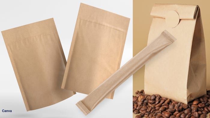
Frito-Lay's combo branding, snacks mind their beeswax, Biscoff cookie packs redesigned, PepsiCo UK embraces paper packaging, Berry's better bale wraps.


 Closure device.")

.png?width=300&auto=webp&quality=80&disable=upscale "Legal Case Made with Real Cheese Claim")


Editors' Choice


Sign up for the Packaging Digest News & Insights newsletter.