Getting a feel for multi-sensory packaging
September 19, 2014

Brands today are tapping into the personalization of packaging to reach the masses one consumer at a time. But standing apart from the it’s-all-about-me package decoration crowd, tactility is an underused multi-sensory element that draws shoppers in, often with visual cues first, and then closes the deal with what may be the most personal of the all the senses—touch.
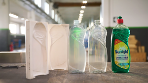
Tactility in packaging today takes on many forms and performs wonderfully in myriad leading and supporting roles. It can take the form of a rubber-like grippable surface that makes hard-to-open lids a breeze or heavy containers easy on the hands during transport. It can manifest as an interrupted surface pattern on an aluminum can that refracts light and draws a shopper’s attention, while at the same time allows can makers to thin the sidewalls without sacrificing top load strength. It can whisper a subtle hint about a personal care product’s ability to soften your skin or a cosmetic product’s ability to highlight your eyes. Or, on a purely functional note, it can help those who are visually impaired simply ensure they are using the right product.
Tactility can be used by any number of printing and converting technologies: embossing, raised-letter inks (both traditional and now digital as well), laser-etching, molded patterns, specialty materials, and even tactile coatings. Once the bastion of high-end cosmetics, jewelry or expensive wines and spirits, the categories and package formats in which tactility is being exploited seems to have no limits today.
According to Mintel’s Global New Products Database (GNPD), between 2009-2013, 75% of skincare product introductions in the U.S. featured some element of soft-touch packaging. But more recently, categories such as pet foods, baby foods, dairy, fabric care, health care and savory spreads are also using the emotional connection tied to soft-touch packaging. In the Asia-Pacific market during the same period, 47% of new color cosmetics featured a package with soft-touch element, while the percentage of new product introductions with soft-touch attributes across all categories grew from 13% to 32%. In Europe, the trend has expanded to such products as sauces and seasonings; and meal centers are beginning to embrace tactility.
While embossing as a tactile element is not new, it is crossing category lines and making its presence felt not just in cosmetics and personal care items, but in chocolates, gum and other confections.
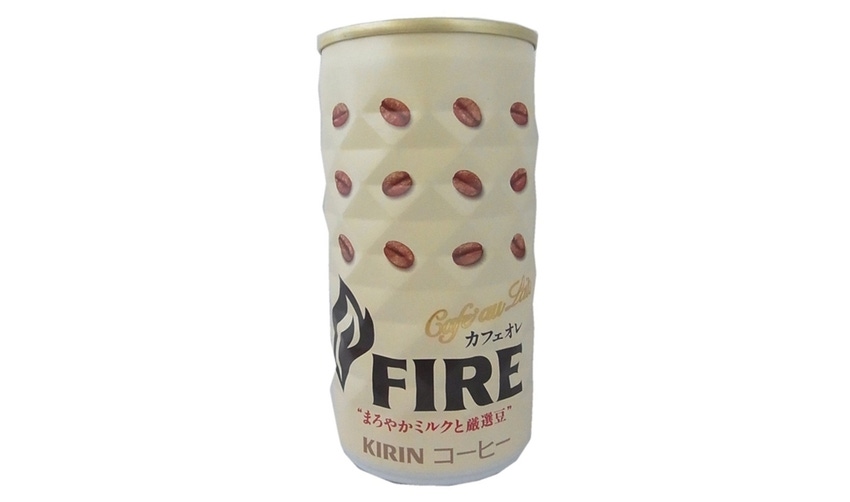
Introduced in January 2014, Japanese mega-brand Kirin used an interrupted surface pattern on a two-piece steel can for its Kirin Fire Cafe Au Lait product. The can, produced by Toyo Seikan Kaisha (www.toyo-seikan.co.jp/e/), features a series of facets that are rolled into the can body during forming. The facets serve a dual purpose; they help strengthen the side walls and top load strength of the can so that it can be thin-walled; and, secondarily, like for its premium wine in a two-piece aluminum can, the facets refract store lights to attract consumer attention on crowded convenience-store shelves. And finally, the diamond-shaped facets provide a unique hand-feel for consumers during consumption directly from the can, which, along with the high-quality of Kirin products, help to form a repurchase decision during the Third Moment of Truth—when the consumer experiences the product and the package together and begins to form a decision about whether to buy the product again.
Tactility is a new concept neither to wine and spirits, nor, more matter of factly, to the visually impaired community. But it is unique, and perhaps unprecedented, to include Braille branding on a front-panel label for an upscale organic wine. But that’s exactly what South African vintner Bon Cap did for its handcrafted 2007 Organic Cape Blend. The 750ml glass bottle with a flexo-printed and embossed paper label with Braille further accentuates the complexity and elegance of this handcrafted wine, which is a blend of 50% Pinotage, 21% Petit Verdot, and 29% Cabernet Sauvignon.
For the launch of this private label woman’s deodorant, Cosméticos Natura pulled out all graphics and multi-sensory stops. The striking red oval-shaped plastic dispensing container is drenched in an unspecified soft-touch coating and then screen printed. Natura Faces Ousada Desodorante Feminino is fragranced with a mulberry scent enveloped in a fruit cocktail aroma. The product is made with 95.1% renewable vegetable origin ingredients, and retails in a 100ml refillable pack made with 98.9% recyclable materials. The container also features tactile Braille branding.
For those who wish to wash the muck and the mud off their neck after a hard day of hunting, the Duck Commander Body Wash container features a highly tactile (or tactical) pistol grip shaped container. The 24-oz high-density polyethylene (HDPE) bonus-pack with a gravure-printed camouflage and wood-grain pattern shrink-sleeve label presents both a visual and tactile experience for fans of the hit reality TV show “Duck Dynasty.”
David Luttenberger is the global packaging director at Mintel. He has 24 years’ packaging experience. Reach him at [email protected]. Follow him on Twitter at @packaginggeek.
About the Author(s)
You May Also Like


