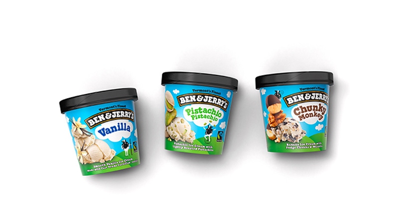
Ben & Jerry’s integrates flavor tower motif into packaging
November 25, 2014

The iconic ice cream brand Ben & Jerry’s recently underwent a brand transformation to its packaging to increase clarification amongst its premium ingredients without losing the personality commonly associated with the “cool” brand which is associated by its whimsical flavor combos. The end result? A more unified messaging which helps create a more consistent and up-scale look across all packaging, otherwise known as the “flavor tower” motif.
The company enlisted the help of Pearlfisher New York to reinvent its portfolio.
Hamish Campbell, creative director, Pearlfisher, comments, “Consumers already love Ben &
Jerry’s indulgent flavors and the brand’s effusive personality. Our job was to take that personality and use it to express how premium the product is. The flavor towers play with gravity and scale, creating indulgent larger than life taste expressions. The iconic Ben & Jerry’s cow frees the brand to convey the spirit, joy and whimsical nature of Ben & Jerry’s. We used both tools to clarify the brand’s messaging, unifying the brand and creating a more consistent and premium feel across all segments.”
Mike Branson, Pearlfisher founder/CEO comments on the new design, “Premium quality and quirky personality are often considered conflicting equities—we are pleased that our redesign has proved that it’s possible to create utterly ownable and distinctive personality without compromising euphoric taste communication. Add to this global brand desirability and we are incredibly optimistic about this new design for Ben & Jerry’s.”
About the Author(s)
You May Also Like


