'Frozen concoction' refreshingly rendered
January 29, 2014
Studying the label for Mott's, Inc.'s Margaritaville Margarita Mix, you can almost taste the bite of lime and sting of salt on your tongue, and feel warm, tropical breezes blow, carrying the fragrant scents of fuchsia and orchid. Described as "somewhere between the Port of Indecision & Southwest of Disorder" on the mixer label, "Margaritaville" is a fictional beachcomber's heaven, immortalized in the 1977 song of the same name by Jimmy Buffet.
Introduced in December '00, Mott's bottled, non-alcoholic cocktail mix employs stunning label graphics that celebrate the Margaritaville state of mind. While that state may be carefree and relaxed, bringing it to life via label converting was a bit more strenuous. Converted by Brook & Whittle USA of North Branford, CT, the three-label set offered up a veritable hurricane of challenges, requiring special ink formulations, custom screen-printing meshes, and more.
Mixing markets
While it is best known for its apple juice and apple sauce products, Stamford, CT-based Mott's, Inc., a subsidiary of Cadbury Schweppes p.l.c., has diversified its product portfolio over the years. In the adult mixers category, Mott's has made the bartender's job a lot easier. 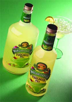 Its products include the Holland House line of eight cocktail mixers, Rose's lime juice and grenadine products, the 10-variety line of Mr & Mrs T mixers, and canned Coco Casa pi?a colada mix.
Joining two other Mott's-marketed margarita mixes, Margaritaville was created, says Tony Jacobs, marketing director, mixers for Mott's, to fulfill a need in the market for a "differentiated, premium margarita product."
"When we introduced the product, the [mixers] category had been on an upswing for several years, with a record growth of thirteen percent," he explains. "Margarita mix was not only the biggest contributor to sales, but it was also the fastest-growing segment of the category, with nearly sixteen-percent growth."
Producing and marketing the product under license from Jimmy Buffet's Margaritaville Holdings, Mott's perceived, would add to product recognition. According to the company's internal research, 83 percent of the adults surveyed were aware of the name Margaritaville and closely identified with the imagery with which it is associated. Furthermore, 100 percent of these consumers associated the name Margaritaville with margaritas.
With the glass only half-full, Mott's partnered with Seagram Americas Corp., which provided the necessary kick to the concept by introducing Margaritaville Tequila, an 80-proof, imported Mexican tequila. In late '00, Mott's and Seagram launched the Margaritaville duo in the 10-biggest tequila-consuming markets in the U.S.: Arizona, California, Colorado, Florida, Georgia (Atlanta), Illinois (Chicago), Louisiana, Nevada, New Mexico and Texas. Last May, the products were released nationally.
It's a real beauty
Packaging for the cocktail mixer consists of a traditional glass bottle with a somewhat-less-than-traditional label treatment. Clear-glass 1- and 1.75-L bottles, designed by Mott's packaging engineering group members John Corbitt and Erica Nozato, are supplied by Anchor Glass. Gold, aluminum roll-on closures from Silgan top the bottles, enhancing the gold metallic ink found throughout the product labels.
Says Jacobs, the goal in designing the label graphics for the Margaritaville line was "to portray the fun and festive 'atmosphere' of the brand and build off the tropical imagery of margaritas, the Margaritaville brand name and Jimmy Buffet, while communicating the fantastic taste that the product delivers." Commissioned with this task was Zunda Design Group of South Norwalk, CT, which worked simultaneously with Seagram to create a consistent look between the two products.
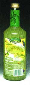
For Mott's mixer, the result is a three-label set that uses a no-label look on front and back for a premium presentation. Front and back label stock is a 2-mil, pressure-sensitive biaxially oriented polypropylene with a 1.5-mil polyethylene terephthalate liner supplied by Fasson Roll North America. An ultra-clear filmstock, the labels are printed with vibrant, bold graphics that use a predominantly green color scheme and exotic, tropical images.
At the top of the front-panel label, a medallion with the copy "Hemisphere Danger" in gold type around its edges features the image of a seaplane descending from a sunset-bronzed sky into a palm-tree-laden paradise. At label bottom, a salt-rimmed glass pitches, filled with a lime-green "concoction," mixed with crushed ice. Other graphics include generous slices of ripe lime, fresh flowers in bright hues of red, purple, orange and pink, and the obligatory parrot, whose feathers drape artfully over a banner reading "Margaritaville."
On the back label, copy asks "Where is Margaritaville?" and gives a fanciful, Buffet-inspired answer. Here also, two "recipes" advise consumers "How to find Margaritaville" by the "Straight Route" or the "Slushy Route." A Nutrition Facts box and additional product usage and company information are screened in white type along the bottom of the label, along with a bar code in black.
The third label, found on the bottle neck, is a different construction. Made from paper, it is printed on an offset press with dark green graphics depicting a map of locations south of the border, along with sliced limes and tropical flowers. In an effort at co-marketing, copy reads "Just add Margaritaville Tequila."
A clear advantage
Mott's chose to use clear, p-s labels for its packaging to differentiate its product on the shelf and to achieve a premium look, says the company's graphics manager, Steven McCluskey. It chose Brook & Whittle to carry out the demanding converting process, he says, "because they offered UV flexo with combination rotary screen printing."
"Brook & Whittle's ability to run four-color process graphics on a white-screen backup offered us the best opportunity to create a clear, clean and impactful label," he says.
Among the pioneers of UV flexo printing, Brook & Whittle began using the process about five years ago. According to Brook & Whittle president Steve Stewart, the converter adopted this technology because of its perceived benefits. Among them, he says, are the ability to produce cleaner, brighter colors, reduced makereadies and cleanups, better mileage with the ink systems, the reduction of additives, and a short learning curve for press operators.
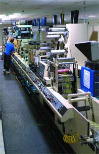
To add the beauty of screen printing to its capabilities, Brook & Whittle uses a Mark Andy model 4150 10-in., 10-color combination UV flexo press that includes three model RS modular rotary screen printing stations from Stork X-Cel. The press is also equipped with one modular foil-stamping head from I.KELA Co.
 "When we first got into combination UV flexo/rotary screen printing, probably only between three to five percent of the industry was employing that technology," says Stewart. "That number is probably around twenty-five or thirty percent now, and is still growing very rapidly."
With 40 employees and a 24,000-sq-ft facility, Brook & Whittle, says Stewart, finds its small size a competitive advantage. "We are big enough that we can handle the volumes, but small enough that we can make decisions quickly and turn on a dime," he notes.
Confronting challenges
Discussing the finer points of the printing project, Simon Gore-Grimes, Brook & Whittle's vice president of sales and marketing, explains that while the company's 10-color press was the perfect match for the Margaritaville application, the project still involved a host of challenges. "The main challenge with the front of the label was to print a high-end, four-color image over rotary screen ink," he explains. "We had to come up with special dot-gain curves and a very special ink system to accomplish this."
Chroma Corp. supplies both the UV flexo and the rotary screen inks, as well as a special, protective lacquer used after printing, formulating them to work in conjunction with one another. In addition, the screen printing ink offers a high opacity to eliminate any product showthrough.
Notes Gore-Grimes, filmstock selection was also vital. The Fasson material, a favorite of Brook & Whittle's, was chosen for the project because it provides the transparency required and "because this material can be applied at very good production speeds," he explains.
The back-panel label offered up its own set of challenges, including the use of solids, a vignette, and fine copy and lines, printed via rotary screen. Says Gore-Grimes, "We had to have a halftone mesh custom-made with a unique angle so that we could actually print the solid, the vignette and the fine type all with one screen head." Stork, which manufactures its screens from a nickel-plated, nonwoven material, rather from steel, as is customary other rotary screen suppliers, provided Brook & Whittle with the custom mesh solution.
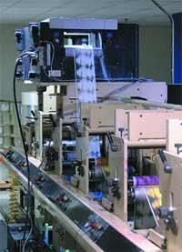
In addition to the consumables, the press's distinctive features and components also played a crucial role in the successful outcome of the project, claims Gore-Grimes. The 4150 consists of 10 UV flexo stations, accompanied by three rotary screen stations utilizing Stork's Quick Positioning System (QPS). Through QPS, the rotary screen modules ride on a rail above the press, allowing Brook & Whittle to substitute any three of the flexo stations with screen-printing capabilities. A modular die station can also be inserted anywhere along the line. Following the Margaritaville label's path through the press, the equipment applies a rotary-screen white ink, UV flexo yellow, UV magenta, UV cyan, UV black, rotary-screen black, UV gold metallic and varnish.
|
A special ink system allows the label front to be rotary screen-printed in whiite, over which are flexo-printed the four-color graphics. |
"Without the rotary screens, we just couldn't have achieved the opacity we were looking for," explains Gore-Grimes. "The thicknesses that we're able to achieve with the screens simply could not have been matched with flexo."
Another relevant feature is the press's use of the EZCuree cool UV system from Energy Sciences. The new technology allows temperature-sensitive materials to be run through the press, without registration issues. This allows Brook & Whittle to run a range of films not previously possible at higher production speeds.
An automatic register system, controlled through a computer mounted on the front of the press, enables operators to automatically register the press lineally through sensors. "This allows us to run with a much lower waste percentage and at faster operating speeds," says Gore-Grimes. "It really helps us maintain a higher level of quality."
The Margaritaville labels, Gore-Grimes estimates, run at rates of 180 fpm. With the press's top-rated speed reaching 500 fpm, the only limiting factor is the ink system, he explains. "We can only cure the ink so fast to get it to lock down and pass all the necessary testing. But for a job of this nature, that's a pretty good production speed."
Staying all season
|
Following the label's path through the press, the equipment applies a rotary-screen white ink, UV flexo yellow, UV magenta, UV cyan, UV black, rotary-screen black, UV gold metallic and varnish. |
From numbers gathered from the retail field, Mott's is not the only one mesmerized by the inviting and exotic graphics rendered so deftly by Brook & Whittle. According to Mott's marketing director Tony Jacobs, the mixer product is doing "great" with consumers.
"It currently has almost an eight-percent share [in the mixer market] and has the third-largest share in the margarita segment," he enthuses. "It's also the fastest-growing of the top-ten margarita mixes, which is very good for a brand new product."
Through masterful representation, the allure of Margaritaville lives on.
More information is available:
Label converter: Brook & Whittle USA, 203/483-5602. Circle No. 263.
Label filmstock: Avery Dennison, Fasson Roll NA, 800/944-8511. Circle No. 264.
Bottle: Anchor Glass Container Corp., 813/884-0000. Circle No. 265.
Closure: Silgan Plastics Corp., 314/542-9223. Circle No. 266.
Label design: Zunda Design Group, 203/853-9600. Circle No. 267.
UV flexo presses: Mark Andy, Inc., 636/532-4433. Circle No. 268.
Rotary screen modules: Stork X-Cel, Inc., 704/598-6393. Circle No. 269.
Foil-stamping head: I.KELA Co., an ITW Decorating co., 941/355-6498. Circle No. 270.
Ink: Chroma Corp., 815/385-8100. Circle No. 271.
Cool UV system: Energy Sciences, Inc., 978/694-9000. Circle No. 272.
About the Author(s)
You May Also Like
