Are seniors top of mind when you design your packages?
When it comes to packaging that addresses their specific needs, especially around readability, seniors have friends and foes. Considering that people over the age of 60 will be the fastest-growing consumer group for the rest of this century, according to A.T. Kearney’s Global Maturing Consumer study, it’s surprising that pleasing this powerful buying group isn’t on every packaging designer’s To Do list.
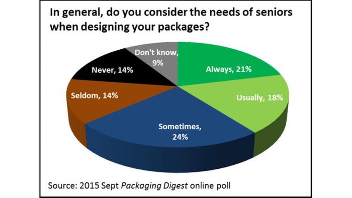
In an online poll in September 2015, Packaging Digest asked packaging professionals “In general, do you consider the needs of seniors when designing your packages?” While the overall numbers seemed to be in line with what you might expect—39% of respondents Always or Usually consider seniors’ needs, 24% Sometimes do, 28% Seldom or Never do and only 9% said they Don’t Know—the results were interesting when broken down by markets segments.
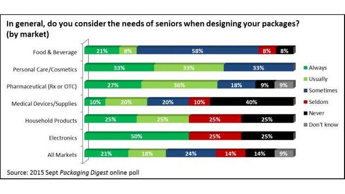
On the up side, two thirds of respondents in the Personal Care/Cosmetics markets indicate they Always or Usually consider seniors’ needs, and the remaining third say they Sometimes do. All respondents from this market segment are aware and try to accommodate the packaging needs of the elderly—A+ for them!—because, as one Personal Care/Cosmetics person states, “If a senior can't read a label, they generally won't buy the item.”
Respondents in the prescription and over-the-counter Pharmaceutical market are also almost two-thirds positive, with 63% answering Always or Usually. Sometimes and Never/Don’t Know is equally split at 18% each.
Pharmaceutical respondents are well aware of the benefits of catering to the older population, as well as the risks. “They make up the majority of our customers,” says one participant. Another one writes, “They are a large part of the population with great buying power.”
In a more neutral position, our Food/Beverage industry respondents sit mostly in the Sometimes spot, with 58% choosing this option. The positive end of the spectrum is a weightier than the negative end, with 29% selecting Always or Usually and just 18% picking Seldom or Never.
But sometimes a designer’s options are limited by available packaging technology, as this participant explains: “Many times our designs incorporate graphic features for the elderly by default. That is, larger type fonts are used because the flexographic print process has some size restrictions. Those sizes are being reduced though because of the better presses.”
Other times, even if seniors regularly buy the product, designers are told to go in a different direction. “Really is a spec from marketing and the new wave is to attract millennials,” says a Beverage packaging professional. And this Food respondent says, “Most of the packaging we design for is targeting a younger demographic.”
On the down side, 50% of respondents in three markets—Medical Devices/Supplies, Household Products and Electronics—Seldom or Never consider the needs of the elderly when designing their packages.
Why not? The reasons range from lame to legitimate.
“Never thought of it before,” says one poll participant in the Medical segment. Another Medical participant writes that a “large font can take away from aesthetically pleasing packaging design.” A third Medical-related poll taker admits, “Regulatory requirements can take priority and conflict with considerations for elderly consumers ease-of-use needs.”
A respondent in Household Products explains that there is “not enough space for larger print,” a point Packaging Digest explored in the article “Small packs that talk big come to the aid of seniors,” which focused specifically on the readability of packages, since this is a major point of contention with this age group.
Our exclusive poll explored the readability issue, too.
Unfortunately, older consumers will need to keep their bifocals or magnifying glass handy because the top pick, at 38%, is “Not addressing this issue.”
Say what?!
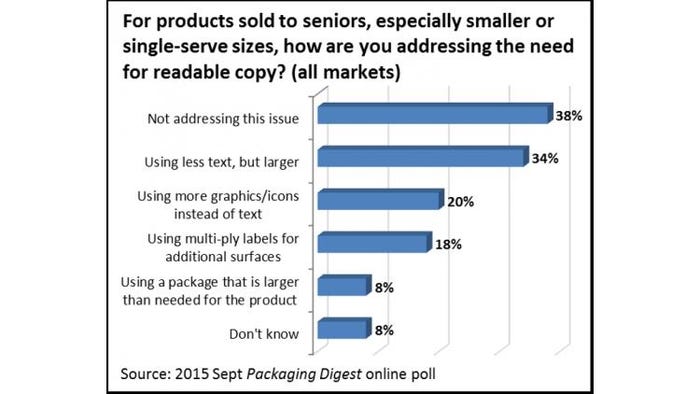
Again, a closer look market by market is revealing. Of our respondents, 75% of those in Household Products say they are not addressing this issue. Next down on the list, at 67%, are those in the Medical Devices/Supplies market, followed by participants in the Beverage business at 50%.
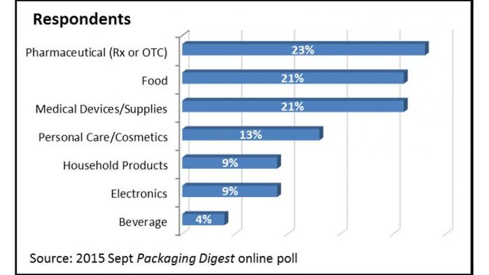
The only market where zero respondents said they were not addressing this issue is Electronics, which is somewhat surprising since the majority of buyers of laptops, smartphones and other tech devices are probably well shy of being eligible for an AARP membership. But the percentage of respondents saying they work in Electronics was pretty low at 9% (see “Respondents” chart at the end of the article).
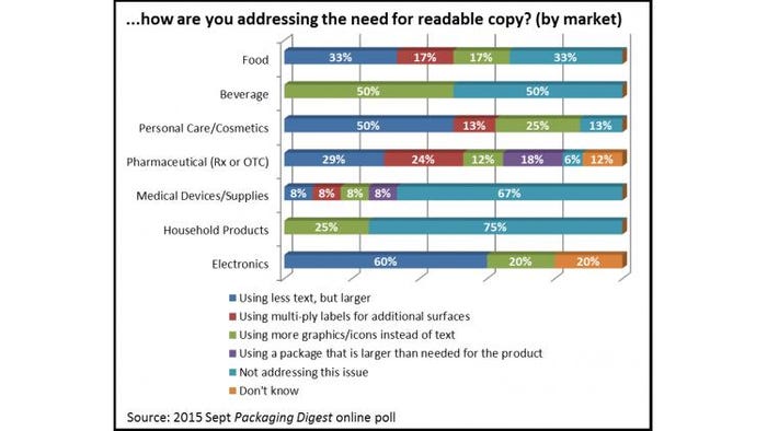
For this question, people could select more than one choice, so the total exceeds 100%. The next highest option, at 34% is “Using less text, but larger.” As this Food respondent says, “Most graphic artists are young and have great eyesight. While they can read a 6-point font, most older people cannot. This could be anyone in their 30s, 40s or 50s.” This same participant points out that readability isn’t just about size. ”While the font size is an issue, there is also the issue of contrast—having too similar colors as a font and background that is just not readable.”
It’s a good point to make, that people over 60 aren’t the only ones straining to read text on a package. “We have some over 45s on our staff and they always say ‘I can't see it!’” says this Pharmaceutical packaging professional. This respondent in the Electronics field agrees, “There are many individuals who have visual impairments and I would like to think that we strive to serve everyone to the best of our ability.”
The good news is that solutions abound, including two more that were on our list of choices.
About a fifth (18%) selected “Using multi-ply labels for additional surfaces” and just 8% chose “Using a package that is larger than needed for the product.” That is just what this Electronics respondent admits: “Many times we package the product in a box or plastic container to provide more space for valuable information to be printed on.”
Making packages easier to read can be accomplished many ways, including a combination of solutions. This Pharmaceutical participant describes that they are “using a multi-panel label with multiple pages and large text.” Another Pharmaceutical survey taker writes in an option—often used now in this age of ubiquitous smartphones and internet access—that wasn’t in our list: “Product inserts and references to website directions as well.”
As many package developers know, packages that are easy for older consumers to handle and read often appeal just as well to other demographics. What’s good for them is good for others.
So, why should you keep seniors top of mind when creating your packaging? “Because we want everyone to be able to use our products,” says this Electronics packaging professional.
____________________________________________________________________________________
Passionate about packaging design? Learn about the latest developments in packaging innovation at SouthPack 2015, Nov. 18-19, in Orlando, FL.
____________________________________________________________________________________
About the Author(s)
You May Also Like


