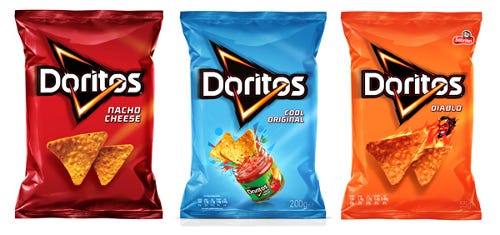
Global packaging redesign energizes iconic Doritos brand
March 11, 2015

Doritos global design
Doritos, a leading brand from PepsiCo's Frito-Lay division, has partnered with branding and design firm Hornall Anderson to update its identity and packaging to create global harmonization and unleash the power of the iconic brand.
"We are thrilled with the new design as it is our first step towards embracing a unified global positioning for Doritos," says Taylor Jenkins, Doritos brand manager. "Our design has been elevated to combine the global energy with social share-ability that we feel will break through with our core consumer."
Tasked with creating a breakthrough look and feel to activate the Doritos brand narrative in a highly consumer-relevant way, Hornall Anderson's U.K. team visited many different cities across the world to see how Doritos was shopped and to discover how to best achieve an emotional connection with its core demographic of teens and young adults. The team immersed itself in the demographics' visual world, analyzing key graphic trends in gaming, sport, grooming, fashion and music, among others. As all findings were distilled, the team translated the consumer insight into a design system and voice that could bring Doritos to life on a global scale.
"The Doritos target consumer moves fast, so when it came to the packaging, every element needed to have a valuable well-defined role," says Ali Whitely, Hornall Anderson U.K. creative director. "We considered everything from photography, tone of voice and visual personality to create a bold and inspiring look and feel. The new identity and package design brings to life the emotional equities of the Doritos brand and what it means to the consumer."
With different cultures come different needs, resulting in the necessity of design elements that are flexible enough to address any culture's specific packaging requirements. Although many countries have particular market nuances, the key equities are consistently leveraged on pack. Colors, chip photography, logo and the proportions of the graphic elements were all designed to create a harmonious and globally deployable visual translation of the brand and the brand purpose: Ignite You.
Source: Hornall Anderson
.
About the Author(s)
You May Also Like


