Packaging design ain't easy -- if you want it right
January 29, 2014

For everyone who rolls their eyes at the goof ups, blunders and missteps of corporate branding efforts take note — this stuff is hard.
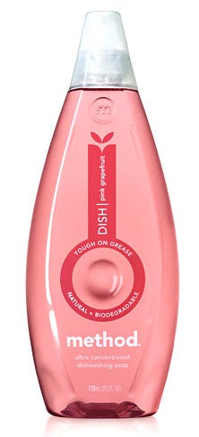
Take for example those darlings of the branding world, Method. For all their progressive ideas, open-minded creativity, and laudable design sense, they admit to missing the mark on their dish soap packaging not once, not twice, but three times over the last decade.
Okay, to be fair, none of these blunders are massive screw-ups that could’ve dragged the whole brand down and soaked up millions of dollars in PR to fix. From the outside, these missteps generally went unnoticed.
It’s just that Method is, well … fussier about this stuff. And that’s why they get it right so often. They ask tough questions about their packaging designs and give themselves honest feedback.
Sometimes the truth isn’t pleasant.
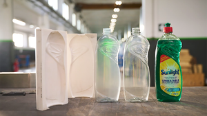
In a recent blog post on The Dieline, Method’s Senior Director of Industrial Design, Joshua Handy, discusses the evolution of the company’s dish soap packaging since 2001. The designs are surprisingly different for such a short amount of time. He describes a series of major design changes, driven by an intense desire to hit the sweet spot of cost, aesthetics and functionality.
It’s a great post, and well worth reading. If nothing else, it’s a little comforting to know that even truly great marketing organizations still struggle in the complex soup of issues presented by today’s packaging and branding expectations.
But based on Method’s previous efforts and their ongoing determination to get it right, I have a feeling they’ll have a winner on their hands in this category too.
- d!b
.
About the Author(s)
You May Also Like


