Packaging design: Seagram's Escapes gets redesign
March 11, 2015


Seagrams Escape redesign
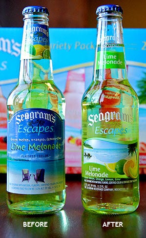
Seagram's Escapes recently introduced new packaging that showcases its colorful, flavored malt beverage to consumers. A transparent label on each bottle enables people to see the refreshing beverage inside.
"We wanted to whet consumers' appetites by really highlighting the liquid instead of covering it up with traditional paper labels," said Jennifer McCauley, brand manager for Seagram's Escapes.
The new pressure sensitive label found on the 11.2 ounce bottles contains lightly screened graphics of a beach scene. The secondary packaging helps tell the brand story of how Seagram's Escapes celebrates and complements moments when people can "unwind."
"The main goal of the Seagram's Escapes packaging redesign was to provide a contemporary look that today's consumers can relate to. We feel that our new packaging helps people envision themselves enjoying our beverage flavors and unwinding at the same time.
"In the spirit of our brand evolution, the packaging shifts from a beach-centric escape to a product-related escape," McCauley said. "By showing more of the liquid and less of the beach, we're providing consumers with an unobstructed look at the beverage they're buying."
The new packaging hits store shelves nationally in April 2010.
SOURCE The Genesee Brewery
.
About the Author(s)
You May Also Like


