Packaging Tip: Use the Shape of Your Package to Communicate
March 11, 2015
Most packaging tends to communicate the benefits of a product using only words, pictures, and color. While these basic building blocks of packaging design do a fine job, the shape of the package is often neglected as a vehicle for communicating with consumers.
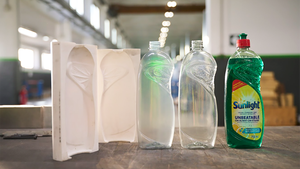
And that’s a shame. The overall form of a package can communicate on a visceral level every bit as strong and intuitive as color or pictures.
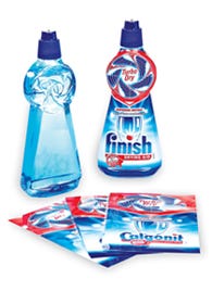
 Some packagers have indeed caught on to using this underworked design language. Take for example, Beckitt Benckiser, the maker of Turbo Dry, a two-in-one rinse agent that speeds the drying of dishes. To achieve rapid acceptance by consumers, the product's packaging needed to be particularly explicit. To stand out in its fiercely competitive sector, the bottle had to indicate the product bonus as clearly as possible to the consumer: that is, it quickly and thoroughly dries dishes.
To do so, Reckitt Benckiser's marketing teams developed a universal packaging concept in seven languages, whose symbolism can be understood in all European countries. The bottle features an elliptical base that evolves into a tronconic form half-way up, with a disk at the summit, whose sides are decorated with a raised pattern that evokes the blades of a fan.
Could this shape communicate the benefits of the product on its own? Probably not. Labels, words, and pictures, are still important. But in looking at it the Turbo Dry package, you quickly and intuitively get a sense about what the product does.
In an overcrowded consumer market, that deeper, more immediate communication can make all the difference in sales. Could your product’s packaging benefit from this kind of thinking?
FREE News Updates ... Subscribe to Packaging Digest Newsletters Now
.
You May Also Like


