Pentawards 2011: The winners are...
March 11, 2015


Pentawards 2011 winner Ramlosa
The international panel of judges of the Pentawards, the world's leading competition dedicated exclusively to packaging design, chaired by Gérard Caron, announces its winners for 2011.
This year, the prize winners received these global trophies in New York, in the exceptional surroundings of the Marriott Marquis on Times Square which is unquestionably the most mythical place in this city "which never sleeps."
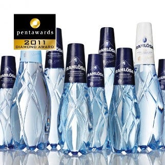
The bottles of Ramlösa (Carlsberg) mineral water presented by NINE (Sweden) win the prestigious Diamond Pentaward, Best of the Show 2011.
The Platinum Pentawards, crowning the best packaging in the five major categories, are awarded to:
Beverages category:
dBod (Holland), for the Heineken STR bottle, an aluminium bottle which reacts at night to UV light.
Food category:
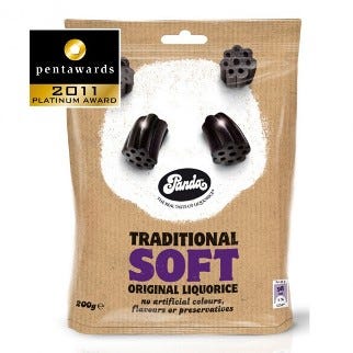
Cowan (England), for Panda Liquorice packaging.
Body category:
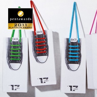
Kempertrautmann Gmbh (Germany), for Görtz 17, Converse, Shoelace Box.
Other Markets category:
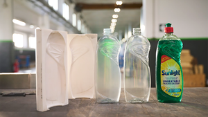
Stocks Taylor Benson (England) for the Morrisons range of detergents.
Luxury category:
Harry Allen Design (USA) for the Bang perfume bottle of Marc Jacobs.
Forty Gold Pentawards were presented, as well as Silver and Bronze Pentawards. The prize-winning creations will be exhibited at the DesignPackGallery (Paris) in January 2012.
In addition, the prize-winning creations at Pentawards in 2011 and 2012 will be published by TASCHEN in a superb book of more than 400 pages which will be launched when the 6th Pentawards are handed out in October 2012 in Paris.
"For this fifth edition we accepted nearly 1,000 entries from 51 countries," explains Brigitte Evrard, co-founder of the Pentawards. "We are extremely happy with this 2011 edition which, despite the world economic crisis and the general reduction in costs this brings, recorded an increase in entries of 11 percent. If 50 percent of the entries come from the four most important markets (U.K., U.S., Japan, France), over the years we have noticed more and more products coming from emerging countries such as Korea, Taiwan, China and Brazil.
This year, packaging created in England held a particular appeal for the international jury, as two Platinum Pentawards and six Gold Pentawards are "made in the U.K."
Gérard Caron, editor of the website www.admirabledesign.com, chairman of the Pentawards jury, adds:
Pentawards: The design to consume?
A lot of packaging design competitions exist in different areas, but none of them has received a response like that enjoyed by Pentawards...even though it was one of the last to come to the party. There must be an explanation for this...
One of the main reasons, probably, is that from the outset we dared to organize this competition on a global level, with all the complexity this represents. Just imagine, everything was conceived in eight languages! However, this reason is not enough. Let me explain.
Each year I have the privilege of being able to examine, along with the other members of the jury, nearly a thousand new items of packaging originating from around 40 countries. A real treasure trove! Certain markets are discovering the rules of modern economics, whereas others are just pulling through... But they're all taking part. In other words, certain countries initiate consumption trends revealed by Pentawards; they will be followed by a handful of other countries a year or two later, before this trend becomes totally international. Because everyone will be affected sooner or later...
These major trends which spread around the globe are given expression to by designers who adapt them to the cultures of their countries with considerable imagination. So there has been packaging which used the humour card, or packaging with minimalist design, not forgetting eco-packaging to ease the conscience of consumers...
Through the medium of Pentawards, packaging design therefore finds itself being the most visible revelation of these consumption trends. The jury is not mistaken in its choices, as these members almost unanimously nominate the same designs for awards... even though they originate from 10 countries—that is 10 different markets—and do not communicate among themselves. This is a phenomenon which, as the chairman of the jury, always fascinates me just as much each year. "Good design," so difficult to define, therefore seems to be universal!
Pentawards has probably become one of the best revealers of major world trends in consumption. Some "trend spotters" were not mistaken...
Jean Jacques Evrard, co-founder of the Pentawards explains: "We are pleased to announce that celebrated publishers TASCHEN, known throughout the world for the quality of their art books, will be publishing a second volume on the Pentawards. Following the resounding success of the first volume entitled 'The Package Design Book,' which was No. 1 seller for several weeks at TASCHEN, this second edition, which will group together the winners of the Pentawards 2011 and 2012, is for us a recognition of the quality of this international competition.
"Above all, though, for the winners of the Pentawards, it is a tremendous showcase which, in addition to highlighting the fact that they have won an international trophy, enables their packaging design skills to gain recognition around the world. This reference book will be available from October 2012 not only in all TASCHEN's superb shops in London, Paris, New York, Berlin, Copenhagen, Cologne, Hollywood, Miami, Brussels but also in quality bookshops throughout the world as well as on the web.
"Naturally, the first book, which groups together winners of the Pentawards 2009 and 2010, is still available in bookshops and on the web."
Next year : The Pentawards 2012 will be presented in Paris
The Pentawards 2012 will be open for entries from April 2 to May 11, 2012. All the information you need to take part in this international competition uniquely dedicated to packaging design is available on the website.
Next year, the 6th official ceremony of the Pentawards will be presented in Paris.
About the Best of the Show—Diamond Pentaward 2011: Ramlösa premium PET* bottle designed by NINE, Sweden
The Swedish mineral water Ramlösa was facing some real challenges in the beginning of 2010, with an iconic premium bottle shape in glass that was much too heavy for transport and with too high costs in terms of production and environmental impact. The obvious choice was to design a new bottle in PET, but would high-end customers accept a premium product served in a plastic bottle?
The producer Carlsberg Sweden gave design—and innovation agency NINE the task of designing a new bottle for the premium version of Ramlösa, in the more environmentally friendly material PET.
Please find the intriguing story of the old Swedish brand Ramlösa, as well as the challenging task to develop a new packaging format that changes the perception of PET as possible premium material, below.
THE MAIN CHALLENGE FOR NINE, DESIGN AND INNOVATION AGENCY:
• Investigate and identify a design solution for Ramlösa PET that conveys premium quality and can change the perception of PET as an ordinary material which customers have today.
• Environmental gains with new bottle.
• The transported packaging weight was immediately reduced by approximately 90 percent for bottles, which resulted in lighter and faster transportation. The transportation of empty glass bottles from England was discontinued.
• The production of PET uses approximately 65 percent less carbon dioxide than glass, which is a direct environmental improvement for the new packaging format.
Ramlösa is a natural mineral water, originating from the ancient spring Ramlösa Hälsobrunn in the southern part of Sweden. The spring was found by a German physician named Johan Jakob Döbelius, who arrived in Sweden by accident at the beginning of the 18th century. Döbelius' original destination was England, but due to extreme weather the ship stopped in Gothenburg on the Swedish west coast. Döbelius remained in Sweden as a district medical officer and spread the word widely about Ramlösa's unique water while travelling.
In a brochure from the time he described the phenomenon of the water, which was said to be able to cure everything from dizziness to scurvy. Even before Döbelius, Ramlösa Hälsobrunn was well-known for its nutritional water. Soldiers with iron deficiency often came there to drink the water.
"The successful launch of Ramlösa in a unique premium PET bottle has increased the number of our customers by 16 percent, and the more environmentally friendly packaging has been an important step in our CSR work." — Paul Davies, marketing director, Carlsberg Sweden
In addition to the Diamond Pentaward trophy, NINE received the amazing EskoArtwork Suite 10 software, one of the most powerful design and visualization programs, worth €5,000.
PENTAWARDS 2011: Five Platinum Pentawards, Best of the Category
Apart from the Diamond Pentaward, best of the show, (Ramlösa by NINE—Sweden), the international jury, under the chairmanship of Gérard Caron, awarded five special prizes, one per category.
The BEVERAGES Platinum went to a metal Heineken bottle, created by dBod, Amsterdam, Holland.
Heineken launched the new STR Bottle in New York and Los Angeles. dBOD used state-of-the-art techniques to create a spectacular surprise revealed by UV light. We applied this cutting-edge technique on a new aluminium bottle for Heineken, which was introduced in nightclubs. The trendy, minimalist design on the aluminium bottle emphasises the broad position that Heineken occupies.
Sven David Kuipers, marketing manager at dBOD, says: "The bottle was inspired by dark nightclubs which have black lights to light up the dance floor. With light shining through the new Heineken bottle, it suddenly illuminates and reveals hidden stars and other squiggly designs. Drinking a Heineken never looked so cool!
"Through the use of groundbreaking UV ink technology, the STR bottle brings a new level of excitement in the world's top nightlife venues. When exposed to UV black light, hidden ink suddenly flares up on the bottle surface and reveals a bright-glowing design: an enticing experience for an exclusive audience. The design shows an intricate pattern of stars and trails, visible around the bottle base and in the large centre star."
The STR bottle has launched succesfully in 40 markets so far and has become the ultimate must have bottle in exclusive nightclubs around the world. In addition, the STR bottle received lots of attention in the press.

Pentawards 2011 winner Panda
The FOOD Platinum was won by Cowan Design (England), for Panda Liquorice packs.The Panda brand was established in Finland in 1927 and has been in the U.K. for 25 years, predominantly in the health food area. With the growth of competitive traditional soft liquorice brands in the multiples, the brand wished to launch two traditional soft SKUs, Original Black and Raspberry. Targeted at traditional liquorice lovers, foodies who are often older, and younger adult sweet buyers alike, the brand needed to create a visual language that would differentiate from its health food offering and work in the mainstream market. It needed to stand out from the crowd, communicate softness and heritage and appeal to a wide group.
The immediate competition is a mix of "traditional" brands and the more mainstream sweetie players. Cowan was wanted to evoke emotion—but reinterpret "old fashioned" as "nostalgia." Taking "soft spot for nostalgia" as our core thought, Cowan created a more emotive and appealing brand that would have broad appeal. Their key visual equity, beyond the logo, was the Panda bear. Cowan set about giving him a personality and a role. As pandas evoke the "ahh" factor, are long associated in the memory, emotive and "soft," the solution was to literally make him the face of the brand. This gives a strong, differentiated look, which has great shelf standout, yet the pack itself conveys softness, even an innocence for simpler times.

Pentawards 2011 winner
The BODY Platinum was awarded to Kempertrautmann Gmbh (Germany), for Görtz 17, Converse, Shoelace Box.The first recyclable shoebox that makes the plastic bag unnecessary.
Marketing objective: Create a shoebox for Görtz 17's Converse Collection to engage consumers at the point of sale.
Strategy: To boost the sales of a stylish shoe that's already a cult product, we created new packaging that made the brand even more desirable in terms of look and functionality: The first recyclable shoebox that makes the plastic bag unnecessary. Its minimalist design draws attention to the handles, which can be removed and used as an extra pair of shoelaces. The series consists of five colour-coordinated designs that match perfectly with Görtz 17's Converse Collection.
The OTHER MARKETS Platinum was awarded to Stocks Taylor Benson (England) for the range of Morrisons own label brand detergents.
Laundry care is a complex segment. With a huge array of product types and product formats, the key to solving the brief was to clarify and simplify on-pack messaging and create shelf standout for consumers. The various product types (such as Bio, Non Bio, 2 in 1s and Colours) and their benefits are the key messages. Then within each type a variety of different formats are available (tablets, capsules, powders, liquids and gels and super concentrates).
Steering away from the rather dated category norm imagery of flowers, butterflies, mothers hugging children and scientific whooshes, the revamped range focuses on a simple, strong design concept that mimics fabric care labels found on clothing. This ties the complete range together and still allows for the important differences between product type and format to be clearly identified.
This "label" design concept cleverly allows further key messages to be conveyed. The background fabric changes for product type. For example, a soft fleece fabric is used for Non Bio. Secondary messages, such as number of washes and washing temperatures, are displayed as icons done in the style of washing instructions found on clothing labels.
In a world populated all too often with copycat design when it comes to own label packaging, the goal was to break convention and create category busting designs that will clean up against the competition.
The LUXURY Platinum went to Harry Allen Design (USA) for the BANG perfume bottle of Marc Jacobs.
To capture the complex essence of Marc Jacob's new men's fragrance, Harry Allen went back to basics. The design brief provided the name, BANG, and a request that the bottle be both whimsical and manly. Harry Allen and his team distilled the brand message to its core when they took hammer to metal. The form is digitally lifted from a piece of metal that Harry struck with a hammer in his studio. The impact is honest, spontaneous, masculine and fun.
In addition to the Diamond Pentaward and the five Platinum Pentawards, the international panel of judges also awarded 40 gold Pentawards among the 46 categories in competition this year. Silver and Bronze Pentawards were also given out.
Source: Pentawards
.
You May Also Like


