Redesigned ice cream packaging serves up nostalgia
March 11, 2015
When Anthem worked with Unilever on reinvigorating the packaging for Unilever's Good Humor ice cream treats, the design company looked at what it states is the "magic, fun and taste" that is central to the Good Humor brand.
The confections known fondly by many Americans as Good Humor ice cream treats are actually part of a worldwide product line. In markets outside of the U.S., the confections are sold under the Heart brand.
Evidence of the worldwide product line can be found in Good Humor's previous logo, which comprises a double-heart shape with the Good Humor brand name set in capital letters. While incorporating the Heart icon in the Good Humor brandmark helped reinforce the identity of the worldwide Heart brand, it was preventing full capitalization of Good Humor's brand equity.
"Unilever realized that walking away from the heritage and the history of the Good Humor man, the truck, the bells, the blue coloration and so forth, was not doing much to increase sales, but, in fact, was potentially disengaging consumers because it didn't feel like their Good Humor," remarks Janice Jaworski, managing director at Anthem Worldwide - New York. "This iconic American ice cream brand was not doing justice to itself by being part of that [Heart branding] execution."
Anthem worked with the Unilever's Visual Branding team on an extensive identity exploratory. Some of the ideas that were bandied about included creating a hybrid branding element that would keep the Heart icon but replace the Good Humor font with lettering that would be more in keeping what was used on the Good Humor truck or the Copperplate styled fonts used for the in-home packaging. They also looked at branding that included a visual representation of a Good Humor truck, which many of the brand's adult consumers associate with happy childhood memories.
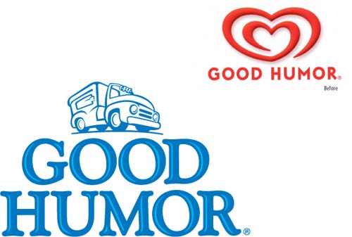
Good Humor redesigned logo transports adult consumers to happy childhood days
Remarking on her impressions when first viewing the ice cream truck-inspired branding, Jaworski says, "You could almost look at the logo and picture the truck coming down the road and all the kids running out with their change." After discussing how much freedom Anthem had in leaving the Heart branding aside, Unilever decided to move forward with the ice cream truck-inspired branding in blue versus Heart's trademark red.
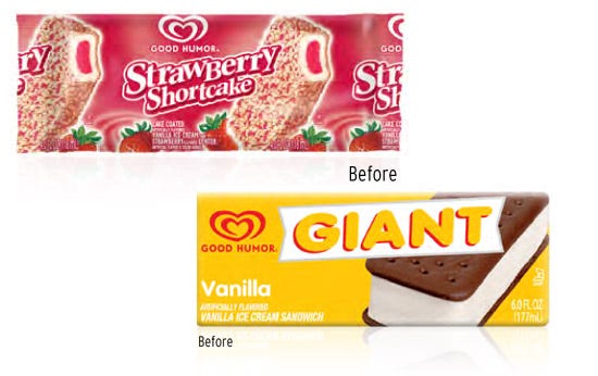
Previous packaging of Good Humor Strawberry Shortcake and ice cream sandwich bars
Given the long history of the Good Humor brand, it's no surprise that a wide range of Good Humor confections are sold individually through outlets such as ice cream trucks and C-stores. Unfortunately, package design wasn't consistent throughout the extensive product line. For example, Good Humor's Strawberry Shortcake and Giant bars previously had very different looks.
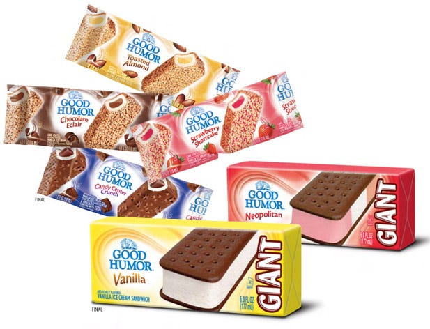
Redesign packaging for Good Humor bars and sandwiches
The redesigned packaging for both products now prominently feature a swirl pattern that ensconce the new Good Humor logo in addition to each confections' flavor/variety designation, which also happens to sport consistent type treatment across brands. Other products such as Good Humor's filled cone confections also have the same look.
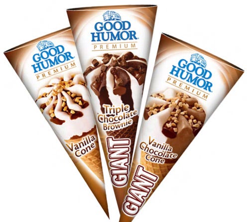
Good Humor redesigned cone packaging
Anthem was originally commissioned to update the packaging for Good Humor's out-of-home products only. "Unilever's brand team was really enjoying how we were taking the out-of-home look that they decided to award us the in-home," recalls Jaworski.
The in-home packaging did not have the same design challenges that the packaging for the individually wrapped products did.
Because the in-home packaging does not use decorated wrappers, Anthem and Unilever did not have to worry about how the wrappers would be printed. Anthem had to design the out-of-home wrappers to look consistent whether they were printed random repeat or registered. "In effect, we had to create a design that was flexible enough to be centered and cut at the various increments for each wrapper length but also one that worked and still looked the same in essence as a registered one," Jaworski explains.
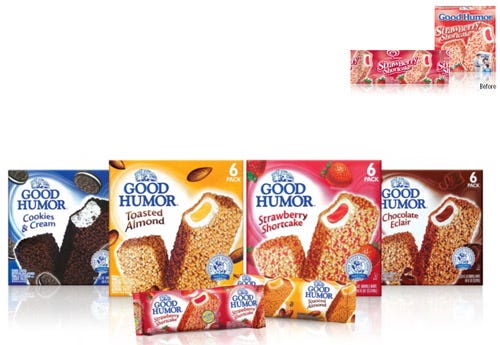
Good Humor redesigned grocery and single-serve packaging
Anthem designed the in-home packaging to take full advantage of the better billboarding offered by the carton and advantages afforded from printing on paper. "Printing on paperboard is a better canvas to showcase nice graphics, color and so forth," Jaworski comments.
About the Author(s)
You May Also Like


